
Bad tickets slow down support teams and frustrate customers. They’re incomplete, vague, or misrouted, leading to wasted time and missed SLAs. The solution? Smarter submission forms that collect the right details upfront. Here’s how to fix your ticket intake process:
- Simplify forms: Keep them short with only essential fields like name, email, and issue description. Use multi-step layouts to reduce abandonment rates.
- Use conditional logic: Show relevant fields based on user input (e.g., billing vs. technical issues) to streamline data collection.
- Order fields logically: Start with simple questions and move to complex ones. Real-time validation helps users fix errors immediately.
- Leverage AI: Automate ticket summaries, detect intent, and prompt users for missing details before submission. AI also ensures accurate ticket routing and tagging.
These steps reduce manual sorting, improve ticket quality, and speed up resolutions. A well-structured form paired with AI tools transforms support operations, saving time and boosting efficiency.
How to Design Better Submission Forms
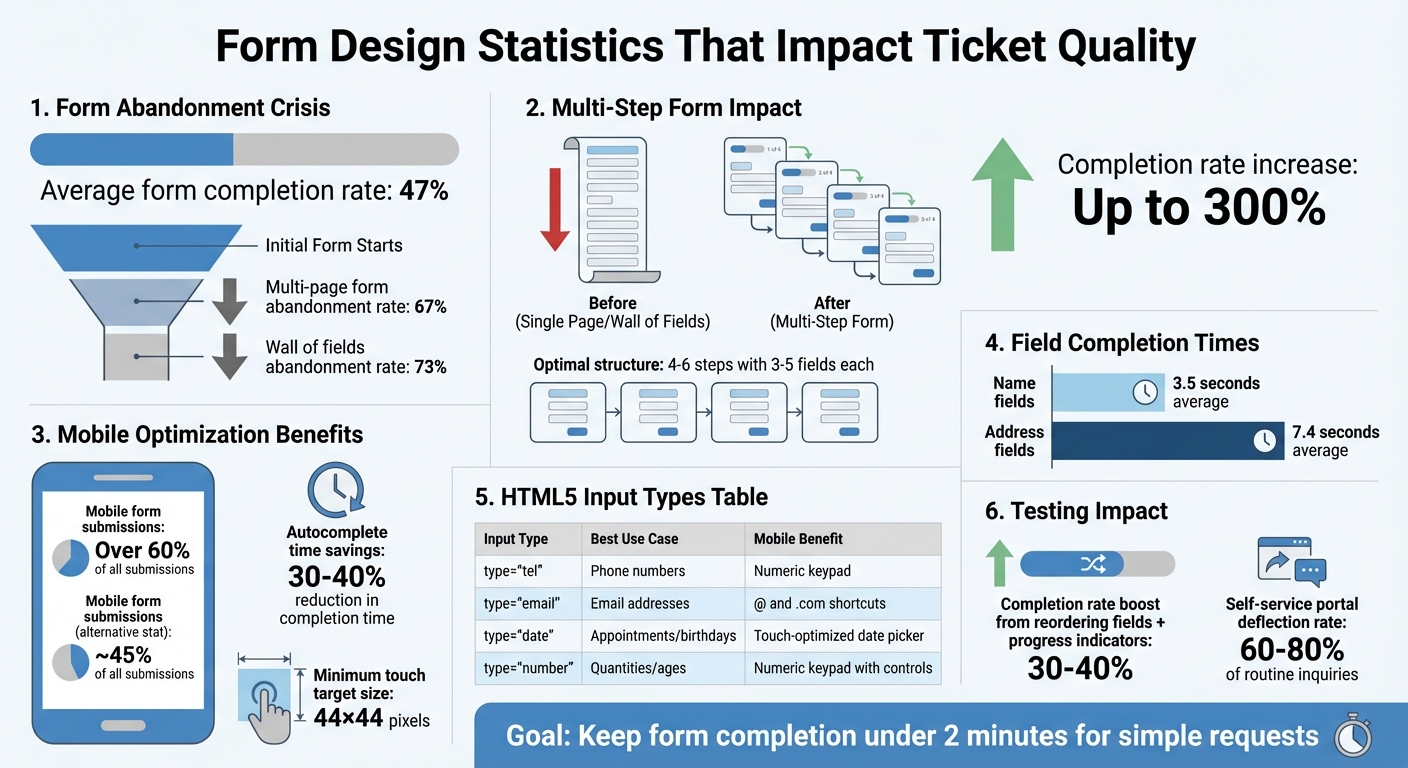
Fine-tuning your submission forms is an effective way to address issues like incomplete or misrouted tickets. The key is to focus on capturing only the information you truly need – every extra field increases the chance users will abandon the form. With an average view-to-completion rate of just 47%, more than half of users don’t finish the forms they start [4].
Keep Forms Short and Simple
A streamlined form layout reduces the chances of missing crucial ticket details. Stick to the essentials: name, email, and a brief description of the issue. This keeps things simple while allowing troubleshooting to begin. For gathering additional information, consider progressive profiling. This approach collects details over time, building on small, initial commitments to encourage users to complete the form [5].
Multi-step forms with progress indicators can also help. By breaking the process into smaller, more manageable steps, these forms ease user anxiety and can increase completion rates by up to 300% [4][5][6].
Use Conditional Logic to Show Relevant Fields
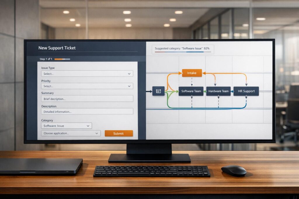
Dynamic forms that adapt to user input can make the experience feel intuitive and personal. For example, if a user selects "Billing Issue" from a dropdown, show fields for invoice number and payment date. If they choose "Technical Problem", display fields for product version and error messages. This kind of conditional logic hides irrelevant questions, reducing cognitive load while ensuring you collect the right data for each situation.
To make this work effectively, use dropdown menus or radio buttons as triggers – free-text fields are less reliable for setting conditional rules [6]. Keep branching logic simple, with no more than 2–3 levels, to make testing and maintenance easier. Start with a couple of basic fields like name or email to establish trust before introducing more tailored questions [6].
Order Fields from Simple to Complex with Real-Time Validation
The order of your fields matters. Begin with straightforward inputs like name and email before moving to more contextual fields like company or role. Save sensitive or complex questions for the end. This sequence takes advantage of commitment escalation, a psychological principle where users are more likely to finish a task once they’ve already invested effort in it [6][7].
Real-time validation is another game-changer. Use on-blur validation, which checks for errors as soon as users leave a field. This approach allows users to fix mistakes immediately while the information is still fresh in their minds, making corrections feel minor rather than frustrating [6]. For example, users spend an average of 7.4 seconds filling out address fields compared to just 3.5 seconds for name fields, so clear guidance is especially important for more complex inputs [4]. Provide specific error messages like "Password must be at least 8 characters and include one number" instead of vague warnings like "Invalid input" [6][7]. Input masking, such as formatting phone numbers automatically, can also guide users toward entering data correctly [6].
sbb-itb-e60d259
Using AI to Improve Ticket Quality
Modern AI tools are taking ticket quality to the next level by automating data assessment and follow-up, working hand-in-hand with smart intake designs. Instead of relying solely on agents to resolve ambiguities, AI-powered intake systems analyze user submissions in real time, identify specific needs, and streamline the process of data collection.
AI for Auto-Summaries and Intent Detection
Using Natural Language Processing (NLP), AI can interpret ticket descriptions, even when they’re vague or unclear. For example, if someone submits a ticket saying "can’t log in" without clarifying the issue – whether it’s a forgotten password, account lockout, or SSO error – AI can pick up on contextual clues like "forgot my password" or "SAML 2.0 error" and categorize the request accurately. This means fewer ambiguous tickets for agents to untangle.
AI also evaluates sentiment and urgency automatically. For instance, a ticket with "Quick question" in the subject line but phrases like "system down" or "losing revenue" in the body would be flagged as high-priority [11]. Taner Tombaş, a back-end engineer, highlights the importance of this capability:
Intent detection is the bridge between user questions and intelligent retrieval [9].
Organizations using intent-aware systems report a 60% drop in complaints about AI misunderstanding requests and a 25% reduction in follow-up clarification questions [9]. AI even prompts users to fill in missing details before submission, ensuring more complete tickets.
AI-Powered Clarification Before Submission
AI doesn’t just accept incomplete entries – it actively seeks clarification when needed. For example, if a user submits "billing problem" without specifying an invoice number or payment date, the system can ask follow-up questions like "Which invoice are you referring to?" or "What date was the charge?" before finalizing the ticket [8][9]. This eliminates the need for agents to send back-and-forth emails asking for basic details.
Conversational AI agents can go a step further by replacing static forms entirely. These agents engage users in natural conversations, probing vague answers until they gather enough information to route the ticket properly [10]. This approach tackles a common problem: multi-page forms often see abandonment rates exceeding 67% [10].
Automatic Routing and Tagging
AI doesn’t just clarify submissions; it also ensures tickets are routed to the right team. By analyzing the entire ticket body, AI can override incorrect user selections. For example, if a user selects "General Question" but mentions "API integration" or "SAML 2.0" in the description, AI can match the technical details to the appropriate expert and send the ticket directly to them [11].
This eliminates the inefficiency of "ticket tennis", where cases bounce between teams due to misrouting. Nooshin Alibhai, Founder and CEO of Supportbench, emphasizes this impact:
AI is revolutionizing the operational backbone of support by bringing intelligence and context-awareness to ticket routing and prioritization [11].
AI also ensures consistent tagging of tickets, preventing issues caused by missing or inconsistent metadata. Unlike human agents, who may forget or apply tags inconsistently, AI assigns relevant tags every time, improving organization and reporting accuracy while reducing manual effort.
Form Structure and Placement Best Practices
Form Design Statistics: Completion Rates and Mobile Optimization Impact
Improving ticket quality goes beyond smart data capture and AI tools. The way forms are structured and where they’re placed can make a huge difference.
Choose the Right Input Types and Use Multi-Step Forms
How a form is designed plays a big role in whether users complete it. Breaking up a form into smaller steps – ideally 4–6 steps with 3–5 fields each – makes it less overwhelming and reduces the 73% abandonment rate caused by forms that feel like a "wall of fields" [12]. Multi-step forms also benefit from the sunk cost fallacy: once users start, they’re more likely to finish.
Start with simple fields like name and email to build momentum. Save more complex or sensitive questions for later, and finish with high-value qualifiers. Adding progress indicators, like "Step 2 of 4" or a progress bar, motivates users by showing them how close they are to finishing. This taps into the goal gradient effect, which encourages people to complete tasks as they see progress [12].
When choosing input types, make sure they match the data you’re collecting. For example:
- Use radio buttons for 2–4 options so users can see all choices at a glance.
- Dropdowns work better for 5–15 options, saving space while still being clear.
For mobile users – who account for over 60% of form submissions – optimize with HTML5 input types. Examples include:
- type="tel" for phone numbers, which triggers a numeric keypad.
- type="email" for email addresses, which brings up shortcuts like "@" and ".com."
- type="date" for appointments or birthdays, offering a touch-friendly date picker.
Here’s a quick guide to input types and their mobile benefits:
| Input Type | Best Use Case | Mobile Keyboard Trigger |
|---|---|---|
| type="tel" | Phone numbers | Numeric keypad |
| type="email" | Email addresses | Keyboard with @ and .com shortcuts |
| type="date" | Appointments or birthdays | Native touch-optimized date picker |
| type="number" | Quantities or ages | Numeric keypad with increment controls |
To further improve the experience, use on-blur validation. This checks for errors as users finish each field, catching mistakes while the context is fresh without being intrusive. Input masking for fields like phone numbers or credit cards also helps guide users to enter information correctly [6].
Once your form is optimized, the next step is placing it where it will have the most impact.
Place Forms on High-Intent Pages
Where you position your form can be just as important as how it’s designed. Forms should be placed in areas where users are most likely to need help – like after they’ve tried to solve an issue themselves. For instance, placing a form at the end of an unhelpful knowledge base search ensures users can escalate their issue without starting over [3].
Embedding forms in centralized customer portals is another smart move. These portals often serve as hubs for onboarding resources and support tools, making them a natural place for users to submit requests [1]. Additionally, use data to identify pages where users frequently encounter challenges, such as after a major UI update or on complex feature documentation. Adding forms or support links to these pages can proactively address user needs.
High-intent pages – like customer dashboards, billing sections, or technical documentation – tend to generate more complete and relevant submissions. This is because users visiting these pages are already engaged with specific tasks, making them more likely to provide detailed information.
Track Metrics and Test Changes
To know what’s working, you need to measure it. Keep an eye on form completion rates to spot where users drop off, and track ticket quality scores to see if your forms are reducing bad submissions [3]. Other important metrics include ticket volume, resolution time, SLA breaches, satisfaction scores (CSAT), and how often users engage with your portal.
A/B testing is a great way to refine your forms. Try different field orders, progress indicator styles, or input types with a subset of users before making widespread changes. For example, reordering questions to start with simpler fields and adding progress indicators can boost completion rates by 30% to 40% [12]. Enabling the autocomplete attribute for returning users can also cut form completion time by 30% to 40% [12]. Even small tweaks, like ensuring touch targets are at least 44×44 pixels, can reduce mobile abandonment caused by mis-taps [12].
Common Form Design Mistakes to Avoid
Poorly designed forms can overwhelm support teams and disrupt the processes that make AI-driven operations efficient. These missteps often result in incomplete tickets, delayed routing, and wasted agent hours.
Asking for Too Much Information Upfront
Requiring excessive details at the start can turn users away, especially on mobile devices, which account for about 45% of all form submissions [14]. Keep initial questions limited to what’s absolutely necessary to route the ticket. Use conditional logic to show additional fields only when needed, and stick to a single-column layout for a natural reading flow. This approach not only reduces cognitive strain but also encourages smoother interactions and more accurate data collection [13][14].
Skipping User Feedback and Testing
User feedback is critical for refining form design. Without real-world testing, forms often include overly technical language or confusing layouts that lead to ticket misclassification and unnecessary escalations [16][17].
"Internal testing reveals technical issues, but customer testing reveals usability problems." – Digikat [15]
Beta testing with a range of users – power users, occasional users, and first-time customers – can highlight workflow gaps that internal teams might miss [15]. After launch, keep an eye on ticket volume spikes, analyze "no results" search queries, and review document ratings to identify areas where content isn’t deflecting tickets effectively [18]. When tested thoroughly, customer self-service portals can deflect 60–80% of routine inquiries [15].
Not Using Automation and AI
Relying on manual processes slows down resolutions and makes it harder to track important data for optimization. Without automation, teams spend too much time sorting tickets, leading to missed submissions and unclear ownership.
Leverage automation to streamline ticket routing by issue type, category, or urgency, eliminating the need for manual triaging. AI tools can also auto-fill form fields based on keywords, reducing user effort and boosting data accuracy. Set automated escalation rules and timers to ensure timely responses, and use automation for quick tasks like sending instant acknowledgments or closing inactive tickets. These steps reduce the manual workload, allowing support teams to focus on more impactful tasks.
Conclusion
Smart intake design lays the groundwork for making precise, data-driven decisions. Properly structured forms help isolate variables like region or request type, enabling quicker root-cause analysis[2]. This method turns random disruptions into patterns that can be analyzed and addressed effectively.
By incorporating features like conditional logic, AI-powered intent detection, and knowledge base deflection, you can immediately cut down ticket volume while improving the quality of submissions[3]. For instance, if 40% of requests are flagged as high-priority, it highlights critical workflow problems. A well-structured intake process provides the clarity needed to address these issues[2]. Additionally, AI tools like auto-summaries and intent detection work hand-in-hand with these design adjustments to streamline operations.
"If you want to lead with precision, it starts here. Design your intake process like your company depends on it – because it does." – Alexander Procter, Okoone[2]
Enhancing ticket quality also opens the door to further form optimizations. Swap open-text fields for dropdown menus (e.g., urgency: Standard, Rush, Urgent) and implement real-time validation[2]. Monitor how long it takes users to complete forms and aim for under two minutes for simple requests. These tweaks lighten the load on agents, improve AI-powered ticket routing accuracy, and let your team focus on cases that genuinely require human attention.
FAQs
What fields should every support form include?
Every support form should have a few essential fields to streamline issue resolution and minimize incomplete submissions. These fields include:
- Customer contact information: Basic details like name, email, and phone number to identify the customer and maintain communication.
- Issue description: A clear explanation of the problem to help the support team understand the situation.
- Product or service selection: Identifying the specific product or service ensures the issue is routed to the right team.
- Priority or severity level: Allows customers to indicate how urgent or critical the issue is, helping prioritize tickets.
- Supporting details or attachments: Additional context, such as screenshots or documents, can provide clarity and speed up resolution.
- Ticket category or type: Classifying the request helps organize and direct it to the appropriate department or specialist.
Including these fields ensures the support process runs smoothly and efficiently.
When should I use conditional questions in a form?
Conditional questions in a support portal form can tailor the experience for users by dynamically adjusting fields based on their responses. This approach ensures that only relevant questions are displayed, making it easier to gather precise information and improving both ticket quality and routing accuracy.
Here are some key ways to apply conditional questions effectively:
- Show or hide fields based on earlier answers: For example, if a user selects a specific product or issue type, additional fields related to that choice can appear. This avoids clutter and keeps the form focused.
- Collect detailed information only when necessary: If a certain issue requires more context, you can trigger follow-up questions to dig deeper, but only when the situation calls for it.
- Streamline the user experience: By guiding users through relevant steps, you make the process less overwhelming and help them provide the right details without unnecessary back-and-forth.
Using these methods, you not only simplify the form-filling process for users but also ensure your support team receives the information they need to resolve issues efficiently.
How can AI catch missing details before submission?
AI works by scanning form inputs and matching them against a set of predefined requirements. It spots missing details, incomplete fields, or inconsistencies in real time and immediately alerts users to fix or complete their entries. This process ensures that all required information is filled out before submission, which helps cut down on errors and boosts the overall quality of submissions. Additionally, AI can offer context-based suggestions for corrections, making the process smoother and more precise.