

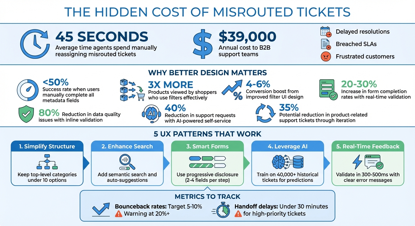
Incorrect category selection wastes time and money. On average, agents spend 45 seconds manually reassigning misrouted tickets, costing B2B support teams over $39,000 annually. Worse, these errors delay resolutions, breach SLAs, and frustrate customers.
The solution? Smarter design. Here’s how to guide customers to the right category every time:
- Simplify category structures: Use plain language and group logically. Avoid overwhelming users with too many options – stick to fewer than 10 top-level categories.
- Enhance search tools: Add semantic search and auto-suggestions to match user phrasing and reduce failed searches.
- Design smarter forms: Use progressive disclosure and inline validation to make forms intuitive and error-free.
- Leverage AI in customer support: Predictive categorization, trained on historical data, ensures accurate routing and reduces manual errors.
- Provide real-time feedback: Validate selections instantly and offer easy recovery paths for mistakes.
The Cost of Wrong Category Selection in B2B Support
Build a Clear Category Structure
Creating an organized and intuitive category structure is key to accurate selection. When customers face a cluttered list of options, they often guess instead of confidently choosing the right category. The goal isn’t to train customers to choose better – it’s to design a system where the correct choice is obvious.
Use Plain Language and Logical Groups
Skip the technical jargon and stick to terms your customers naturally use. For instance, if customers commonly say, "I can’t log in", the category should be labeled as "Login Problem" rather than something technical like "Authentication Services."
Consistency is also crucial. Use one term for each concept and define it clearly. For example, "Billing" could be defined as: Questions about charges, invoices, refunds, or subscription changes. This ensures customers, agents, and AI systems all interpret categories the same way [3].
Structure categories based on the type of issue, not your internal department names. Customers don’t care if their problem falls under "Tier 2 Engineering" or "Product Ops." They just need a straightforward category like "Bug" or "Billing Question." A two-tier system works well here: start with a mandatory high-level category (Tier 1) and then reveal optional subcategories (Tier 2) for more detail. This strikes a balance between quick selection and useful detail [3].
"If agents need to read a paragraph of documentation to understand which category applies, the taxonomy is too difficult or complex."
– Jake Bartlett, Writer and Customer Support Expert [3]
Avoid generic catch-all categories like "Other" or "General Inquiry." These often become dumping grounds for unclear submissions, making your data less useful [3].
Once you’ve nailed the language and grouping, focus on simplifying the number of options.
Limit Options to Reduce Overwhelm
Hick’s Law explains that the more choices people have, the longer it takes them to decide and the harder it becomes to choose [5]. To prevent this, keep your top-level categories under 10 options. For example, a Tier 1 structure for B2B software support might include: Bug, Feature Request, Billing Question, How-To, Account Management, and Technical Issue [4].
Use progressive disclosure to manage complexity. Start with a small set of broad categories (e.g., six main options) and only display subcategories after the initial selection. This keeps the interface clean while still gathering detailed data for accurate routing and reporting.
"Selecting a category should be fast and obvious. It can only be fast and obvious if you limit the number of categories you have."
– HelpSpot [4]
Focus your taxonomy on the 80% of tickets you handle most often, rather than rare edge cases. For example, if "Password Reset" makes up a significant portion of your tickets, it deserves its own category. On the other hand, something like "Legacy API Deprecation", which rarely occurs, can be tracked using custom fields or tags. Start simple, and only add complexity when ticket volume justifies it [4].
sbb-itb-e60d259
Improve Search and Findability
When search tools fail, customers often resort to guessing, which can lead to misrouted tickets and added frustration. A well-designed search system eliminates this by guiding users directly to the right option based on their input, reducing errors caused by manual selection.
Add Semantic Search and Auto-Suggestions
Basic search systems that rely on exact keyword matches often miss the mark. For instance, if your category is named "Billing Question", but a customer searches for "invoice problem", a traditional search might not link the two. Semantic search solves this by understanding the intent and meaning behind words, seamlessly connecting synonyms and varied phrasing [8].
Auto-suggestions further enhance the experience by presenting relevant categories or help articles as users type. This reduces the mental effort required and minimizes the uncertainty of facing an empty search bar [2]. A great example comes from Tripaneer’s Digital Product Designer, Zina Szőgyényi, who revamped a platform with over 300 tags in 2018. By reorganizing options and improving search functionality, the team achieved a 33% faster completion rate and saw users select an average of four additional relevant tags per listing [1].
"The multi-select pill box is a good solution when the user is familiar with the content of the list… In case when the content of the list is not familiar… their search doesn’t return with any results 50% of the time."
– Zina Szőgyényi, Digital Product Designer, Tripaneer [1]
To further improve the search experience, enable autofocus on the search field so the cursor is ready as soon as it’s selected. Add text prompts like "Billing issue" to guide user input and arrange suggestions by frequency or urgency rather than alphabetically. This ensures the most relevant options are prioritized.
The final piece of the puzzle? Keep a close eye on search failures to refine and improve category selection accuracy.
Track and Fix Failed Searches
Every search that yields zero results is an opportunity to improve. These failed queries highlight gaps in your category structure, whether it’s missing synonyms, unclear labels, or entirely overlooked topics. For example, if users often search for "refund" but your category says "Credit Request", it’s time to bridge that disconnect.
Using tools like query rewriting and synonym mapping can address common issues. For instance, typos such as "reciept" should still return the correct category, like "Receipts & Invoices" [6]. Similarly, grouping related terms – such as "bill", "invoice", and "statement" – under a single category ensures users find what they need regardless of phrasing.
If you rely on AI models to predict categories from search data, be cautious of data imbalances. For example, if 90% of searches focus on one issue, less frequent but critical categories like "Security Breach" could be overlooked. Techniques like downsampling and upweighting can help balance the model, ensuring it remains sensitive to rare yet important categories that might account for less than 0.1% of searches [7].
Design Smarter Forms with Progressive Disclosure
Creating smarter forms is crucial for avoiding misrouting and speeding up resolution times. By relying on a clear category structure, these forms guide users step-by-step to ensure accurate selections.
Forms that overwhelm users often lead to guesswork, resulting in incorrect category choices. Progressive disclosure solves this issue by gradually revealing fields based on prior answers, making the process feel more like a guided conversation. Studies indicate that working memory can only handle three to four chunks of information at once before performance declines [9]. This approach simplifies the experience and prepares users for more detailed inputs later on.
Start with easy, low-pressure questions – like asking for a name or email address – to build momentum. Once users commit to these initial steps, they’re more likely to complete the more complex categorization fields that follow. This step-by-step engagement can significantly improve conversion rates, boosting them from the usual 2–3% to as high as 15–25% [11].
Use Contextual Questions and Inline Validation
Ask relevant, targeted questions to guide users toward accurate category choices. For instance, if a customer selects "Billing Issue" as their main category, the form should immediately display follow-up options, such as "Invoice not received" or "Incorrect charge", while hiding unrelated fields. This use of conditional logic keeps the process focused and reduces the chance of errors [13].
Inline validation is another key feature for smarter forms. By validating each field as it’s filled out, users get immediate feedback, like a green checkmark for correct entries or clear error messages when something needs fixing. Make sure text accompanies color cues, as about 8% of men have color vision deficiencies [15]. Real-time validation can increase form completion rates by 20–30% and cut data quality issues by up to 80% [15].
In February 2022, Tornike Kurdadze from Netguru tested a redesigned eCommerce category hierarchy using interactive chips with arrows. Among 132 participants, 87% found the design intuitive, demonstrating the power of streamlined, interactive interfaces [14].
"Effective web forms are psychological conversations, not interrogations."
– Orbitforms.ai [11]
Once users select the right categories, the final step is to make the submission process as smooth as possible.
Reduce Friction in the Submission Process
Keep each step of the form short, limiting it to 2–4 fields to avoid overwhelming users [10]. Group related fields together – such as combining company details into one section and issue details into another – to ensure the flow feels logical. Additionally, use progress indicators like "Step 2 of 4" to let users know how far along they are, reducing uncertainty [10].
Swap stiff field labels for conversational prompts. For example, instead of labeling a field as "Category", ask, "What can we help you with today?" For sensitive fields like phone numbers, include a brief explanation (e.g., "This helps us connect you with the right specialist") to clarify why the information is needed.
To ensure your form feels natural, read the questions aloud as if you were speaking directly to someone. If the sequence feels awkward, it’s likely to confuse your users too [12]. Aim for a completion rate above 60% with a target time of 2–3 minutes. Remember, every extra second of load time can decrease conversions by about 7%, so prioritize speed and clarity [11].
Use AI for Predictive Categorization
AI-driven categorization takes the hassle out of ticket routing by analyzing customer input instantly and suggesting the most accurate category before submission. By training AI models on historical ticket data, these systems can predict intent and route requests effectively, eliminating the need for complicated dropdown menus. This approach aligns with user experience practices that emphasize clarity and efficiency in customer support.
Research into enterprise support systems revealed that users accurately completing all metadata fields – like Product, Deployment Type, and Issue Type – manually had a success rate of less than 50% [16]. AI steps in to resolve this by inferring missing details from ticket descriptions, improving routing accuracy right at the submission stage.
In January 2026, UiPath introduced a "Case Classification Agent" powered by BERT (Bidirectional Encoder Representations from Transformers) and Retrieval Augmented Generation (RAG). The model was trained on 40,000 Salesforce tickets and used "ontology-based prompt engineering" to enforce structured guidelines. This allowed the AI to deduce metadata fields, such as Deployment Type and Product, directly from freeform issue descriptions, significantly improving routing precision [16].
"Semantic search systems can significantly enhance classification accuracy when paired with well-structured, high-quality historical data."
– Aayush Pratap Singh, Engineering@UiPath [16]
Similarly, Emma App, a fintech company operating in the US, UK, and Canada, adopted the Crisp AI Chatbot in March 2026 to manage its expanding customer base. By training the AI on helpdesk content and internal payment workflows, the company handled a 127% increase in monthly conversation volume (from 3,500 to 7,200), achieved 100% weekend inquiry coverage, and delivered three times faster resolution times [17].
Train AI Models for Better Predictions
The key to accurate AI predictions lies in high-quality training data. Domain-specific datasets – like resolved support tickets – are more effective than general product documentation because they reflect real customer language and issue patterns [16]. For instance, UiPath found that a dual index combining documentation and tickets underperformed compared to an index focused solely on historical Salesforce tickets [16].
Using supervised learning techniques with models like BERT, businesses can train AI on large datasets (e.g., 40,000 tickets) to ensure the system understands context rather than just recognizing keywords [16]. Pair this with Retrieval Augmented Generation (RAG), which retrieves similar historical cases to provide context for AI decisions, improving the precision of categorization [16].
Incorporate ontology-based guardrails into the training process by defining valid category combinations (e.g., Product × Issue Type). This prevents the AI from suggesting illogical or non-existent categories [16]. Additionally, create continuous feedback loops by logging user overrides and retraining the model weekly. This ensures the AI adapts to new product features, updated phrasing, and emerging trends [17].
With these strategies in place, AI systems can drastically reduce manual errors and speed up issue resolution.
Cut Manual Errors and Speed Up Resolution
Refined AI models significantly reduce errors and accelerate ticket resolution. By automatically assigning categories based on customer input, tickets are routed to the correct team faster, cutting down on unnecessary back-and-forth reassignments. AI-powered self-service tools can also reduce the number of support requests handled by human teams by 40% [17].
Set confidence thresholds to balance automation with oversight. If the AI’s confidence score falls below a certain level, route the ticket for human review. These cases can then be used to improve future predictions [16]. This approach ensures quality while still accelerating most cases.
Enhance the AI with sentiment detection to identify frustration cues like "urgent" or "still not working." These tickets can be prioritized for quicker responses, ensuring escalated issues receive immediate attention [17]. Real-time dynamic filtering further improves accuracy by refreshing suggested categories instantly, reducing errors and providing immediate confirmation [13].
"It’s not about replacing support. It’s about keeping customers cared for – even when no one’s online."
– Geoffrey Safar, Head of Operations, Emma App [17]
Platforms like Supportbench integrate AI automation seamlessly, allowing teams to auto-assign issue types, tag cases, and prioritize tickets based on intent and sentiment. This keeps support operations efficient, responsive, and scalable, even as ticket volumes grow.
Provide Real-Time Feedback and Error Recovery
Real-time feedback is the finishing touch when it comes to preventing errors in forms. It works hand-in-hand with smarter forms and inline validation, ensuring tickets are routed correctly from the start. By validating selections before submission, real-time feedback helps avoid misrouted tickets caused by accidental clicks (slips) or misunderstandings about categories (mistakes). This immediate clarity gives users the chance to correct errors as they occur.
Timing is everything. For example, a 300–500 ms debounced validation works well for format checks like email fields, while text fields benefit from validation triggered on blur (when the user moves away from the field). Research shows that real-time validation can improve both form completion rates and data quality [15].
Design Confirmation and Error Prevention States
To prevent errors, confirmation messages and proactive warnings are key. When a user selects a category, showing a green checkmark can confirm their choice, boosting confidence and reducing hesitation. If there’s a mismatch, use clear and actionable microcopy to explain the issue, why it matters, and how to fix it. For instance: "Category mismatch. This issue seems like a Billing query. Please select ‘Billing’ to ensure it reaches the correct team" [19][20].
"Even better than good error messages is a careful design which prevents a problem from occurring in the first place."
– Jakob Nielsen [18]
Accessibility is equally important. Error messages should use attributes like aria-live="polite" or role="status" so screen readers can relay updates smoothly. And since about 8% of men and 0.5% of women experience color vision deficiency, avoid relying on color alone – pair it with icons or text labels [15].
Once you’ve minimized errors with clear confirmations and warnings, the next step is to offer users a way to recover easily.
Create Clear Recovery Paths
Mistakes happen, and when they do, users need simple ways to fix them. Allow them to adjust a wrong category without losing any entered data, such as descriptions or attachments. For multi-step forms, include an error summary at the top of the page with anchor links that take users directly to the problematic fields, making navigation quick and painless.
Gmail’s "Undo Send" feature is a great example of recovery done right – it lets the action proceed while offering a brief window to reverse it. For support forms, consider adding a review screen before final submission. This screen could display the category selection, description, and attachments side-by-side, giving users one last chance to double-check everything [18][20].
"The goal is not to make users more careful. The goal is to make the interface forgiving enough that carefulness is optional."
– Heurilens [18]
Platforms like Supportbench make these recovery strategies possible with tools like customizable form validation, inline feedback, and auto-save functionality. These features ensure that even if users navigate away mid-process, their input is preserved. By combining these recovery methods with earlier UX patterns, such as progressive disclosure and AI categorization, the process stays smooth, efficient, and frustration-free – keeping users on track without forcing them to start over.
Measure and Improve Category Accuracy Over Time
Once you’ve implemented proactive error prevention and AI-driven routing, the next step is consistent measurement. Why? Because even the most well-thought-out category structures need regular adjustments. By tracking misrouted tickets and studying user behavior, you can uncover where the system falters and what needs to be adjusted. Without this data, you’re essentially guessing instead of making informed decisions.
Key metrics to monitor include bounceback rates and handoff delays. Aim for bounceback rates between 5% and 10%; anything above 20% indicates serious problems. Similarly, high-priority tickets should be handed off in under 30 minutes, while delays over two hours point to routing issues [21]. Bounceback rate measures how often tickets are returned to Tier 1 teams for clarification or rerouting. Handoff delay, on the other hand, tracks the time it takes for escalated tickets to be acted upon by the next team.
"Your escalation problems are structural, not performance-based. You need metrics that expose breakpoints – the moments when information gets lost, when priority gets mistranslated, when updates don’t reach the other system."
– Richie Aharonian, Head of Customer Experience & Revenue Operations, Unito [21]
Analyze Misrouted Tickets
Start by categorizing tickets that bounce back to identify recurring problems. For instance, if half of the returned tickets lack essential logs, make those fields mandatory in your submission form [21]. Dive into search logs to align category labels with the language users actually use. If labels feel vague or unclear, revise them to match users’ expectations and mental models [24].
Another key area to focus on is context loss – situations where specialized teams have to request information that was already collected earlier. These incidents highlight breakdowns in your handoff process [21]. Fixing these gaps ensures smoother workflows and fewer errors.
Using pattern detection tools can also help. Instead of treating every misrouted ticket as a unique issue, group similar ones into broader patterns. Building a library of these patterns, linking specific symptoms to root causes, can guide agents toward better decisions upfront [22]. Additionally, if agents are spending 3 to 6 hours per week manually copying data between systems, that’s a sign of integration problems that contribute to misrouting and delays [21].
These steps provide the foundation for a more efficient and accurate support system.
Iterate Based on Data and Feedback
What sets great category design apart is the willingness to refine continuously. Conduct monthly audits to identify category combinations that yield zero results. Add warnings or live counts to steer users away from these dead ends [23]. A/B testing can also be a powerful tool – experiment with different category labels to see which ones reduce filter abandonment (when users open a category but don’t select anything) [23][24].
Search logs are another goldmine for insights. Use them to spot missing categories or confusing terms, then adjust your structure accordingly. Dynamic prioritization can also make a huge difference: reorder categories based on usage data, pushing the most frequently selected options to the top [24]. With an iterative approach, you could potentially reduce product-related support tickets by as much as 35% [21].
To make this process easier, tools like Supportbench offer built-in analytics to track metrics like bounceback rates, handoff delays, and overall category performance. By combining these insights with clear category structures, AI-driven predictions, and real-time feedback, you create a system that not only works well now but keeps getting better over time.
Conclusion
Avoid wrong category selections by focusing on smarter system design rather than piling on more options or creating longer forms. Stick to clear, simple language, limit overwhelming choices, and offer real-time feedback to ease decision-making and reduce errors.
Here’s why it matters: Shoppers who effectively use filters tend to view 3 times more products than those who don’t. Plus, improving filter UI design can boost conversions by 4% to 6% on relevant category pages [23]. The same logic applies to customer support – helping users quickly find the right category ensures tickets are routed correctly the first time, cutting down on bouncebacks and speeding up resolutions.
AI plays a big role here. It eliminates "synonym chaos" [3], while tools like progressive disclosure and dynamic counts make systems more intuitive and efficient.
But the work doesn’t stop there. Keep refining your approach by monitoring metrics like bounceback rates and handoff delays. Test new ideas, track where tickets go off course, and adjust based on actual user behavior. Continuous improvement is key to building a system that works seamlessly.
FAQs
What’s the fastest way to fix a confusing category taxonomy?
The fastest way to fix a messy category taxonomy is to simplify and standardize it. Categories should be clear, consistent, and user-friendly. Aim for a structure that’s detailed enough to support reporting needs but straightforward enough for users to apply without confusion.
Leveraging AI tools, such as automated classification and predictive categorization, can make this process even smoother. These tools help align categories with workflows and minimize the risk of errors like misrouting.
How do I know when AI categorization is reliable enough to auto-route?
To gauge whether AI categorization is dependable for auto-routing, keep a close eye on performance metrics like accuracy, precision, recall, and confidence scores over time. Incorporate testing phases where human agents step in to verify the AI’s classifications. If the AI consistently hits a high accuracy rate – say, around 90% – and shows minimal misclassification, it can be deemed reliable. However, maintaining this reliability requires regular reviews and continuous model training to adapt to changing customer needs.
Which metrics best prove category UX changes are working?
The best way to measure the effectiveness of category UX changes is by focusing on task success rate, error rate, and navigation patterns. These metrics offer a clear picture of how users interact with the interface and show how improvements influence the accuracy and efficiency of category selection.