


A poorly designed error message can cost you users. In B2B portals, vague or confusing error messages lead to abandoned forms, frustrated users, and higher support costs. Here’s how to fix that:
- Clarity is key: Use specific, actionable language like "Missing ‘@’ in email" instead of "Invalid input."
- Tone matters: Avoid blame. Say "Please enter your email" instead of "You forgot to enter an email."
- Placement and timing: Show error messages near the problem field and validate inputs as users fill out forms (but not prematurely).
- Visual design: Combine red text with icons and high-contrast borders for accessibility. Avoid relying on color alone.
- AI for smarter errors: Tools can predict and prevent errors, suggest corrections, and personalize messages to user behavior.
Error messages aren’t just notifications – they guide users toward solutions. Follow these strategies to reduce abandonment rates, improve user experience, and cut down on support needs.
How to design good error messages
sbb-itb-e60d259
Core Components of Effective Portal Error Messages
Creating effective error messages boils down to three key elements: using clear, specific language, maintaining a helpful and supportive tone, and following smart visual design practices. When done right, these messages can guide users through resolving issues instead of frustrating them to the point of giving up. Let’s break down how to make error messages work for users.
Clear and Specific Language
Great error messages follow a simple approach: "Avoid, Explain, Resolve"[1]. They let users know what to check, explain the issue in detail, and provide actionable steps to fix it. For instance, instead of a vague "Invalid input", a better alternative might say, "Your password must include at least one special character"[4][9].
Tailoring messages to the specific problem is crucial. For example, if someone enters an email incorrectly, don’t just say "Invalid Email." Instead, point out the exact issue, like "Missing ‘@’ symbol" or "Incomplete domain." This level of clarity can save users valuable time – vague messages can lead to up to 5 minutes of unnecessary troubleshooting[4].
Brevity matters too. Keep messages short – ideally one to two sentences – and include examples where needed. For instance, if a date format is required, show "MM/DD/YYYY" to make expectations clear. Use direct, action-oriented language in calls-to-action, like "Save", "Resend", or "Update"[8].
Once the language is clear, the tone of the message plays a big role in shaping how users feel about the interaction.
Helpful, Supportive Tone
Even with precise language, the tone of an error message can either build trust or damage it. A collaborative tone works wonders. Instead of "You forgot to enter an email", try "Please enter an email address." This shifts the focus from blame to guidance.
Avoid harsh or accusatory words like "invalid", "prohibited", or "failed"[1]. Instead, focus on solutions and next steps. Atlassian’s design guidelines suggest steering clear of unnecessary apologies, as saying "sorry" can make an issue feel more severe than it really is[7].
The tone should also match the severity of the error. For minor mistakes, like typos, a friendly tone keeps things light. But for more serious issues, like payment failures, a professional and reassuring tone is more appropriate[10]. In sensitive situations, like a declined credit card, passive phrasing such as "This card was declined" can help soften the message and reduce feelings of personal blame[10].
Finally, clear language and tone need to be paired with thoughtful visual design to maximize effectiveness.
Visual Design and Placement Best Practices
Good visual design ensures that error messages grab attention without overwhelming the user. Since around 350 million people worldwide have color-vision deficiencies, relying on color alone isn’t enough[1]. Combine bold red text with high-contrast borders and an exclamation icon to make errors stand out while remaining accessible[1][8].
Placement matters too. Error messages should appear above the input field, not below. This ensures they aren’t hidden by mobile keyboards or autofill dropdowns and makes it easier for users to connect the message with the correct field[8].
For forms with multiple errors, a summary box at the top works best. Include anchor links so users can jump directly to each issue[8][4]. Avoid using toast notifications for errors – they disappear too quickly and often appear far from the problem area. Reserve modal dialogs for critical errors that require immediate attention[10].
How to Position and Time Error Messages
The timing and placement of error messages can mean the difference between a user quickly fixing a mistake or abandoning your form altogether. The key is to catch errors early, make them clear, and ensure corrections are as seamless as possible.
Inline Error Messages for Immediate Feedback
Inline validation provides real-time feedback while users fill out a form. This works best for simple format checks, like email address syntax or password strength. To avoid flickering, use a debounce delay of 300–500 milliseconds[3]. For fields that involve user intent – like names or addresses – it’s better to validate after the user exits the field. This avoids the frustration of premature feedback and gives users a chance to complete their input[1][3].
Place error messages directly above the input field for maximum visibility, especially on mobile devices. This ensures they aren’t obstructed by on-screen keyboards, autofill dropdowns, or accessibility tools like screen magnifiers[12]. Positioning errors near the problematic field reduces mental effort, helping users quickly identify and fix the issue[1][11]. Don’t rely solely on color to highlight errors. Combine red text with bold borders and an exclamation icon to make the message clear for the estimated 350 million people globally with color-vision deficiencies[1].
For accessibility, use aria-live="polite" so screen readers announce the error without disrupting the user’s workflow. Link error messages to their respective fields using aria-describedby and set aria-invalid="true" for fields with errors[3]. Always keep the user’s original input in the field to allow editing rather than forcing them to start over[1].
When multiple errors occur, inline messages should be supported by a consolidated view to guide users through all issues efficiently.
Summary Boxes for Forms with Multiple Errors
For longer or multi-step forms where multiple errors might appear at once, a summary box provides an overview of all problems. If the page refreshes after validation, position the summary box at the very top of the page. For forms that update without a refresh (using AJAX), place the summary just above the submit button, where users are likely focused[8].
Each item in the summary should include a clickable link that takes users directly to the problematic field, saving them from scrolling and searching[3][8]. Use a bold header like "There is a problem" alongside red text and icons to make the summary unmissable[1][8]. Additionally, for users who switch tabs, prepend "Error:" to the page title and adjust the favicon to grab their attention[3][8].
However, the summary box should never replace inline error messages. Pairing the two reduces the mental effort required to resolve errors[11][3]. When errors exist, shift keyboard focus to the summary header so screen readers can announce it immediately[3].
This combination of inline and summary error handling ensures users can address issues quickly and with minimal frustration.
Helping Users Fix Errors Fast
Beyond positioning, providing clear and immediate guidance helps users resolve errors quickly. Include examples of correct input formats – like "Example: name@domain.com" – directly in the error message[1][3]. For fields like ZIP codes, offer suggestions for matching cities based on the entered code[1][3].
Smooth auto-scrolling can guide users to errors but avoid abrupt jumps that might confuse them[12]. For shorter forms, clickable anchor links in the summary box often work better than automatic scrolling. If your validation library mistakenly flags valid but uncommon inputs, include an "override" or "use as entered" option to prevent unnecessary frustration and form abandonment[12].
Avoid using toast notifications for errors. They disappear too quickly and are often positioned far from the input field, making it hard for users to read the message and make corrections simultaneously[12][10]. As Tim Neusesser and Evan Sunwall from Nielsen Norman Group explain:
"The very worst error messages are those that don’t exist. When users make a mistake and receive no feedback, it can create a cascade of misunderstanding, wasted effort, and frustration"[1].
Using AI to Improve Error Messages and Reduce Abandonment
AI has a knack for spotting errors before they even happen. For example, it might suggest "gmail.com" when someone accidentally types "gmail.co." This kind of predictive validation catches mistakes early, preventing issues before users hit "submit." Real-time validation like this can increase form completion rates by 20–30% and cut down on data quality problems by up to 80% [13]. On top of that, AI-powered tools take error detection to the next level by refining these processes in real time.
AI-Powered Real-Time Error Detection
Tools such as LogRocket’s Galileo AI monitor user sessions to uncover where users are struggling and identify patterns that lead to abandonment [2]. For example, AI can spot "rage clicks" or repeated attempts to fix a field – issues that would otherwise require tedious manual reviews. It helps pinpoint poorly designed fields that need immediate attention.
A standout feature is adaptive error messages, which use backend logic to explain specific issues – like "missing @ character" – instead of throwing out generic alerts. However, 98% of websites fail to use these targeted error messages, even when their systems know exactly what went wrong. This is especially problematic for B2B platforms, where precision is critical [14][5]. Edward Scott, Research Lead at Baymard Institute, highlights this issue:
"98% of sites in our benchmark don’t use error messages targeted specifically at the exact problem that triggered the error – despite the back-end logic knowing the issue" [14].
AI also distinguishes between minor "slips" (like typos) and more significant "mistakes" (such as misunderstanding a system requirement). For instance, when a payment fails, AI can identify whether the issue is insufficient funds or a security hold, offering tailored recovery steps instead of the vague "Card Declined" message.
Personalized Error Messages Based on User Data
AI systems take personalization a step further by tailoring error messages based on user history and preferences. Research from Carnegie Mellon reveals that 70% of AI agent failures occur due to missing context [15]. By leveraging past user interactions, AI transforms errors into opportunities for guided recovery.
For example, if a user frequently submits support tickets with attachments, the system can predict when they’ve forgotten to include a file and prompt them before submission. This personalized touch shifts the experience from frustrating to genuinely helpful.
Analyzing User Behavior to Prevent Future Errors
AI doesn’t just fix errors – it learns from them. By analyzing user behavior, it identifies which validation errors lead to the highest abandonment rates, helping prioritize improvements [14]. Tracking metrics like field-level error rates, recovery rates, and recovery time, AI uncovers patterns that inform better form design.
For instance, if users consistently struggle with a specific field – like entering a site-specific identifier – you can redesign it or add contextual help to prevent confusion. Inline validation, triggered at the right moment (like when a user leaves a field), can boost success rates by approximately 22% [5]. This approach avoids interrupting the user’s flow while still catching errors early.
Considering that 70% of shopping carts are abandoned due to avoidable friction during checkout [5], and 18.5% of shoppers leave because of issues with promo codes [5], AI insights can help tackle these pain points head-on. By addressing the most common sources of frustration, businesses can reduce abandonment and streamline workflows.
These AI-driven advancements not only make error messages clearer but also improve overall user experience, cutting down on support costs and lowering submission abandonment rates in the process.
Measuring Error Message Performance
Key Metrics for Measuring Error Message Performance
When error messages are improved using AI-driven methods, it’s essential to measure how these changes impact user behavior. Tracking specific metrics helps confirm whether these updates reduce abandonment and improve user experience.
A/B Testing Different Error Message Designs
Start with a hypothesis based on real user pain points, such as those found in support tickets. Then propose a specific change to address the issue, like providing a clearer recovery path [16]. For example, in 2024, UX Writer Miguel Tomás Gomes tested a GitHub integration error message for a SaaS platform. The original message simply read, "401 Unauthorized." The updated version clarified the issue: "Authentication expired, please reconnect your GitHub account." Over two weeks, with about 850 users per group, the recovery rate increased from 55% in the control group to 65% in the variant group. This was a 10.1 percentage point improvement, with a 95% confidence interval of ±6.6pp [16].
To ensure statistical significance, use a sample size calculator (commonly set at 80% power and 0.05 significance) [16]. Work with engineers to split traffic evenly – 50% to the control group (current message) and 50% to the variant (new design). Prioritize testing in areas with the most significant impact, such as payment failure messages, address validation errors, and coupon code issues, as these directly affect revenue [5]. Focus on one error type at a time to clearly isolate its effect [5].
"The method matters less than the mindset: design tests that can actually prove something, then let the numbers decide." – Miguel Tomás Gomes, UX Writer [16]
These controlled experiments ensure that each adjustment to error messaging contributes to reducing user abandonment.
Tracking Submission and Abandonment Rates
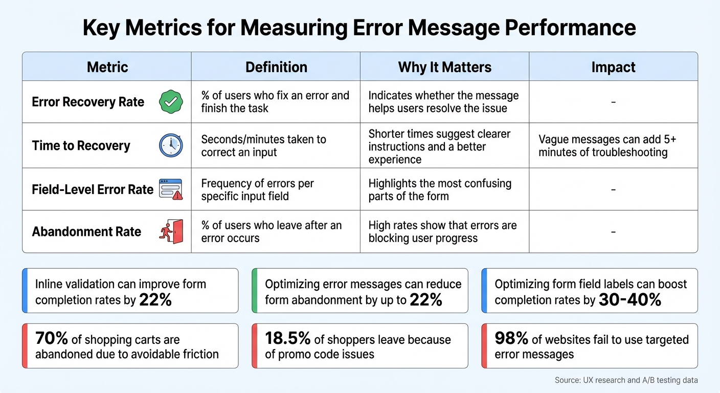
The Error Recovery Rate is a key metric – it measures the percentage of users who successfully complete their task after encountering an error [5]. If users can resolve an issue and finish their submission in the same session, the error message is doing its job. Pair this with field-level error rates to pinpoint which specific inputs (like email, phone number, or ZIP code) are causing the most problems and require immediate fixes [5].
Another important metric is Time to Recovery, which tracks how long users take to correct an error. Ambiguous messages can stretch this time beyond five minutes, frustrating users [4]. Also, monitor the Abandonment Rate, which reflects the percentage of users who leave immediately after encountering an error. A high abandonment rate suggests that errors are preventing users from continuing. Finally, keep an eye on support ticket volume – fewer technical queries indicate that users are better able to resolve issues on their own [16][6].
Together, these metrics confirm whether clearer, more actionable error messages are improving user recovery.
Comparing Results Before and After Changes
To evaluate the effectiveness of your changes, compare user behavior and task completion rates before and after implementing the new error messages. A p-value of less than 0.05 and a 95% confidence interval that excludes zero confirm statistically significant improvements [16]. Beyond numbers, qualitative data like session recordings can provide deeper insights. For instance, if users repeatedly reread an error message or try the same incorrect fix, it may signal that the message is unclear [4].
| Metric | Metric Definition | Why It Matters |
|---|---|---|
| Error Recovery Rate | % of users who fix an error and finish the task | Indicates whether the message helps users resolve the issue [5] |
| Time to Recovery | Seconds/minutes taken to correct an input | Shorter times suggest clearer instructions and a better experience [5] |
| Field-Level Error Rate | Frequency of errors per specific input field | Highlights the most confusing parts of the form [5] |
| Abandonment Rate | % of users who leave after an error occurs | High rates show that errors are blocking user progress [5] |
Improving error messages can reduce form abandonment by up to 22% [5][17], while optimizing form field labels can boost completion rates by 30% to 40% [17]. These improvements not only enhance user experience but also directly impact revenue and reduce the workload for support teams.
Conclusion
Error messages can make or break a user’s experience. They’re the line between a completed action and a frustrated user walking away. Using clear language, an empathetic tone, strategic placement, and AI-driven enhancements can transform these moments of friction into opportunities for resolution. When an error happens, users need precise guidance: What went wrong? Why did it happen? How can I fix it? A vague message like "Invalid input" only adds to the confusion, while something specific like "This email address is missing the @ character" leads users toward a solution [14].
Where and when error messages appear is just as important as the message itself. Inline validation – triggering an error message as soon as a user exits a field – has been shown to improve form completion rates by 22% [5]. Similarly, summary boxes that highlight multiple errors at once help users navigate complex forms without feeling overwhelmed. Preserving user input and validating fields as they’re filled not only saves time but also builds trust and confidence. These small design choices pave the way for AI to elevate error messaging even further.
AI adds another layer of precision by enabling real-time detection and personalized messaging. While most websites still rely on static error messages, adaptive AI-driven prompts that adjust based on specific user actions can significantly reduce abandonment rates [14]. AI tools can also pinpoint where users are struggling, giving support teams actionable insights to prioritize fixes that deliver quick results. However, these refinements need to be backed by thorough testing and data analysis to ensure they’re effective.
"Error messages are key obstacles to conversion. While teams obsess over product photography and checkout button colors, confusing error copy quietly drives customers away." – Jakub Rusniok, Founder, EcomHint [5]
Metrics like A/B testing outcomes, recovery rates, and abandonment statistics show that well-designed error messages can reduce abandonment by up to 22% [17]. Beyond just improving user experience, these optimizations can directly boost revenue and cut down on support tickets. An error state isn’t a dead end – it’s a critical part of the user journey. Thoughtfully crafted error messages, especially in AI-powered systems, ensure smoother workflows, lower support costs, and happier users. By prioritizing these strategies, businesses can turn potential frustrations into seamless interactions.
FAQs
When should my portal validate a field?
Your portal should validate fields in real-time as users fill them out to give instant feedback and help prevent mistakes. If real-time validation isn’t practical, consider validating when users leave a field (on blur) or just before form submission. These methods help catch errors early, reduce frustration, and lower the chances of users abandoning the form.
How do I make error messages accessible without relying on color?
To make error messages accessible, it’s important to go beyond just using color. Combine clear text, descriptive messages, and icons to provide multiple cues. Always position error messages close to the source of the issue, ensuring they are easy to spot and have enough contrast to stand out. Avoid relying solely on color to indicate errors; instead, pair it with recognizable patterns or symbols. This approach ensures inclusivity for users with visual impairments or those using devices with limited screen capabilities.
Which error-message metrics should I track to cut abandonment?
To cut down on submission abandonment, keep an eye on these key metrics:
- Error frequency and types: Pinpoint the most common issues users encounter.
- Visibility and clarity: Check if error messages are easy to spot and understand.
- Time to resolution: Track how quickly users are able to fix their mistakes.
- Correction rate: Measure the percentage of users who successfully resolve their errors.
- Interaction rates: Monitor user actions like clicks or responses to error messages.
Analyzing these metrics can help you fine-tune error messaging and create a smoother user experience.