

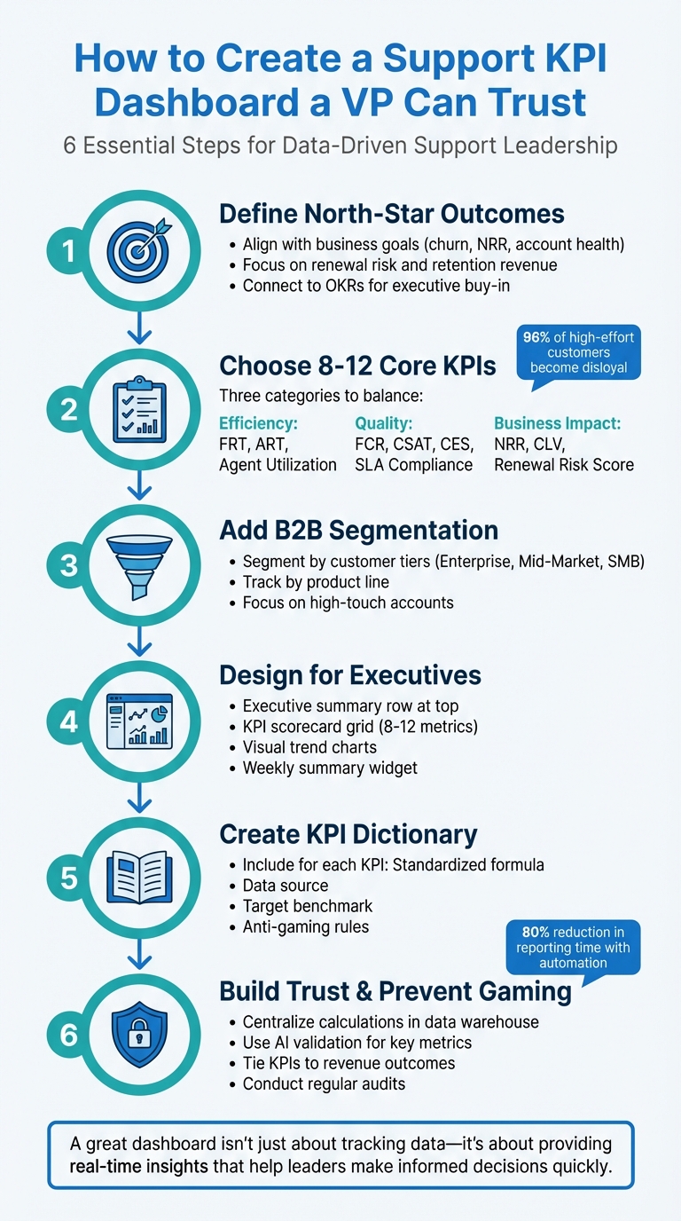
Creating a support KPI dashboard that earns a VP’s trust boils down to these key steps:
- Focus on Outcomes: Align metrics with business goals like reducing churn, increasing Net Revenue Retention (NRR), and improving account health.
- Select Actionable KPIs: Limit the dashboard to 8–12 core metrics that are measurable, relevant, and clearly tied to performance.
- Segment Data: Break down metrics by customer tiers, product lines, or support channels to highlight critical insights for high-priority accounts.
- Ensure Transparency: Use standardized formulas, documented data sources, and anti-gaming rules to maintain data integrity.
- Design for Executives: Make dashboards visually clear, with summary rows, trend charts, and actionable insights.
- Tie Metrics to Revenue: Show how support impacts retention, growth, and cost efficiency to shift perception from cost center to value driver.
A great dashboard isn’t just about tracking data – it’s about providing real-time insights that help leaders make informed decisions quickly.
6-Step Framework for Building a Trustworthy Support KPI Dashboard
How to Build Dashboards Managers Use
sbb-itb-e60d259
Define Your North-Star Outcomes
For modern, efficient, AI-driven B2B support, defining your key outcomes is critical. These outcomes serve as the foundation for strategic improvements. Start by identifying the broader organizational objectives your dashboard needs to support – whether that’s boosting customer retention, reducing churn, or driving revenue growth – and work backward from there. Treat metrics as tools for decision-making, not just historical records, so your dashboard becomes a guide for action rather than a simple log of past performance. This approach ensures that your KPIs align with meaningful goals.
In B2B support, the most impactful outcomes directly influence renewal risk, Net Revenue Retention (NRR), and account health. With customer acquisition costs for B2B SaaS companies increasing by 60% over the last five years, retention has become the cornerstone of sustainable growth.
Connect Metrics to Renewal Risk, Retention Revenue, and Account Health
To drive revenue growth, B2B support metrics must tie directly to renewals, account health, and revenue expansion. Net Revenue Retention (NRR) is one of the most telling metrics, as it shows whether your existing customers are increasing their spending or not – making it a direct indicator of how support impacts growth. Similarly, Customer Lifetime Value (CLV) highlights the long-term financial contribution of the customer relationships your team nurtures.
For high-touch accounts, account health scores consolidate various customer signals – like ticket volume, sentiment trends, and product usage – into a single metric. This helps identify churn risks early, giving your team time to address issues before they affect renewals. Segmenting KPIs by account value is especially important for high-priority customers, where losing just one account could have a big impact on revenue.
Customer Effort Score (CES) is another vital metric, as it predicts loyalty more accurately than CSAT. Research shows that 96% of customers who experience high-effort interactions become disloyal, while 94% of those with low-effort experiences are likely to repurchase.
Tracking Next Issue Avoidance can help you spot repeat inquiries, which often signal product friction. Improving First Contact Resolution (FCR) not only enhances customer satisfaction but can also reduce churn by up to 67%. This makes FCR a key metric for teams focused on retention.
| Goal Category | Primary Focus Metrics | Impact on Revenue/Retention |
|---|---|---|
| Driving Growth | Net Revenue Retention (NRR), Support-Influenced Revenue | Tracks opportunities for expansion and upselling. |
| Reducing Churn | Customer Churn Rate, Customer Effort Score (CES) | Identifies friction points that could lead to cancellations. |
| Long-term Loyalty | Net Promoter Score (NPS), Customer Lifetime Value (CLV) | Assesses relationship health and renewal likelihood. |
| Operational Efficiency | First Contact Resolution (FCR), Average Resolution Time | Lowers service costs and boosts transactional satisfaction. |
Focus on Measurable and Actionable Outcomes
To turn these connections into results, focus on outcomes that are measurable and directly tied to your team’s performance. For example, set specific goals like reducing repeat issues or increasing NRR. Clear, measurable targets ensure everyone understands what success looks like and how their efforts contribute to the bigger picture.
Outcomes should also be actionable, meaning your team can take concrete steps to improve them. For instance, if reducing customer effort is a key outcome, your team might refine self-service resources, optimize ticket routing, or provide targeted training to improve resolution efficiency. Similarly, if increasing NRR is a priority, support teams can close the feedback loop by sharing insights about product pain points with the product team, helping to address the root causes of churn.
Focus on outcomes that directly link support performance to business value. Examples include reducing escalation rates for high-value accounts or increasing the percentage of support interactions that lead to upsell opportunities.
"Support is no longer just about solving problems – it’s about creating experiences that drive growth." – Fullview
Finally, align your outcomes with OKRs (Objectives and Key Results) to secure executive buy-in. For instance, if reducing churn is a company-wide goal, your support dashboard should track KPIs like CES, FCR, and account health scores that directly contribute to that objective. This alignment ensures your dashboard isn’t just tracking data but actively driving the results that matter most to the business.
Choose 8-12 Core KPIs with Clear Formulas and Data Sources
Once you’ve established your north-star outcomes, the next step is narrowing down the specific KPIs to feature on your dashboard. Keep it concise – 8 to 12 core metrics are ideal for a clear, executive-focused overview. Each KPI should have a fixed formula and a clearly documented data source.
Focus on Efficiency, Quality, and Outcomes
To provide meaningful insights, organize metrics into three key categories: Efficiency (speed and productivity), Quality (customer sentiment), and Business Impact (revenue and retention). This structure allows executives to quickly gauge whether the support team is working effectively, delivering great customer experiences, and contributing to the company’s goals.
For Efficiency, metrics like First Response Time (FRT) and Average Resolution Time (ART) are essential. Studies show that 90% of customers consider an immediate response critical, with 60% defining "immediate" as within 10 minutes.
Quality metrics should include First Contact Resolution (FCR), Customer Satisfaction (CSAT), and Customer Effort Score (CES). CES stands out as it’s 1.8x better at predicting customer loyalty compared to CSAT, with 96% of customers who face high-effort experiences becoming disloyal.
For Business Impact, focus on metrics like Net Revenue Retention (NRR), Customer Lifetime Value (CLV), and Support-Influenced Revenue. These metrics demonstrate how support drives growth rather than just being a cost center. Additionally, tracking Renewal Risk Score and Ticket Volume by Priority Customer can help identify accounts at risk of churning.
| KPI Category | Example Metrics | Why It Matters |
|---|---|---|
| Efficiency | First Response Time (FRT), Average Resolution Time (ART), Agent Utilization | Highlights team speed and productivity |
| Quality | First Contact Resolution (FCR), CSAT, CES, SLA Compliance | Measures customer satisfaction and experience |
| Business Impact | Net Revenue Retention (NRR), Customer Lifetime Value (CLV), Renewal Risk Score | Links support performance to revenue and retention |
This framework ensures clarity and consistency when defining and tracking metrics.
Standardize KPI Formulas and Data Sources
Every KPI must have a standardized formula and a documented data source to prevent misinterpretation or manipulation. Even small differences in measurement – like determining First Response Time from ticket creation versus ticket assignment – can lead to major discrepancies. By documenting formulas and sources, you ensure the entire team aligns on what success looks like.
Here are some key examples of KPI formulas for B2B support teams:
| Metric | Formula | Data Source |
|---|---|---|
| First Contact Resolution (FCR) | (Tickets Resolved on First Contact ÷ Total Tickets) × 100 | Case Management System |
| Average Resolution Time (ART) | Total Time to Resolution ÷ Total Resolved Tickets | System Timestamps |
| First Response Time (FRT) | Total First Response Time ÷ Total Number of Tickets | Case Management System |
| CSAT Score | (Number of Positive Survey Responses ÷ Total Responses) × 100 | Post-Resolution Surveys |
| SLA Compliance | (Tickets Handled Within SLA ÷ Total SLA-Applicable Tickets) × 100 | Case Management System |
| Cost per Ticket | Total Support Operating Costs ÷ Total Resolved Tickets | Finance/Payroll + Help Desk |
| Customer Effort Score (CES) | Sum of all CES Ratings ÷ Total Number of Responses | Post-Interaction Surveys |
| Agent Utilization | (Total Time Spent on Tickets ÷ Total Logged Time) × 100 | Time Tracking Software |
Automating data collection using system-generated timestamps can reduce errors from manual entry.
"KPIs break down when conversations are scattered across channels. Moving every customer interaction onto one platform means things are less likely to get lost and lets you measure performance across the full support experience." – Yoona Kim, Pylon
Balance Outcome KPIs with Operational Metrics
A well-rounded dashboard combines high-level outcomes with operational metrics to provide a complete view of performance. Outcome metrics like Net Revenue Retention and Customer Health Scores highlight the overall value of support, while operational metrics like SLA Compliance and Average Resolution Time reveal whether the team can sustain that performance.
For instance, if your dashboard shows an increase in NRR (outcome), but SLA compliance is declining and agent utilization is above 70% (operational), it’s a red flag for potential burnout and unsustainable growth. Balancing these two types of metrics helps leaders make better decisions about staffing, tools, and processes.
Industry benchmarks offer helpful context: First Contact Resolution rates typically range from 70–79% for most support teams, though they may be lower for complex B2B products. CSAT scores generally fall between 75–85%, with top-performing teams hitting 85%. Agent utilization should stay within 60–70% to prevent burnout while maintaining productivity. Use these benchmarks to set realistic goals and pinpoint areas for improvement.
Be cautious of the "Cobra Effect" – optimizing one metric at the expense of another. For example, focusing too much on reducing Average Handle Time might boost efficiency metrics but hurt FCR and CSAT. That’s why maintaining a balance between outcome and operational KPIs is critical for long-term success.
Add B2B Segmentation for Better Insights
Broad metrics like total tickets closed or average customer satisfaction (CSAT) can sometimes hide critical issues affecting key customer segments. For example, a VP might feel confident in strong overall performance, only to discover that high-value enterprise accounts – those driving a large share of revenue – are reporting lower satisfaction levels. Segmentation helps uncover these hidden insights by breaking down data by customer groups and product lines, turning general metrics into meaningful, actionable information. This approach allows you to align metrics with the needs of specific customer segments.
Segment Metrics by Priority Customers and High-Touch Accounts
Enterprise customers and high-touch accounts demand special attention, and their metrics should reflect that. These accounts often operate under strict service-level agreements (SLAs) and contribute significantly to revenue, so it’s crucial to create dedicated dashboard views for them. For example, segment your data by tiers like Enterprise, Mid-Market, and SMB to ensure high-value customers receive the premium service they expect.
For these priority accounts, focus on metrics like SLA Compliance (with thresholds below 90–95% signaling potential renewal risks) and Escalation Rate to identify underlying issues. Pair these with the Customer Effort Score (CES), a key indicator of customer friction. High-effort experiences, such as repeated transfers or long wait times, often lead to churn.
"Metrics should be signals, not goals." – Eric Klimuk, Founder and CTO of Supportbench
Another useful tool is the Account Health Score, which consolidates various data points – like ticket volume, sentiment trends, and SLA breaches – into a single, easy-to-read metric. This helps leadership teams identify churn risks before they impact revenue. Additionally, tracking Net Promoter Score (NPS) trends for individual accounts can reveal whether recurring issues are eroding customer loyalty. For reference, an NPS above 0 is considered positive, over 50 is excellent, and above 70 is regarded as world-class.
Track KPIs by Product Line
Customer segmentation becomes even more powerful when paired with product-specific insights. Start by calculating the percentage of total tickets attributed to each product. This helps identify products that generate a disproportionate number of support requests, which could indicate issues like poor documentation, unresolved bugs, or product complexity.
Drill deeper by monitoring metrics like Average Resolution Time and ticket volume by issue category for each product. These data points can highlight specific areas where customers are encountering friction. Additionally, track Cost per Ticket by product line. In the tech sector, the average cost typically ranges from $25 to $35 per ticket, though complex B2B products often exceed this range.
For B2B SaaS companies, use ticket benchmarks to evaluate product performance. On average, you’ll see 0.2 to 0.5 tickets per customer per month, while high-touch enterprise accounts may generate closer to 1.0 ticket per customer. These benchmarks help normalize your data and identify outliers that may need immediate attention.
Design a Dashboard Layout for Executives
Once you’ve identified clear KPIs and segmented your data effectively, the next step is crafting a dashboard that delivers actionable insights for executives. These dashboards need to provide real-time, high-level insights that highlight risks and support quick decision-making.
To make your dashboard truly useful, align it with key objectives such as reducing churn, boosting agent retention, or lowering the cost per ticket. Every element on the dashboard should contribute to a cohesive narrative, guiding executives from broad outcomes to specific performance drivers. Here’s how to structure your dashboard to meet these priorities.
Organize Dashboards Around Executive Priorities
Start with an executive summary row at the very top. This section should showcase the most critical metrics, like Net Revenue Retention (NRR), Account Health Score, or monthly churn rate. These metrics act as a quick snapshot of overall performance.
Next, include a KPI scorecard grid that highlights 8–12 core metrics, grouped into logical categories such as:
- Efficiency: Metrics like First Response Time and Average Resolution Time.
- Quality: Indicators like CSAT, NPS, and First Contact Resolution.
- Compliance: SLA Compliance Rate.
- Cost: Metrics like Cost per Ticket and Support Spend as a Percentage of Revenue.
Each metric should display its current value, a comparison to the previous period (month-over-month or year-over-year), and a visual cue – like green or red arrows – to indicate whether performance is improving or declining.
Add segmentation filters to allow executives to explore data by customer tiers (Enterprise, Mid-Market, SMB), product lines, or support channels (email, chat, voice). To make the dashboard dynamic, include a weekly summary widget that highlights the top three risks, major changes from the previous week, and action items requiring immediate attention. This transforms the dashboard into a tool for decision-making, not just a static report.
With this structure in place, the next step is to focus on visual elements that make trends and changes easy to spot.
Use Visual Elements to Show Trends and Changes
Visual design plays a critical role in how effectively a dashboard communicates information. Use line charts to show trends over time, such as how First Contact Resolution has changed over the past 90 days. Bar charts work well for comparisons, like resolution times across different product lines. For quick status updates, display large single numbers with color-coded indicators: green for on-target, amber for caution, and red for critical issues.
Incorporate automated alerts to flag urgent issues in real time. For instance, set the dashboard to highlight when an SLA breach is approaching or when escalation rates exceed 5%. This minimizes manual monitoring and ensures potential problems are addressed before they escalate. Additionally, allow filtering by support channel to pinpoint underperforming areas, whether it’s email, chat, or voice.
Keep the design clean and focused by avoiding unnecessary elements like 3D effects, heavy gridlines, or decorative features that don’t add value. Stick to a consistent color palette, using the same colors for the same types of data across all visualizations. Always include context by comparing metrics to targets, previous periods, or year-over-year trends. This ensures the dashboard remains both visually appealing and highly functional.
Create a KPI Dictionary for Transparency
To strengthen the trust executives place in your dashboards, consider building a detailed KPI dictionary. This serves as a single, reliable reference for metric definitions, calculation methods, data sources, and safeguards against manipulation. A clear dictionary ensures everyone is on the same page, which is vital for maintaining trust in the data.
Think of it as a living document that evolves alongside your business. Whenever goals or data sources shift, update the dictionary to reflect those changes. Regularly reviewing it helps keep your metrics aligned with current priorities. This transparency complements the dashboard design and safeguards against gaming metrics mentioned earlier.
Document Each KPI with Formula, Target, and Anti-Gaming Rules
Each KPI entry should include the following:
- Metric name and plain-language definition: Clearly explain what the metric measures.
- Calculation formula: Specify how the metric is calculated.
- Verified data source: Identify where the data comes from.
- Target benchmark: Provide a realistic performance range.
- Strategic category: Link the metric to a business area like Efficiency, Quality, or Cost.
- Reporting frequency: Indicate how often the metric is tracked (e.g., real-time, weekly, monthly).
- Anti-gaming rules: Describe potential manipulation tactics and the safeguards in place to counter them.
For example, consider "First Contact Resolution (FCR)." This metric measures the percentage of tickets resolved during the first customer interaction without requiring follow-up. The calculation formula is: (Tickets Resolved on First Contact ÷ Total Tickets) × 100. The verified data source is your ticketing system. The target benchmark for FCR typically falls between 70–79%. Assign FCR to a strategic category like Quality or Efficiency, define its reporting frequency (e.g., weekly), and include anti-gaming rules to ensure accuracy, such as verifying the "resolved" status with the customer and pairing it with metrics like Ticket Reopen Rate.
"Metrics should be signals, not goals. Low First Contact Resolution (FCR) might point to onboarding problems, while rising backlog often signals documentation gaps." – Eric Klimuk, Founder and CTO, Supportbench
Anti-gaming rules are especially important. For instance, if you’re monitoring First Response Time (FRT), specify that only meaningful responses count. Automated acknowledgments or placeholder replies like "I’m looking into this" shouldn’t qualify. Pair FRT with CSAT, CES, and NPS scores to ensure agents aren’t sending empty responses just to meet the metric. Similarly, for Average Handle Time (AHT), balance it with First Contact Resolution to prevent agents from rushing through tickets without resolving issues.
| KPI | Formula | Target | Anti-Gaming Rule |
|---|---|---|---|
| First Contact Resolution | (Tickets Resolved on First Contact ÷ Total Tickets) × 100 | 70–79% | Verify "resolved" status with customer; pair with Ticket Reopen Rate. |
| First Response Time | Total First Response Time ÷ Total Number of Tickets | < 4 hours (Email); < 2 mins (Chat) | Exclude automated replies; ensure response is meaningful. |
| Average Resolution Time | Total Time to Resolution ÷ Total Resolved Tickets | ~24 hours (Email) | Segment by issue complexity to avoid penalizing agents for hard cases. |
| Cost per Ticket | Total Support Cost ÷ Total Resolved Tickets | $25–$35 (Technology sector) | Balance against CSAT to ensure quality isn’t sacrificed for cost. |
To maintain trust in your metrics, lock formulas and conduct regular audits to prevent manual adjustments that could skew results. When definitions are clear and safeguards are in place, executives can rely on the data without questioning its accuracy or methodology.
Prevent Metric Gaming and Build Executive Trust
Once you’ve defined your KPIs and documented their formulas, the next step is to ensure those metrics remain reliable and tamper-proof. Executives lose confidence quickly when they suspect data manipulation. The aim is to create a dashboard that delivers unaltered, trustworthy insights.
Secure Formulas and Audit Data Sources
Centralize KPI calculations within your data warehouse or architecture layer rather than relying on your visualization tool. When calculations are housed in business intelligence (BI) tools, anyone with edit access can modify them, which opens the door to potential manipulation. By centralizing these calculations, you create an unchangeable Single Source of Truth. Automating data ingestion through APIs and direct connectors to systems like your CRM, finance, and support platforms ensures consistent and accurate data flow.
"An executive will only trust a dashboard if they trust the data behind it. Implement strong data governance practices to ensure accuracy, consistency, and timeliness." – Improvado
Limit edit permissions to certified analysts and include tooltips that link each KPI back to its dictionary entry. Display a "last refreshed" timestamp on the dashboard to confirm data currency. For example, in 2025, Signal Theory Inc. streamlined its reporting process by automating data pipelines with Improvado. This change reduced reporting time by over 80% and eliminated the manual labor that previously consumed four or more hours per report.
Use AI Validation for Key Metrics
In addition to establishing strict data controls, AI tools can further validate the accuracy of key metrics. AI systems can monitor metrics like First Contact Resolution (FCR) and Customer Satisfaction (CSAT) in real time, comparing explicit survey results with implicit indicators such as sentiment analysis or repeated customer queries. These systems learn statistical patterns for each metric, flagging subtle shifts in trends before they escalate. This approach has been proven to reduce forecast errors and detect anomalies as they happen.
Set up "frustration loop" alerts to identify unresolved issues when customers repeatedly contact support. Use sentiment analysis to ensure high resolution rates aren’t masking customer dissatisfaction. By 2025, 80% of call centers had adopted AI tools like virtual agents and predictive analytics. Companies leveraging AI-enhanced KPIs are five times more likely to align incentive structures with broader business goals compared to those relying on older KPI systems.
This comprehensive approach to data validation strengthens the connection between support performance and critical outcomes like revenue and retention.
Tie KPIs to Revenue and Retention Outcomes
After securing your data practices, it’s essential to ensure that every KPI ties directly to measurable business results. Dashboards gain executive trust when metrics clearly demonstrate their impact on the company’s financial performance. While support is often seen as a cost center, aligning KPIs with revenue and retention metrics can shift that perception, proving its value. Focus on metrics like Gross Revenue Churn, NPS, and Support Spend as a Percentage of Revenue. These KPIs align with corporate OKRs and highlight the strategic role of the support team.
"Support transforms from cost to a revenue and retention driver." – Eric Klimuk, Founder and CTO, Supportbench
Leverage account intelligence to consolidate customer signals – such as ticket frequency and sentiment – into health scores that flag churn risks early. Share support trends with product teams to address underlying issues like feature bugs or confusing documentation. When executives see clear correlations, such as higher CSAT scores leading to improved retention and reduced churn, they’re more likely to trust the data and back your team’s initiatives.
Create a Weekly Executive Summary Template
A weekly executive summary turns raw dashboard data into clear, actionable insights. For VPs and other decision-makers, context is everything. This summary bridges the gap by spotlighting risks, explaining trends, and offering specific recommendations. While dashboards provide real-time metrics, the summary adds the "so what?" – a concise narrative that answers, "What matters most this week?"
"If you’re only tracking how many tickets your team closed last week, you’re flying blind." – Eric Klimuk, Founder and CTO, Supportbench
Think of the summary as your operational playbook. It identifies risks early and suggests immediate actions. For example, if your dashboard shows a 10% increase in ticket backlog, the summary should explain whether the spike is due to a product bug, seasonal demand, or a staffing issue – and suggest actionable next steps, like reallocating agents or updating self-service resources.
Highlight Top Risks, Changes, and Action Items
Using your executive dashboard as a foundation, the weekly summary should focus on three essential areas: top risks, key KPI changes, and actionable recommendations.
- Top Risks: Begin by identifying the three most pressing risks to service levels or customer satisfaction. Examples might include SLA breaches, escalations exceeding 20%, or First Contact Resolution (FCR) dropping below 70%. If, for instance, 15 key accounts are at risk of missing their SLA due to a product issue, flag this immediately and outline the potential impact on renewals.
- Key KPI Changes: Highlight trends rather than isolated stats. Instead of saying, "CSAT is at 88%", explain the story behind the numbers: "CSAT rose by 6 percentage points to 88% after agents completed empathy training". This approach shifts the focus from raw data to the bigger picture.
- Actionable Recommendations: Tie every insight to a specific next step. Avoid vague suggestions like "improve response times." Instead, propose concrete actions, such as "Implement AI chatbots for password resets to reduce repetitive inquiries by 20%, freeing agents for high-priority cases".
Finally, link these metrics and actions to broader business goals, like Net Revenue Retention (NRR), Customer Lifetime Value (CLV), or cost efficiency. This demonstrates how support not only resolves issues but also drives growth and retention.
Conclusion
Building a reliable KPI dashboard comes down to four essential steps: defining clear north-star outcomes, selecting 8–12 core metrics with well-defined formulas, designing a layout that highlights executive priorities, and fostering transparency through documentation and safeguards against manipulation. When every metric ties back to critical business goals – like Net Revenue Retention, churn reduction, or cost management – the dashboard evolves from a simple reporting tool into a strategic asset that drives meaningful decisions.
Alignment plays a central role in this process. Executives feel more confident when operational metrics, such as First Response Time, directly connect to the outcomes they care about – whether it’s boosting retention revenue, increasing customer lifetime value, or optimizing support costs as a percentage of revenue. This connection allows support leaders to back their decisions with data that resonates with the leadership team.
Transparency is equally important for building trust and enabling bold, data-driven decisions. Practices like locking metric formulas, conducting regular audits of data sources, and maintaining a shared KPI dictionary ensure calculation consistency and prevent disputes over data accuracy. With standardized definitions and protections against metric manipulation, executives can shift their focus to identifying risks early and making informed choices that improve both customer satisfaction and overall business performance. By following these principles, your dashboard becomes more than just a reporting tool – it becomes a driver of continuous improvement in AI-driven support operations. This includes leveraging AI-driven sentiment analysis to gain deeper insights into customer health.
FAQs
How can I make my KPI dashboard reliable and resistant to manipulation?
To build a trustworthy and tamper-resistant KPI dashboard, begin by establishing clear, standardized formulas for every metric. Ensure all data sources are thoroughly documented to maintain clarity. Automating data collection and updates is key to reducing manual errors and limiting opportunities for manipulation. Incorporate validation checks to verify data accuracy, and set up safeguards to identify or block any attempts to skew the metrics. By prioritizing transparency and consistency, you can foster confidence in the reliability of your dashboard.
What are the key KPIs to include in a support dashboard to help reduce customer churn?
To keep customer churn in check, it’s crucial to focus your support dashboard on key performance indicators (KPIs) that reflect both customer experience and the efficiency of your support team. Here are some of the most important KPIs to track:
- Customer Satisfaction (CSAT): This metric gauges how satisfied customers are with their support interactions. High scores here often indicate a positive experience.
- Net Promoter Score (NPS): NPS measures customer loyalty by asking how likely they are to recommend your company to others.
- First Contact Resolution (FCR): This tracks how often your team resolves issues during the initial interaction, which is key to leaving a strong impression.
- Response Time: Keeping an eye on how quickly your team responds to inquiries can highlight whether customers are getting the timely help they need.
- Customer Effort Score (CES): This measures how easy it is for customers to resolve their issues, shedding light on how seamless your support process feels from their perspective.
By monitoring these KPIs, you can uncover actionable insights into your customers’ experiences and pinpoint areas for improvement. The result? Stronger trust, increased loyalty, and fewer customers walking out the door.
How can I segment KPIs to better understand and support high-value customer accounts?
To better understand high-value customer accounts, break down your KPIs into categories such as priority accounts, product lines, or account types (e.g., renewal risk or high-touch clients). This categorization helps ensure your metrics reflect the strategic needs of each group, allowing you to allocate resources more effectively.
For instance, you might track metrics like First Contact Resolution (FCR), customer satisfaction (CSAT), or renewal risk indicators, but analyze them separately for high-value accounts versus standard ones. By setting clear formulas and defining reliable data sources for each segment, you can avoid inaccurate measurements and misleading conclusions. This method helps you uncover trends, closely monitor performance, and make informed decisions that not only boost customer retention but also enhance revenue outcomes.