

Customer impact reporting turns support incident data into actionable insights for your business. It focuses on outcomes – like affected users, SLA risks, and revenue implications – rather than just counting resolved tickets. By tracking this data over time, you can identify patterns that explain recurring issues, improve customer retention, and align support efforts with business metrics like Net Revenue Retention (NRR) and Customer Lifetime Value (CLV).
Key Takeaways:
- What is it? A structured way to measure and communicate how incidents affect customers.
- Why does it matter? It reveals trends, prevents churn, and ties support to business success.
- How to do it? Use a clear taxonomy to define impact dimensions (business, operational, experience), track metrics over time, and leverage AI to automate tasks like tagging and sentiment analysis.
Benefits:
- Gain insights into recurring issues to improve product and documentation.
- Highlight SLA breaches and their financial impact by customer tier.
- Use AI to automate data collection and enrich reports with predictive metrics.
This approach ensures your reports answer three critical questions: What happened, why it mattered, and what will be done about it.
Incident Reports: Executive Dashboards Guide
sbb-itb-e60d259
Defining and Operationalizing Customer Impact
To create consistent and comparable reports, it’s crucial to establish a shared definition of "impact."
Key Dimensions of Customer Impact
In B2B support, customer impact isn’t just a single metric – it’s a combination of three key dimensions that together provide a full understanding of the situation:
- Business impact: This focuses on financial risks, such as the revenue at stake, potential SLA penalties, and any contractual obligations that could be affected.
- Operational impact: This examines the technical scope, including the number of users impacted, the services disrupted, and the extent of the dependency chain (commonly referred to as the "blast radius").
- Experience impact: This captures the human element, including CSAT, CES, and sentiment signals from customer interactions.
To ensure consistency in escalation decisions, these dimensions can be combined into a composite score. A practical model might use a 0–100 scale, with weights assigned as follows: user and revenue impact at 25% each, SLA impact at 20%, and service scope, customer tier, and incident duration at 10% each [2].
Once these dimensions are clearly defined, the next step is to standardize them with a structured taxonomy.
Building a Customer Impact Taxonomy
A taxonomy provides a shared framework for describing impact, avoiding vague labels, and using clear thresholds for better clarity.
For user impact, severity can be classified by the percentage of affected users:
- Under 10%: Partial impact
- 10–50%: Degraded impact
- Over 50%: Complete impact [2].
You can also layer in the type of disruption – such as a complete outage, degraded functionality, or latency – assigning weights of 1.0, 0.7, and 0.1 respectively to refine scoring [2].
Customer tier is another critical factor. For example, an incident affecting a single Enterprise account with a $500,000 annual contract carries more weight than an issue impacting 20 free-tier users. Adding a Strategic Account flag ensures high-priority accounts receive extra attention, regardless of user count [2]. This approach turns generic labels into actionable insights.
Different stakeholders require tailored views of this data:
- Board members focus on metrics like CLV and Net Revenue Retention.
- Ops managers prioritize SLA compliance and Average Handle Time.
- Product and sales teams look at NPS and ticket trends by intent [3].
Designing your taxonomy with these audiences in mind ensures that reports are immediately useful without needing extra interpretation.
By combining a unified definition, a precise taxonomy, and embedded impact fields, you create a foundation for actionable and ongoing reporting. Once the taxonomy is developed, it should be directly integrated into your support platform.
Adding Impact Fields to Your Support Platform
For a taxonomy to be effective, it needs to be part of your everyday workflows. This means adding custom fields for factors like impact severity (high, medium, low), disruption type, Strategic Account status, and revenue at risk. These fields should be filled out by agents or automated systems at the time a case is created [1][2].
Consistently using these fields generates structured metadata, which makes reporting much simpler. Instead of manually piecing together context from free-text notes weeks later, you can quickly query the structured fields for insights.
"The tool provides graphs. Your report provides meaning." – Radu, Head of Digital Transformation, BlueTweak [1]
The ultimate goal is to make impact classification a natural part of case management, not an afterthought. When impact data is captured from the start, reporting becomes streamlined and far more actionable.
Building a Longitudinal Customer Impact Reporting Framework
Using the embedded impact taxonomy, transform structured data into time-based insights that highlight actionable trends. This approach shifts the focus from static snapshots to dynamic, improvement-driven reporting.
Mapping the Incident Lifecycle for Reporting
Every incident follows a lifecycle with three key stages, each presenting an opportunity to gather data. At detection, track the source channel, the customer’s initial sentiment, and their account tier. During triage, document root cause tags, priority level, and whether the initial routing was accurate. At resolution, record the total number of touches, team handoffs, and the final customer sentiment.
Three critical timestamps define this lifecycle: when the issue began (Detection), when it was officially recognized (Triage), and when the impact ended (Resolution). To maintain accuracy, allow manual overrides if triage or resolution timestamps are missing – this prevents inflated MTTR (Mean Time to Resolution) values [5].
"CSAT is a lagging indicator, not a control knob… if your dashboard only shows satisfaction, you are reacting after the damage is done." – Daniel Mercer, Senior SEO Content Strategist, Supports.live [8]
With a clear map of incident stages, the focus shifts to identifying metrics that can uncover actionable trends over time.
Core Metrics for Measuring Customer Impact
To drive meaningful change, focus on metrics that go beyond volume, shedding light on impact severity and operational efficiency. Using the incident timeline, replace vanity metrics with alternatives that offer deeper insights.
| Metric Category | Vanity Metric (Avoid) | Actionable Alternative | Why It Matters |
|---|---|---|---|
| Operational | Total Tickets Handled | Tickets by Root Cause | Pinpoints what drives ticket volume [7] |
| Quality | Agent Occupancy Rate | First Contact Resolution | Evaluates true effectiveness [7] |
| Experience | Average Handle Time | Customer Effort Score | Better predicts loyalty than speed [7] |
| Financial | Total Support Budget | Cost Per Resolution | Highlights efficiency improvements over time [7] |
For B2B support, prioritize SLA breach data by customer value. For instance, a breach affecting a Fortune 100 client should carry more weight than several minor misses with smaller accounts [6]. Additionally, move beyond average resolution times by using p95 or p99 percentiles, which expose the long tail of complex cases where the most dissatisfied customers often reside [6].
Structuring Time-Based Reports and Dashboards
A tiered reporting cadence ensures that each team gets the insights they need: agents benefit from daily dashboards focused on queue health, managers use weekly summaries to track trends, directors rely on monthly reviews to refine strategy, and executives gain strategic insights from quarterly business impact reports [7]. Keep reporting cadences consistent within each section to avoid confusion [1].
Incorporate comparisons to the previous month or year to address seasonality, and pair charts with customer quotes for added context [1]. Include a concise risk log – for example, if CSAT improves but reopen rates increase, this could indicate that issues are being reopened rather than fully resolved [1]. Leveraging AI-driven insights in these dashboards can further enhance efficiency by identifying patterns and anomalies that manual analysis might miss. This ensures support operations remain modern and cost-effective.
Using AI to Improve Customer Impact Reporting
Automating Data Collection and Case Tagging
Manually tagging cases often leads to errors. Agents may skip fields, apply inconsistent labels, or leave critical data incomplete – especially under pressure. AI can remove much of this hassle.
With intent detection, AI identifies the nature of a customer’s report – whether it’s a product bug, service outage, or billing issue – and instantly tags the case as it arrives, requiring no input from an agent. Combine this with automated priority and customer-value routing, and high-impact cases are flagged immediately, bypassing the need for manual judgment calls [10].
For example, Supportbench‘s AI Automation layer excels at this. It automatically assigns issue types, prioritizes cases, and tags them based on the content and context of the interactions [10]. These streamlined processes not only save time but also create a solid foundation for analyzing customer impact more effectively.
Enriching Impact Signals with AI
Raw ticket data tells you what happened, but AI can go further by showing how severe the issue was and who it affected the most.
Take predictive CSAT and CES scores as an example. Instead of waiting weeks for survey responses, machine learning models can estimate satisfaction and effort scores using past interaction data. This provides an early warning system for customer dissatisfaction during active incidents [9][10]. If a high-value customer shows a declining predicted CSAT, account managers can step in before the relationship suffers.
Another powerful tool is sentiment and emotion analysis. AI tracks the tone of customer interactions and flags sudden negative shifts. This can trigger automated alerts for account managers or activate escalation workflows [10]. By turning sentiment into structured, reportable data, AI transforms a traditionally vague signal into a clear, actionable metric.
| AI Feature | Impact Signal Enriched | Actionable Insight Provided |
|---|---|---|
| Auto-Tagging | Categorical impact data | Highlights which product areas cause the most issues [9] |
| Predictive CSAT | Satisfaction risk score | Alerts teams to at-risk customers before surveys arrive [9][10] |
| Sentiment Analysis | Emotional intensity per case | Triggers escalations and account manager notifications [10] |
| Case Summarization | Concise interaction history | Automatically fills "Impact Description" fields [10] |
Case summarization is another game-changer for reporting. Instead of combing through dozens of interaction threads, AI condenses each case into a structured summary. This summary can directly populate "Impact Description" fields in reporting templates [10]. By layering predictive and sentiment insights onto raw data, support teams can spot trends and proactively address recurring customer issues.
Building Reusable Dashboards with AI-Driven Insights
Once you’ve enriched your data, dashboards can move beyond static reports to become dynamic decision-making tools. A well-designed dashboard can continuously deliver updated, actionable insights in real time.
Supportbench’s KPI 360° Customer View is a great example. It consolidates escalation trends, customer health scores, predictive satisfaction data, and sentiment signals into one comprehensive view [10][11]. You can filter it by agent, team, issue type, or account tier. This makes it equally valuable for frontline managers tracking weekly metrics and executives preparing for quarterly reviews. Since the data is auto-tagged and enriched by AI, the dashboard reflects accurate, up-to-date information rather than relying on what agents remembered to log.
To take it a step further, you can set up sentiment-based alerts within these dashboards. For instance, if a key account’s health score drops suddenly, the system can send an automatic notification – eliminating the lag of waiting for someone to review a report two weeks later [10]. This shift from reactive to predictive reporting not only improves decision-making but also makes customer support operations more efficient over time.
Avoiding Common Pitfalls and Reducing Reporting Costs
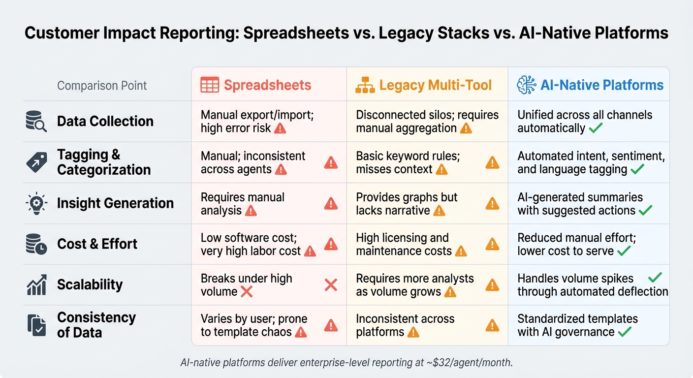
Spreadsheets vs. Legacy Stacks vs. AI-Native Platforms for Customer Impact Reporting
In AI-native B2B support operations, steering clear of reporting mistakes is just as important as building a solid framework. Both play a crucial role in shaping the decisions you make and the customer experience you provide.
Common Mistakes in Customer Impact Reporting
Even teams with strong data collection practices can fall into reporting traps. One frequent issue is focusing too much on activity instead of outcomes. For example, reporting the number of tickets resolved without explaining the impact on customers or the business doesn’t tell the full story. A high ticket count alone doesn’t guarantee that your support is effective or meaningful for customers [1][12].
Another common misstep is relying on aggregate averages that mask critical details. A single CSAT score might look fine overall, but it could be hiding dissatisfaction among a few key customers who are at risk of churning. That’s why breaking down data by factors like customer tier, issue type, or product area is so important [4].
Lack of context is another major pitfall. Sharing metrics without explaining why they shifted or what actions will follow makes even accurate data less actionable. Every report should not only highlight what happened but also clarify why it matters and what steps will be taken next. This helps tie support outcomes directly to broader business goals.
Lastly, disconnected manual data sources can wreak havoc on reporting. When chat, email, and voice data are stored in separate systems, reports become inconsistent and time-consuming to produce. This can lead to errors and delays that snowball over time [1].
How to Cut Costs and Improve Reporting Efficiency
To address these challenges, it’s essential to streamline your reporting process in a cost-effective way. One of the quickest wins is eliminating manual classification tasks. AI-native platforms can automatically handle intent tagging, language detection, and sentiment scoring. This transforms raw conversations into structured data without requiring agents to manually fill out fields, reducing costs per resolved case and freeing up analysts to focus on deriving insights rather than cleaning data [1].
Another impactful strategy is identifying deflection opportunities. High-volume, low-complexity issues – like password resets or billing inquiries – can often be addressed through self-service tools or automation. Quantifying how many contacts fall into these categories can help build a strong case for investing in solutions like knowledge bases or automated workflows, which can deliver measurable cost savings [4].
Unifying all communication channels into a single platform is also critical. Consolidating data removes the need for manual aggregation, and when combined with AI-driven summaries and auto-filled reporting fields, it drastically reduces the time spent on reporting [1]. These efficiencies not only cut operational costs but also improve customer support by enabling faster and more accurate responses.
Reporting Approaches Compared: Spreadsheets vs. Legacy Stacks vs. AI-Native Platforms
The way you approach reporting has a direct impact on accuracy, speed, and cost. Here’s a comparison of the three most common methods:
| Feature | Spreadsheet-Driven | Legacy Multi-Tool Stacks | AI-Native Platforms (e.g., Supportbench) |
|---|---|---|---|
| Data Collection | Manual export/import; high error risk | Disconnected silos; requires manual aggregation | Unified across all channels automatically [1] |
| Tagging & Categorization | Manual; inconsistent across agents | Basic keyword rules; misses context | Automated intent, sentiment, and language tagging [1] |
| Insight Generation | Requires manual analysis | Provides graphs but lacks narrative | AI-generated summaries with suggested actions [1] |
| Cost & Effort | Low software cost; very high labor cost | High licensing and maintenance costs | Reduced manual effort; lower cost to serve [1] |
| Scalability | Breaks under high volume | Requires more analysts as volume grows | Handles volume spikes through automated deflection [4] |
| Consistency of Data | Varies by user; prone to template chaos | Inconsistent across platforms | Standardized templates with AI governance [1] |
Spreadsheets struggle to keep up as volume increases, and legacy systems require extensive manual effort. AI-native platforms, on the other hand, simplify and standardize reporting, making it faster, more accurate, and more efficient.
Conclusion: Building a Scalable, AI-Assisted Reporting Process
Turning raw data into actionable decisions is at the heart of effective customer impact reporting. This guide has emphasized the importance of defining what impact means for your customers, tracking it consistently, and using AI to handle the repetitive tasks. That way, your team can focus on interpreting insights and making decisions instead of piecing together data.
Key metrics like First Contact Resolution, Customer Effort Score, and escalation trends provide a clearer view of how issues develop and affect the customer experience, especially when segmented by factors like customer tier or product area. Combining these with efficiency metrics – like CSAT alongside average response time – ensures a balanced understanding of performance. AI takes this process further by removing manual bottlenecks, streamlining how data is collected and reported.
AI is reshaping the way reporting works. For example, in 2026, over half of customer service journeys begin on third-party platforms before a ticket is even created [1]. This means your reporting framework needs to capture signals from beyond your immediate support tools. By doing so, AI-driven reporting not only boosts efficiency but also equips executives and operational leaders with the insights needed to make informed decisions.
"A great customer support report turns raw numbers into decisions." – Radu, Head of Digital Transformation, BlueTweak [1]
With features like automated tagging, sentiment scoring, and unified data consolidation across channels, AI-native platforms allow teams to produce consistent, reliable reports without the hassle of juggling disconnected tools. At just $32 per agent per month, these platforms deliver enterprise-level reporting capabilities without the hefty price tag.
This approach builds on the frameworks and metrics discussed throughout this guide. The result? A reporting process that is dependable, scalable without requiring additional staff, and capable of delivering actionable insights to everyone – from frontline managers to top executives.
FAQs
What’s the fastest way to start tracking customer impact without rebuilding our support process?
The fastest way to get started is by creating a basic customer health score using data you already have in your support platform. Start by focusing on 3–5 key metrics that provide meaningful insights, such as:
- Ticket volume: How many support tickets are being submitted?
- Resolution times: How quickly are issues being resolved?
- Sentiment trends: Are customer interactions generally positive or negative?
- Escalation patterns: How often are issues being escalated to higher levels of support?
Monitor these metrics over 30, 60, and 90 days to identify patterns and trends. Automating the process can save time – use built-in reporting tools or webhooks to gather data seamlessly without interrupting your team’s workflow.
Make sure your scoring system aligns with immediate business goals, like reducing churn, so it delivers actionable insights from day one.
How do I weight revenue risk, user impact, and SLA risk in a single impact score?
To create a single impact score, start by normalizing metrics such as revenue risk, user impact, and SLA risk to a scale of 0–100. Next, assign weights to each metric based on how strongly they influence churn or retention. Combine these weighted metrics into a single composite score to establish an objective starting point.
It’s important to regularly validate and fine-tune these weights using churn and renewal data. This ensures the score remains accurate as customer behaviors and priorities shift over time.
Which incident metrics show churn risk earlier than CSAT?
To catch churn risks early – before they start reflecting in your Customer Satisfaction (CSAT) scores – focus on tracking leading indicators of friction or inefficiency. Here are a few key metrics to keep an eye on:
- Ticket reopen rates: Frequent reopenings often suggest incomplete or unsatisfactory resolutions.
- Repeat contacts: If customers need to reach out multiple times, it signals a high-effort, frustrating experience.
- Agent touches: Multiple follow-ups by agents can point to inefficiencies or unresolved issues.
Beyond these, it’s also important to monitor SLA risks (missed service-level agreements) and backlog aging (tickets sitting unresolved for too long). Addressing these early can prevent small problems from escalating.
Lastly, consider using AI-driven sentiment analysis. It can detect shifts in tone, flagging early signs of dissatisfaction in customer interactions. This proactive approach helps you intervene before accounts become at risk.