

Portal bounce rate measures how often users leave after viewing just one page. A high bounce rate means users aren’t finding what they need, leading to more support tickets and higher costs. Fixing this can save money and improve customer satisfaction. Here’s what you need to know:
- Why it matters: High bounce rates increase support tickets, costing $2–$15 per email and $6–$12 per phone interaction. A good portal can cut support workload by 40–63%.
- Top causes: Slow page loads, poor search tools, outdated content, confusing navigation, and lack of mobile responsiveness.
- Key fixes: Speed up load times, improve search functionality with AI, simplify navigation, update content regularly, and ensure mobile-friendly design.
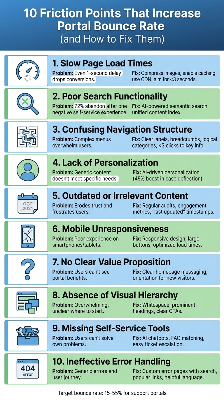
10 Friction Points That Increase Portal Bounce Rate (and How to Fix Them)
10 Portal Friction Points and Solutions to Reduce Bounce Rate
Here are 10 common issues that can drive users away from your portal, along with actionable ways to address them. These solutions aim to improve user experience and keep visitors engaged.
1. Slow Page Load Times
Sluggish loading times can quickly turn users away. Even a one-second delay can lead to a noticeable drop in conversions [2].
The fix:
Speed things up by compressing images, enabling browser caching, and cutting down on HTTP requests. Using a content delivery network (CDN) can also make a big difference. Aim for load times under three seconds, and keep an eye on metrics like "Time on Site" and "Exit Pages" to spot problem areas. Don’t forget to test your portal on mobile devices to ensure it loads just as quickly.
2. Poor Search Functionality
If users struggle to find what they need, they’ll head elsewhere.
The fix:
Upgrade to AI-powered semantic search that understands context, not just keywords. For instance, searching "login" should also suggest related topics like "password reset."
"72% of customers will abandon a brand’s site after a single negative self-service experience, often choosing to go to Google or a competitor instead."
– Linsey Knerl, Author, Coveo [3]
Enhance search by consolidating all content sources into a unified index and tracking searches with no results. Companies like Xero have seen significant improvements – like a 20% drop in users needing extra support – by adopting these enhancements [3].
3. Confusing Navigation Structure
Overly complicated menus can overwhelm users and make it hard to locate information.
The fix:
Simplify your navigation with clear, user-friendly labels. Add breadcrumb trails to show users their location and organize content into logical categories. Ensure key information is accessible within a few clicks, and design mobile navigation with large, easy-to-tap buttons.
4. Lack of Personalization
Generic content can alienate users when it doesn’t address their specific needs.
The fix:
Leverage AI to personalize the experience. Tailor content like open tickets, relevant articles, and recommendations based on user history. For example, ConnectWise used AI to personalize its portal, resulting in a 45% boost in case deflection and a 28% increase in click-through rates [3].
5. Outdated or Irrelevant Content
Old or incorrect information can erode trust and frustrate users.
The fix:
Perform regular content audits to refresh or remove outdated articles. Use engagement metrics to find underperforming content and keep it updated. Add "last updated" timestamps to assure users they’re viewing current information.
6. Mobile Unresponsiveness
With so many users relying on mobile devices, a portal that doesn’t work well on smartphones or tablets is a major issue.
The fix:
Adopt responsive design to ensure layouts adjust to different screen sizes. Use large, tappable buttons and readable text, and optimize load times for mobile. Test your portal on a variety of devices to ensure everything runs smoothly.
7. No Clear Value Proposition
If users can’t immediately see the value of your portal, they’re likely to leave.
The fix:
Clearly communicate the benefits of your portal on the homepage. Use headers like "Find answers instantly" or "Track your cases" to highlight key features. Add a brief orientation for first-time visitors and showcase popular articles or AI chat previews to encourage engagement.
8. Absence of Visual Hierarchy
A cluttered layout can overwhelm users and make it unclear where to start.
The fix:
Use whitespace to separate sections and create focus. Add prominent headings, clear call-to-action buttons, and organized layouts. For example, make sure the search bar, popular articles, and contact options are easy to spot.
9. Missing Self-Service Tools
If users can’t solve their own problems, they’ll get frustrated – and your support team’s workload will increase.
The fix:
Add AI chatbots to handle common questions and implement FAQ matching to suggest relevant articles as users type. Make it easy for users to escalate to a support ticket if self-service tools don’t solve their issue.
10. Ineffective Error Handling
A generic "404 – Page Not Found" page can abruptly end the user’s journey.
The fix:
Design custom error pages that guide users back on track. Include a search bar, links to popular articles, and an option to submit a support ticket. Use friendly, helpful language like "We can’t find that page. Let’s get you back on track", and monitor broken links to fix them quickly.
Next, discover how to track these fixes and fine-tune your strategy using data-driven insights.
sbb-itb-e60d259
How to Diagnose and Measure Improvements
Tracking Key Metrics
To evaluate the impact of resolving friction points, focus on key metrics like bounce rate. Start by monitoring bounce rate changes across different page types. For support portals, aim for a bounce rate between 15% and 55%. Contact pages should ideally fall on the lower end (10–40%), while knowledge base articles might range higher (30–80%) if users are quickly finding the answers they need [5].
Another critical metric is scroll depth, which helps pinpoint where visitors drop off. If 80% of users aren’t scrolling past the midpoint of a page, consider repositioning your most important self-service tools higher up [5][6]. Additionally, track self-service success rates (the percentage of users finding answers without filing a ticket) and time-on-page to determine whether visitors are engaging with your content or leaving too soon. Collect data from 200–500 sessions per page, and segment these metrics by device type (mobile vs. desktop) and traffic source. This detailed analysis ensures that each adjustment you make is tied directly to reducing bounce rates.
"Bounce rate isn’t inherently bad – context matters. A 70% bounce rate on a blog article might be perfectly healthy… But a 70% bounce rate on your pricing page is a red flag." – UXHeat [5]
Iterative Data-Driven Improvements
While metrics like bounce rate tell you users are leaving, they don’t explain why. To dig deeper, use tools like click heatmaps to find "dead zones" where users are clicking on non-interactive elements [5]. Session recordings can reveal behaviors such as rage clicking or extended pauses, which often indicate confusion or frustration [5][6].
Search logs are another valuable resource for identifying content gaps. For instance, if users frequently search for "password reset" but don’t find relevant results, it’s a clear sign that your documentation needs updating.
When making changes, adopt an A/B testing approach. Test one adjustment at a time, whether it’s moving a search bar, tweaking a headline, or adding an AI chatbot. After implementing a change, gather data from another 200–500 sessions to measure its impact. This method can lead to a 10–20% improvement in user retention [6]. Additionally, monitor "ticket-after-portal" rates to determine if your self-service resources are effectively addressing user needs.
Finally, keep an eye on your Core Web Vitals – such as Largest Contentful Paint, First Input Delay, and Cumulative Layout Shift – to catch and address performance issues early. These iterative, data-driven tests close the gap between identifying friction points and improving user engagement.
Conclusion and Next Steps
Improving portal performance starts with addressing the friction points identified in the analysis. The next steps aim to deliver targeted updates that enhance user experience and drive measurable results.
Key Takeaways
Reducing bounce rates requires removing obstacles at every stage of portal interaction. Factors like slow load times, unclear navigation, ineffective search tools, and lack of mobile-friendly design are some of the major reasons users abandon portals. Data shows that a well-designed portal not only improves user retention but also reduces the need for manual support, leading to cost efficiency. Tools powered by AI – such as predictive search and chatbots – are particularly effective for handling routine inquiries and guiding users to relevant content. As Loop11 aptly states:
"Reducing your bounce rate isn’t rocket science. It starts with one core principle: intuitive UX design." [4]
The financial benefits are hard to ignore. For example, deflecting 200 support tickets each month translates to $12,000 in annual savings [1]. Additionally, companies with robust self-service tools report an average 20% boost in Net Promoter Scores [1], demonstrating the direct link between better portal design and higher customer satisfaction.
Action Plan for Portal Optimization
Start with a friction audit to identify problem areas. This includes analyzing high-exit pages and reviewing failed search queries to uncover content gaps. Address technical issues by compressing images, enabling browser caching, and ensuring pages load in under two seconds – critical, as 40% of users abandon websites that take longer than two seconds to load [8]. Simplify navigation by limiting menu options to seven or fewer and use AI-powered search tools that offer article suggestions as users type.
Focus on impactful changes like personalized calls-to-action, which have been shown to perform 202% better than generic options [7]. Platforms such as Supportbench can simplify this process by integrating intelligent search, automated workflows, and real-time analytics, allowing AI to manage routine queries while your team focuses on more complex issues.
FAQs
What bounce rate should my support portal aim for?
Your support portal should strive for a bounce rate under 40%. Generally, a bounce rate between 20% and 40% reflects strong user engagement, though the ideal range can differ based on your objectives and unique circumstances. To lower bounce rates, prioritize making your portal easy to use and packed with helpful, relevant content.
How can I identify the pages causing high bounce rates?
To figure out where visitors leave your portal earlier than expected, dive into user session data. Tools like session replay software or analytics platforms can give you a clear view of how users interact with your site. These tools help highlight the pages or elements that might be causing frustration.
Pay close attention to metrics such as bounce rates and complaint rates – whether they come from email campaigns or website analytics. These numbers can act as red flags, pointing to areas where users face challenges or lose interest.
By understanding how users behave on specific pages, you can zero in on problem areas. This insight allows you to make targeted improvements, ultimately lowering bounce rates and keeping more visitors engaged.
Which portal fixes usually cut support tickets fastest?
One of the quickest ways to lower support ticket volume is by implementing effective self-service options. Tools like detailed knowledge bases, order tracking systems, and account management features can lead to a reduction of 40-63% in ticket volume. In some cases, businesses have seen over a 50% drop in just six months.
These tools give customers the ability to solve common problems – like checking their order status or viewing account balances – on their own. This not only streamlines their experience but also takes a significant load off your support team.