
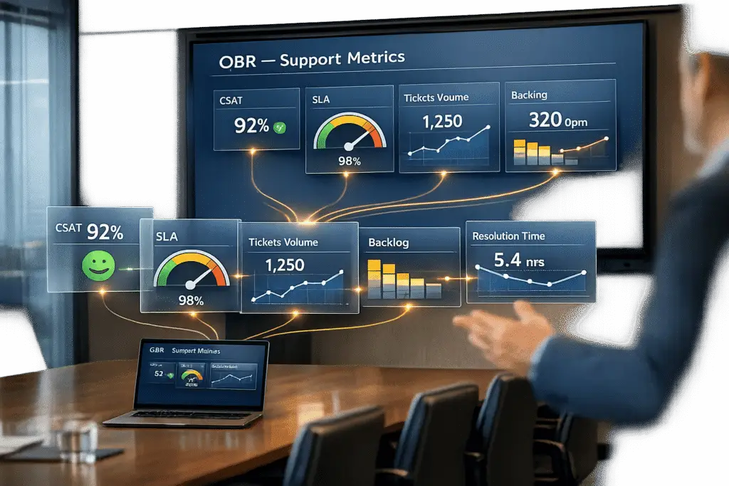
Manual creation of QBR slides is time-consuming and error-prone, often taking up to 8 hours per client. This limits many organizations to offering QBRs only to their top 10% of customers. Automation solves this by reducing prep time by up to 80%, pulling real-time data directly from support platforms, and eliminating manual errors. Here’s what you can automate:
- Key Metrics: Ticket trends, SLA performance, escalations, FCR, CSAT, and CES.
- Data Integration: Use APIs to connect CRMs, analytics tools, or Google Sheets for live data updates.
- Templates: Automate slide generation with placeholders for metrics like {{ticket_volume}} or customer experience scores.
- AI Tools: Platforms like Supportbench offer predictive CSAT, dynamic SLA tracking, and automated summaries.
Which Support Metrics to Automate for QBR Slides
Focus on automating metrics that are both labor-intensive to compile and essential for turning QBRs into meaningful, forward-thinking discussions with clients [4][9][5].
Start by targeting metrics that consume significant team resources and act as leading indicators of customer health. For example, usage trends can highlight churn risks or drops in engagement [4][5]. Standardizing these core KPIs across your organization ensures your automation efforts are built on a consistent and reliable foundation [4][3].
Here’s a breakdown of key metric categories to automate and their importance for B2B support operations:
| Metric Category | Why It Matters | What Automation Delivers |
|---|---|---|
| Ticket Trends | Identifies recurring issues and peak activity periods | Eliminates manual data aggregation from support tools [9] |
| SLA Performance | Reflects team efficiency and customer satisfaction levels | Provides real-time compliance tracking [9] |
| FCR & Escalations | Evaluates customer experience quality and team performance | Automatically detects performance gaps [5] |
| CSAT & CES | Assesses customer sentiment and interaction difficulty | Enables automated sentiment and trend analysis [5] |
To make automation impactful, audit your QBR process to pinpoint which data points – like ticket volume or resolution times – take the most time to gather manually [4]. Ensure your automation tools can directly access your CRM, product analytics, and helpdesk platforms via APIs to eliminate manual exports [9]. This approach allows you to scale high-quality QBRs to all clients, not just the top tier [2][3].
Ticket Trends and Volume Analysis
Tracking ticket trends over time uncovers actionable patterns that help you identify recurring issues before they escalate. Automating this metric allows you to anticipate busy periods and address friction points that could increase future ticket volumes [8].
Volume analysis also highlights which product areas or features generate the most support requests. This insight becomes invaluable during QBRs when discussing product roadmaps or feature prioritization. By presenting these friction points to clients, you position your support team as a proactive partner, ready to collaborate on solutions [5].
Average Resolution Time and SLA Performance
Automating resolution time tracking shifts the focus from reactive reporting to strategic performance management. Resolution times and SLA compliance provide a clear picture of how efficiently your team responds to client needs. These metrics demonstrate whether you’re meeting the service commitments outlined in your contracts. Automated analysis helps identify performance gaps in real time, enabling you to present actionable improvement plans instead of just reporting missed targets [5].
Automated SLA tracking ensures your QBR slides always include up-to-date compliance data. By pulling the latest numbers directly from your support platform, you provide accurate insights and real-time visibility into your team’s performance. This transparency builds trust with executives and underscores your accountability, reinforcing your role as a strategic partner [9].
Escalation Rates and First Contact Resolution (FCR)
Automating escalation tracking allows you to transition from reactive service to proactive support. High escalation rates often point to friction in the customer journey, such as gaps in team expertise or issues with product complexity. Including these metrics in your QBRs highlights your commitment to improving customer experience [5].
First Contact Resolution (FCR) measures how often your team resolves issues on the first interaction. Higher FCR rates are typically linked to better customer satisfaction and lower operational costs. Automating FCR tracking helps you quickly identify recurring issues that require multiple touches, enabling you to align training or product updates with actual customer pain points [7]. This showcases your team’s role in driving operational excellence.
Customer Satisfaction (CSAT) and Effort Scores (CES)
Automating sentiment tracking with tools like Natural Language Processing (NLP) enhances your ability to predict and prevent churn. CSAT, CES, and NPS scores provide insights into customer sentiment and interaction difficulty, which are critical for retention in B2B SaaS. By monitoring these metrics, you can spot potential churn risks early and address them proactively [5].
"AI-driven insights can be a game-changer for strategic decision-making. Without the data analytics capabilities of AI, companies risk making decisions based on outdated or incomplete data." – Eric Klimuk, Founder and CTO, Supportbench [8]
Predictive CSAT takes this a step further by using AI to forecast customer satisfaction based on interaction data, without waiting for survey responses [8]. This gives you faster, more comprehensive insights into customer sentiment, enabling you to address concerns before they affect renewal discussions and strengthening your forward-focused partnership approach.
sbb-itb-e60d259
How to Automate Support Data Slides: Step-by-Step
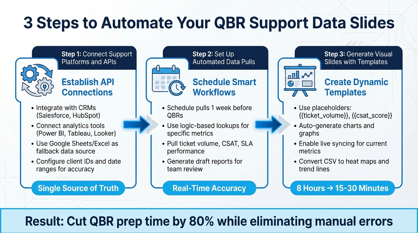
How to Automate QBR Support Data Slides: 3-Step Implementation Process
To streamline your QBR (Quarterly Business Review) process, automating support data slides can make a huge difference. By connecting your support platform with presentation tools, setting up automated workflows, and using templates that update in real-time, you can eliminate tedious manual tasks like copy-pasting data. This approach not only reduces errors but also frees up your team to focus on analyzing insights instead of compiling numbers. Here’s how you can set this up step by step.
Connecting Support Platforms and APIs
The first step is to establish API connections between your support platform and your automation tool. Many modern platforms integrate seamlessly with CRMs like Salesforce and HubSpot, as well as analytics tools like Power BI, Tableau, and Looker Studio [1][2]. If your platform lacks direct API support, you can route metrics into a centralized Google Sheet or Excel file, which can act as a live data source for your slides [2].
This setup ensures that all your presentations pull data from a single, consistent source. It also enables you to maintain uniform branding across client decks [1][2]. To make the process even more precise, configure the automation to recognize specific client IDs or date ranges. This way, the system fetches the correct quarterly data for each account every time [2].
Setting Up Automated Data Pulls
Next, schedule workflows to automatically pull data at regular intervals – ideally one week before a QBR – to ensure your slides reflect the most up-to-date performance metrics [1][7]. You can also trigger workflows when meetings are scheduled or contracts are renewed [7].
To make the data extraction smarter, use logic-based lookups. For instance, set up workflows to pull specific metrics like ticket volume, CSAT scores, or SLA performance for a particular quarter. This ensures that the right data is matched with the right client and time frame [2]. To add a layer of quality control, have the automation generate a draft report first. This allows your team to review the data and add any qualitative insights before finalizing the presentation [7].
Once your data is ready, the next step is to turn it into visually engaging slides.
Using Templates to Generate Visual Slides
Create a master template in PowerPoint or Google Slides with dynamic placeholders, such as {{ticket_volume}} or {{chart:csat_trends}}, that can automatically populate with data [2][3]. These placeholders pull directly from your support platform, converting raw numbers into polished charts and graphs without any manual effort [5].
Instead of using static screenshots from dashboards, automation tools can transform CSV data into real-time visualizations like heat maps or trend lines. Some tools even allow live syncing, so your slides always display the most current metrics [1][6]. By automating this step, you can cut the time spent on QBR slide creation from eight hours down to just 15–30 minutes [10].
"Slideform enables the efficient mass generation of a large volume of reports… This functionality is extremely important for our organization, as we need to generate over 100 reports per month." – Verified User, Slideform [10]
With this process, your team can focus on delivering insights and strategies rather than getting bogged down in manual data preparation.
Using Supportbench AI Features to Automate QBR Data
Supportbench offers AI-driven tools that take the hassle out of preparing Quarterly Business Review (QBR) slides. By automating tasks like data collection, calculations, and case reviews, this platform lets your team concentrate on meaningful analysis rather than tedious data gathering. Here’s how its AI features turn raw support data into actionable insights.
AI Case Summaries and Predictive CSAT
Supportbench’s AI automatically summarizes each ticket at both its creation and closure, providing concise case histories. These summaries make it easy to spotlight major wins and tackle complex resolutions during QBRs [11][12].
Another standout feature is the predictive CSAT (Customer Satisfaction) and CES (Customer Effort Score) scoring. Using sentiment and emotion analysis, the platform predicts these scores even before customers complete surveys. This is especially handy when survey response rates are low, ensuring you still have a full dataset for your presentation. Additionally, the AI identifies cases with churn risk by analyzing customer sentiment [11][12].
Dynamic SLA Monitoring and FCR Detection
Supportbench takes performance tracking to the next level with dynamic SLA (Service Level Agreement) monitoring and FCR (First Contact Resolution) detection. Instead of using rigid, one-size-fits-all SLA rules, the platform adjusts SLAs dynamically based on the complexity of each case. For instance, a simple request and a complex technical issue are evaluated differently, giving you performance metrics that better reflect real-world resolution efforts.
The platform also uses AI to analyze interactions and predict FCR. This eliminates the need for agents to manually classify tickets or self-report, delivering accurate resolution metrics effortlessly [11].
Customizable Dashboards for KPI Tracking
Supportbench’s dashboards and scorecards make tracking KPIs (Key Performance Indicators) straightforward. These tools consolidate data on escalations, customer health, and agent performance into a single, export-ready view. You can seamlessly integrate these visuals into your QBR slides without additional formatting. The dashboards also allow you to drill down into specifics – whether by agent, team, or issue type – giving you the granular insights needed for effective business reviews [11][12].
On top of that, the platform leverages AI-powered quality assurance to evaluate every ticket for empathy, tone, and accuracy. This automated QA process replaces manual sampling with standardized scorecards, tracking performance improvements over time. By integrating these insights, your QBR presentations become more efficient and focus on data-driven discussions that matter most.
Common Mistakes When Automating QBR Slides (and How to Fix Them)
Automating QBR slides can save a ton of time, but it’s surprisingly easy to make mistakes that hurt the credibility of your data. For instance, if Sales and Finance present conflicting ARR numbers, it’s often because they’re pulling from systems that aren’t aligned [14]. Another common issue? Automated slides pulling "dirty data", like deals that are technically still open but way past their expected close dates. These errors can erode trust during presentations [14]. Even semi-automation isn’t immune – manually copying and pasting metrics from multiple platforms can still introduce mistakes [1]. Let’s dive into how to fix these problems.
Fixing Data Silos and Inconsistent Metrics
Data silos are a major culprit when teams gather information manually from multiple, disconnected sources [2]. Here’s how to fix it:
- Define your canonical data sources: Decide on primary sources for key metrics, like using your CRM for pipeline data and Finance tools for revenue, at least 3–4 weeks before the QBR [14].
- Freeze the data early: Lock down the numbers 10 days before the meeting to ensure everyone’s working with the same data set.
- Run data quality checks: Perform automated checks about 48 hours before freezing the data to catch outdated or incorrect information, like deals that should’ve been closed [14].
A real-world example? In October 2025, Jenzabar replaced its old CRM-based helpdesk with Supportbench. This change centralized workflows across sales, support, and product teams, leading to faster resolutions and more consistent communication with customers [16].
Testing Workflows to Ensure Data Accuracy
Centralizing your data is just the first step – verifying its accuracy is just as important. Before you roll out your slides to clients, test your workflows with a small subset of accounts. This helps you spot errors before they go live [4].
- Map placeholders to live data: For example, placeholders like
{{ticket_volume}}or{{csat_score}}should be linked to the correct CRM fields. Double-check that they’re pulling accurate data [2]. - Add a human review step: Have Customer Success Managers review AI-generated content before it’s shared externally. This extra layer of oversight catches anomalies, like unexpected data spikes, that might need manual verification [4].
"With proper controls, Customer Success leaders ensure that outputs align with company standards, brand voice, and customer expectations" [4].
Balancing Automation with Customization
Automation can handle the heavy lifting of data collection, but customization is what makes QBRs meaningful. Fully automated slides often feel like static reports – dense with data but lacking actionable insights [13]. While automation can cut report creation time by up to 80% [1], it’s crucial to tailor the narrative to each customer’s goals.
Here’s a practical approach: Use templates with dynamic placeholders for routine metrics, but pair them with personalized, strategic recommendations. This balance turns the QBR from a dry data dump into a meaningful conversation about partnership and growth. It’s worth noting that 72% of senior decision-makers admit that either data overload or mistrust in data slows down their ability to make decisions [15].
Conclusion
Automated QBR support data slides take what used to be an 8-hour manual task and shrink it down to minutes. This shift allows your team to focus on the conversations that matter – strategic discussions that can drive renewals and tackle issues before they escalate. By removing the tedious work of pulling metrics from various platforms and manually creating decks, Customer Success Managers gain more time to build stronger partnerships.
But it’s not just about saving time – accuracy is a game-changer too. Automated data pulls from tools like Supportbench minimize human error, ensuring that the metrics you present are consistent and reliable every single time.
This kind of automation also makes it possible to scale QBRs for every client, not just the top-tier 10% [2]. That’s a fundamental shift in how clients experience and value their partnership with you.
Looking ahead, the future of B2B support isn’t just about speed – it’s about intelligence. Tools like Supportbench’s predictive CSAT, dynamic SLA monitoring, and AI case summaries elevate QBRs from being a backward-looking report to a forward-thinking strategy session [16]. Instead of just reviewing past performance, you’re uncovering growth opportunities and addressing churn risks before they spiral.
"The next wave of AI in enterprise support won’t just accelerate resolution – it will redefine how service organizations operate." – Eric Klimuk, Founder and CTO, Supportbench [16]
Automating your QBR data slides is just the beginning of this transformation.
FAQs
What’s the fastest way to automate QBR support slides end-to-end?
The quickest way to streamline QBR support slide creation from start to finish is by leveraging AI-powered tools. These tools take care of everything – data collection, choosing the right templates, and generating complete presentations. By integrating directly with your CRM, support systems, and product data, they allow you to pick pre-designed templates and produce shareable decks in just minutes. This approach not only saves time but also cuts down on manual work and boosts accuracy, freeing up teams to concentrate on strategic insights instead of getting bogged down in report creation.
How do I prevent bad or inconsistent data from showing up in automated QBR decks?
To keep automated QBR decks free from bad or inconsistent data, it’s crucial to incorporate data validation and verification into your process. Leverage AI tools to spot anomalies and cross-check data for accuracy. At the same time, include a human review step to catch any issues that might slip through automation. Using standardized templates and sticking to consistent data sources can also go a long way in reducing errors and ensuring your presentations are reliable.
Which support KPIs are the best leading indicators to include in a QBR?
When preparing for a Quarterly Business Review (QBR), tracking the right metrics can provide a clear picture of customer health and operational performance. Some of the most valuable indicators include:
- Adoption Rates: Measure how effectively customers are engaging with your product or service.
- Feature Utilization: Track which features customers are using most and identify underutilized ones.
- Time-to-Value: Assess how quickly customers see results after adopting your solution.
- Customer Satisfaction Scores (CSAT): Gauge customer happiness and overall experience.
- First Contact Resolution Rate: Evaluate how efficiently customer issues are resolved on the first attempt.
- Escalation Rates: Monitor the frequency of issues that require higher-level intervention.
- Operational Efficiency: Review internal processes to ensure resources are being used effectively.
These metrics provide early signals about customer satisfaction and operational trends, enabling you to make informed, proactive decisions.
Related Blog Posts
- JSM reporting vs Support Ops reporting: what’s missing and how to replace it
- What are the signs you’ve outgrown Help Scout (SLAs, tiers, escalations, reporting)?
- Reporting Black Holes: The Difficulty of Extracting Metrics from Slack Conversations
- Support’s Role in QBRs: Generating Data-Driven Customer Reports