
Creating a support analytics dashboard that leaders will actually use boils down to choosing the right metrics, simplifying design, and making the data actionable. Here’s the quick answer:
- Focus on Leadership Goals: Start by identifying what matters most – cost reduction, growth, efficiency, or quality – and select 5–7 metrics tied to those goals.
- Consolidate Data: Pull data from all customer interaction channels and enrich it with context (e.g., customer value, product usage) to provide a complete view.
- Design for Clarity: Create role-specific dashboards (e.g., executives need high-level summaries, managers need operational data). Use visual indicators like color-coding and alerts.
- Leverage AI: Automate analysis, detect anomalies, and predict trends like customer satisfaction or issue escalation.
- Avoid Common Mistakes: Don’t overload dashboards with too many metrics. Balance speed and quality metrics, and regularly update dashboards to align with shifting priorities.
Key Metrics to Track:
- Cost Reduction: Average Handle Time, Self-Service Usage Rate, Ticket Volume.
- Growth: Net Revenue Retention, Churn Rate, Customer Lifetime Value.
- Efficiency: First Response Time, Resolution Time, Backlog.
- Quality: CSAT, CES, and NPS.
Pro Tip: Dashboards should prompt action, not just display data. For example, if SLA breaches increase, trigger staffing adjustments immediately. AI tools can enhance this by predicting issues before they occur.
Power BI for IT Support Ticket Analytics Dashboard
sbb-itb-e60d259
Step 1: Define Leadership Goals and Select Core Metrics
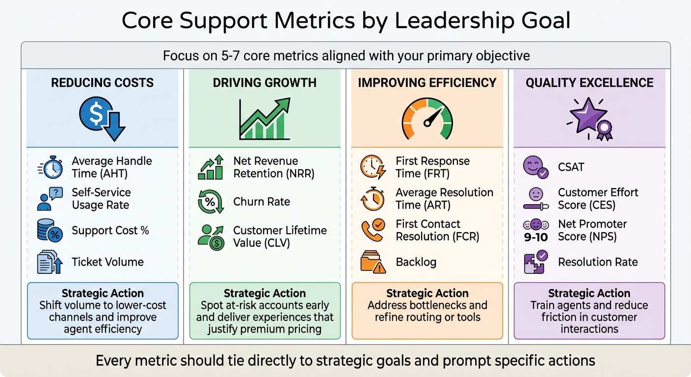
Support Analytics Dashboard Metrics by Business Goal
Start by pinpointing your primary objective: whether it’s cutting costs, driving growth, boosting efficiency, or achieving quality excellence. Clearly defining your goal will help identify the metrics that deliver the most meaningful insights.
Bring in key stakeholders – executives, finance teams, and others – to ensure that your KPIs align with the broader business strategy. The focus should be on metrics that influence the overall business, not just operational performance. For example, if retention is your top priority, you might prioritize metrics like Net Revenue Retention (NRR), Customer Churn Rate, and support-driven revenue.
In B2B settings, leadership priorities often shift from individual transactions to account-level health. A single unhappy user in a key account can jeopardize a significant contract, making it essential to track metrics like SLA adherence and the impact of unresolved issues on the business. John Torres, Director of Customer Communication, highlights this focus:
"I do a monthly report of my analytics to the entire company, and now we’re averaging 99% response rates within two days. That’s a great metric for us because it shows how we’re staying accountable to our customers."
Core Metrics to Track
Once your main goal is clear, narrow your focus to 5–7 core metrics that directly support it. Tracking too many metrics can cause analysis paralysis, while too few may leave critical gaps. Here’s a breakdown of which metrics align with specific objectives:
| Primary Goal | Core Metrics to Track | Strategic Action |
|---|---|---|
| Reducing Costs | Average Handle Time (AHT), Self-Service Usage Rate, Support Cost %, Ticket Volume | Shift volume to lower-cost channels and improve agent efficiency. |
| Driving Growth | Net Revenue Retention (NRR), Churn Rate, Customer Lifetime Value (CLV) | Spot at-risk accounts early and deliver experiences that justify premium pricing. |
| Improving Efficiency | First Response Time (FRT), Average Resolution Time (ART), First Contact Resolution (FCR), Backlog | Address bottlenecks and refine routing or tools. |
| Quality Excellence | CSAT, Customer Effort Score (CES), Net Promoter Score (NPS), Resolution Rate | Train agents and reduce friction in customer interactions. |
Every metric should tie directly to your strategic goal, ensuring dashboards provide actionable insights. For example, First Response Time (FRT) measures how quickly your team acknowledges a customer’s issue – critical since 90% of customers expect an immediate response, with 60% defining "immediate" as within 10 minutes. Similarly, First Contact Resolution (FCR) tracks whether issues are resolved on the first interaction. Even a 1% improvement in FCR can cut operating costs by 1% and reduce churn by as much as 67%.
Customer Effort Score (CES) is gaining traction as a key loyalty indicator. Research shows CES is 1.8 times better at predicting loyalty, with 96% of customers who encounter high-effort support becoming disloyal, compared to just 9% for low-effort experiences. In B2B, meeting SLA commitments is equally critical for maintaining contracts.
To avoid misleading averages, segment metrics by complexity. For instance, blending simple password resets with complex technical issues in Average Resolution Time (ART) can distort results. Similarly, track Backlog Aging by monitoring tickets older than 48 hours or one week, rather than just counting open tickets.
Another essential metric is Cost Per Ticket, calculated by dividing total operational costs (labor, tools, overhead) by resolved ticket volume. This metric reveals efficiency gains over time and supports investment in automation. Companies using AI-powered processes report a $3.50 return for every $1 spent.
Customize Metrics for Leadership Priorities
Dashboards should adapt to the needs of different leadership roles. Executives need high-level summaries on ROI and trends, while managers require operational data for day-to-day decisions. For example:
- Executives: Look for metrics like support-influenced revenue and NRR to assess how support impacts the bottom line.
- Managers: Focus on workload balance, SLA compliance trends, and agent productivity for staffing and routing decisions.
Set up a tiered reporting cadence to match these needs. Agents might rely on daily dashboards for active queues and SLA timers, while managers need weekly updates with trends and backlog data. Directors can review monthly progress against goals, and executives benefit from quarterly reports on ROI and strategic outcomes. This approach ensures everyone gets relevant insights without being overwhelmed.
For B2B leaders, include Account Intelligence in dashboards. This combines signals like recurring issues, SLA breaches, and NPS trends into a single health score. Advanced platforms can even provide Predictive CSAT or Predictive CES, flagging dissatisfaction before surveys are submitted.
Shift your focus from vanity metrics to actionable ones. For example, instead of tracking "Total Tickets Handled", analyze "Tickets by Root Cause" to uncover systemic issues. Similarly, replace "Agent Occupancy Rate" with "First Contact Resolution" to measure real effectiveness in solving problems. As Nooshin Alibhai, Founder and CEO of Supportbench, puts it:
"Metrics are signals, not the full story. Dig into the ‘why’ behind the numbers, gather qualitative feedback, and use insights to drive targeted improvements."
Finally, every metric on your dashboard should have a defined action plan. For instance, if SLA breaches spike, does that trigger ticket reassignment or staffing changes? If CSAT drops below a set threshold, is there an automatic review of interactions? Dashboards must do more than display data – they should drive decisions and prompt immediate actions.
Step 2: Consolidate Data Sources for Complete Visibility
When data is scattered across multiple systems, support teams often operate reactively, addressing issues only after they escalate. This inefficiency can cost up to 26 hours annually in manual data collection alone. Leaders are left in the dark, unable to answer basic questions about metric fluctuations or sudden drops in customer satisfaction. Even worse, fragmented data makes it nearly impossible to identify patterns across different channels. For instance, twenty customers might report the same bug, but without a unified view, each case could be handled in isolation, missing the bigger picture entirely.
Integrate Data from All Support Channels
A consolidated view begins with gathering data from every customer interaction point – case management systems, live chat, email, phone, social media, and knowledge bases. This unified approach ensures consistent monitoring of SLAs, no matter how customers choose to reach out.
But raw ticket data isn’t enough. To uncover meaningful insights, you need to enrich it with context. By combining ticket data with CRM, product, and billing information, you can gain a clearer picture of customer tiers, monthly recurring revenue (MRR), feature usage, and error rates. This helps teams understand whether a spike in issues is coming from high-value customers dealing with critical bugs or lower-tier users facing onboarding hurdles.
Real-time data pipelines are critical for tracking SLAs and spotting patterns early. Consolidated data allows both AI tools and human analysts to detect when multiple customers report the same issue at the same time. This proactive approach can prevent up to 80% of escalations. Instead of discovering a widespread bug days later, your team can act immediately, reducing frustration and improving customer satisfaction.
To enable this, create a materialized ticket view – a database that merges raw ticket data with customer and product details like account tier, MRR, and software version. This pre-computed analytics setup allows faster decision-making. Tools like Stitch or Fivetran can help you move data from ticketing systems into a data warehouse, while reverse ETL tools like Census can push enriched data back into your support platform. This ensures agents have complete customer context during every interaction.
Once all channels are consolidated and enriched, the focus must shift to ensuring the accuracy and reliability of the data.
Maintain Data Accuracy and Consistency
Dashboards are only as good as the data behind them. If the information is riddled with missing values, duplicates, or inconsistencies, it can mislead decision-makers and erode trust in the insights.
Start by standardizing input fields across your team. Use dropdown menus or single-input options for fields like "Ticket Reason" or "Product Area" to avoid free-form text entries that lead to inconsistencies. Requiring these fields to be completed before closing a ticket can help eliminate gaps in your data.
Your data pipeline should also include a robust aggregation layer to resolve quality issues before they reach your analytics tools. Automate validation checks to catch duplicate records, ensure consistent metric definitions across systems, and flag anomalies for manual review. This ensures that when metrics change, leaders can trust the data reflects actual trends, not errors in collection or processing.
To avoid confusion, establish a shared data language across teams. Discrepancies in metric definitions between departments can lead to "Excel chaos", where even basic numbers are disputed. Document your metric definitions, aggregation rules, and data ownership protocols so everyone interprets dashboards the same way. High-level insights should always be traceable back to the original tickets and calculations, reinforcing confidence in the data and enabling leadership to make informed decisions.
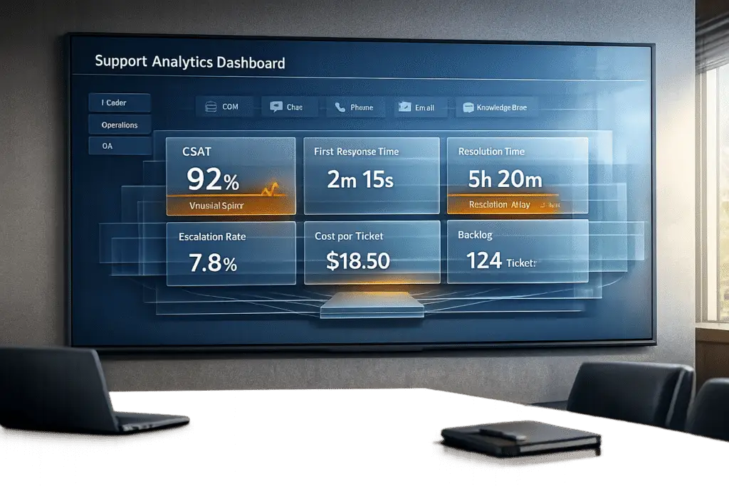
Step 3: Design Dashboards for Clarity and Action
Once your data is consolidated and accurate, the next step is to transform it into insights that drive decisions. This is where dashboards come in. But not all dashboards are created equal – cluttered ones can overwhelm users and lead to "analysis paralysis." The goal? Simplicity and clarity. Dashboards should focus on the key metrics that directly inform decisions. If a leader can glance at a dashboard and immediately understand the situation and what actions to take, you’ve done it right.
Different roles require tailored views. For instance, an executive doesn’t need granular details like individual agent handle times, whereas frontline agents only need the metrics relevant to their daily tasks. By customizing dashboards for each role, you ensure that everyone gets the information they need to act effectively.
Dashboard Types for Different Leadership Roles
Dashboards aren’t one-size-fits-all. The most effective support teams create four types of dashboards, each designed for a specific audience and purpose.
Executive Performance Dashboards
These are for C-suite leaders and VPs, focusing on the big picture. Metrics like Net Promoter Score (NPS), Net Revenue Retention (NRR), and Support Cost as a Percentage of Revenue provide insights into customer loyalty and operational efficiency. These high-level indicators help executives gauge whether the support function is delivering long-term value.
Operations Dashboards
Support managers rely on these dashboards to manage day-to-day operations. They track metrics like ticket volume by channel, backlog size, SLA compliance rates, and staffing levels. For example, if SLA timers are about to expire or backlog is growing, managers can reallocate resources or escalate staffing needs in real time.
Agent Productivity Dashboards
These are designed for team leads and individual agents, focusing on personal performance. Metrics such as First Response Time (FRT), Average Resolution Time (ART), First Contact Resolution (FCR), and agent occupancy help agents prioritize tasks and hit their daily goals. Features like real-time SLA timers and personal queues highlight urgent tickets needing immediate attention.
Customer Experience Dashboards
For CX leaders, these dashboards focus on customer sentiment and areas of friction. Metrics like Customer Satisfaction (CSAT), Customer Effort Score (CES), and sentiment analysis help identify at-risk experiences quickly, enabling early intervention.
| Dashboard Type | Target Audience | Primary Focus | Key Metrics |
|---|---|---|---|
| Executive Performance | C-Suite / VPs | Long-term health & ROI | NPS, NRR, Support Cost % of Revenue |
| Operations | Support Managers | Daily flow & efficiency | Ticket volume, Backlog, SLA compliance, Staffing |
| Agent Productivity | Team Leads / Agents | Individual performance | FRT, ART, FCR, Agent Occupancy |
| Customer Experience | CX Leaders | Sentiment & Friction | CSAT, CES, Sentiment Analysis |
Once you’ve defined the dashboard types, the next step is designing views that encourage action.
Build Role-Based Views and Visual Indicators
Designing actionable dashboards means removing guesswork. Use visual elements like color-coding, alerts, and grouped metrics to make data easy to interpret.
- Color-coding: Apply green, yellow, and red indicators to key metrics like satisfaction scores or SLA compliance. This makes it easy to spot areas needing attention.
- Threshold alerts: Set up notifications for when metrics exceed limits. For example, if backlog size or First Response Time crosses a critical threshold, the system can alert the operations manager immediately.
- Visual grouping: Organize related metrics together. For instance, cluster SLA compliance, First Response Time, and resolution times in one section, while grouping CSAT, NPS, and sentiment analysis in another. This mirrors how leaders naturally process data, making it easier to identify patterns.
Modern dashboards are also leveraging AI to go beyond reactive insights. Platforms like Supportbench include predictive indicators, such as Predictive CSAT or Customer Effort Score (CES), which flag potential problems before they escalate. For example, if an AI-driven dashboard detects a pattern of dissatisfaction, it can alert the team before a customer submits a negative survey.
Lastly, ensure dashboards support drill-down functionality. If a high-level metric like CSAT drops, executives should be able to click into it to see which agents, channels, or products are contributing to the decline. This feature enables quick, informed decisions without needing to switch between systems.
Step 4: Use AI for Automated Analysis and Predictions
AI takes dashboards to the next level by not just presenting data but actively interpreting it. With AI integrated into your support analytics, you can shift from reactive to proactive decision-making. Instead of merely displaying trends, AI-powered dashboards analyze patterns, predict outcomes, and alert you to potential issues before they escalate. This means no more spending countless hours manually sifting through data or waiting for customer surveys to reveal problems. AI platforms can do the heavy lifting, detecting trends and providing actionable insights in real time.
Manual analysis is not only time-consuming – averaging about 26 hours annually across support, CRM, product, and billing teams – but it also risks being too late to address emerging issues. AI changes the game by delivering real-time insights and predictive signals, allowing teams to act quickly and effectively. This proactive approach doesn’t just save time; it also ensures deeper and more accurate analysis, paving the way for AI-generated summaries.
AI-Generated Summaries and Metrics
AI can handle the tedious groundwork that often bogs down analysts. With tools like Large Language Models (LLMs), AI can review case histories, communication patterns, and customer interactions to uncover the reasons behind metric shifts – not just the raw numbers.
Take AI-powered FCR detection, for example. By analyzing entire conversation histories, AI can determine whether a case was resolved on the first contact. This method is far more reliable than relying on agents to tag cases manually or using basic logic. The result? Accurate performance data without adding extra administrative tasks.
"AI Predictive CSAT can give you an early warning signal within the case list if a customer is likely to be dissatisfied, enabling proactive intervention even before a survey is sent." – Nooshin Alibhai, Founder and CEO, Supportbench
Another standout feature is predictive CSAT and CES scores, which are game-changers for B2B support teams. Instead of waiting for survey responses, AI continuously evaluates conversations to identify at-risk customers in real time. This is critical because 96% of customers who encounter high-effort interactions are likely to become disloyal. Predictive CES helps teams address issues before dissatisfaction turns into churn.
AI also excels at clustering topics across thousands of tickets, uncovering recurring themes like "API integration challenges" or "billing discrepancies" without the need for manual tagging. Weekly summaries generated by LLMs can then distill these findings into concise reports, highlighting performance trends, key issues, and actionable recommendations.
| Feature | Manual Approach | AI-Automated Approach |
|---|---|---|
| Data Processing | Manual exports and Excel pivots | Automated pipelines and views |
| Speed of Insights | Delayed (days after issues start) | Real-time or daily summaries |
| FCR Tracking | Agent self-reporting or basic logic | AI analysis of communication patterns |
| Customer Pulse | Reactive (survey results) | Proactive (predictive CSAT/CES) |
| Root Cause | Manual investigation | AI-driven analysis and clustering |
AI doesn’t stop at summaries. It continuously monitors your data, identifying anomalies and alerting you before they escalate.
AI-Based Anomaly Detection and Alerts
Static thresholds for alerts often miss subtle changes. AI-powered anomaly detection learns what "normal" looks like for your support operations by considering factors like seasonality, day-of-week patterns, and historical trends. It then flags deviations automatically. This eliminates the need to constantly adjust thresholds as your business evolves.
For instance, if ticket volume spikes tenfold or First Response Time doubles unexpectedly, AI can alert managers immediately. Catching these patterns early can prevent up to 80% of escalations. What’s more, AI doesn’t just send a vague alert – it pinpoints the anomaly and identifies potential causes, such as a recent product update or a specific customer segment.
"Automated insights could surface issues daily, enabling proactive response instead of reactive firefighting." – Pylar.ai
Modern platforms also address alert fatigue by grouping related issues into a single incident. For example, if SLA breaches, sentiment spikes, and high escalation rates occur simultaneously, AI can connect the dots – recognizing these as symptoms of a larger issue like a service outage or buggy release – and present them as one actionable alert.
Step 5: Avoid Common Mistakes and Drive Adoption
Creating AI-native support dashboards that genuinely influence decisions requires more than just technical know-how – it’s about steering clear of common pitfalls and embedding the dashboard into your team’s daily workflow. Even the most advanced dashboard won’t make an impact if leadership and teams don’t actively use it. The key lies in recognizing design missteps and driving consistent adoption.
Common Dashboard Mistakes to Avoid
One of the biggest traps is metric overload. Trying to pack more than 8–12 metrics into a single view can overwhelm users, leading to analysis paralysis. Instead, aim for simplicity: focus on 5–7 core KPIs that are directly tied to your primary objective, whether that’s reducing costs or driving growth.
Another common mistake is emphasizing Average Handle Time (AHT) as a standalone KPI. Pressuring agents to reduce AHT without context often results in rushed interactions and poor resolutions, which can hurt customer satisfaction. Instead, balance AHT with metrics like CSAT (Customer Satisfaction Score) and First Contact Resolution (FCR) to get a more accurate picture of performance. After all, 96% of customers who experience high-effort interactions are likely to become disloyal. Speed matters, but it should never come at the expense of quality.
Customizing dashboard views for different roles is another critical step. Agents, managers, and executives have distinct needs:
- Agents benefit from real-time task lists and SLA timers.
- Managers need insights into backlog distribution and sentiment trends.
- Executives require high-level metrics like ROI and Net Revenue Retention.
Finally, dashboards must stay relevant. Quarterly audits and updates ensure the metrics align with shifting priorities and business goals. Addressing these common issues paves the way for continuous improvement through testing and feedback.
| Common Mistake | Recommended Fix |
|---|---|
| Too many metrics | Limit each dashboard to 5–7 core KPIs |
| Over-reliance on AHT | Balance AHT with CSAT and FCR for a fuller performance picture |
| Outdated or static data | Enable real-time updates and automated alerts for key thresholds |
| Generic views for all roles | Create role-specific dashboards: tactical for agents, strategic for leaders |
| Ignoring qualitative data | Connect CSAT scores to customer comments for deeper insights |
Once you’ve addressed these pitfalls, the next challenge is ensuring the dashboard remains relevant and becomes an integral part of decision-making.
Test and Iterate Based on Feedback
Dashboards aren’t a “set it and forget it” tool. Before rolling out a dashboard to the entire company, test it with a smaller group to ensure the layout is intuitive and the metrics drive actionable decisions. Ask leadership directly: “Does this data help you make decisions?” If the answer isn’t clear, treat it like a support issue – investigate the problem and make adjustments immediately.
Establishing a tiered review schedule can help integrate dashboards into daily operations:
- Daily stand-ups: Focus on SLA risks and backlog spikes.
- Weekly reviews: Analyze CSAT trends and identify training needs.
- Monthly reviews: Discuss progress toward goals with department heads.
- Quarterly strategic reviews: Showcase ROI and the business impact of metrics like Net Revenue Retention.
John Torres, Director of Customer Communication, implemented a monthly analytics report in September 2025, sharing key performance data across the company. This transparency fostered accountability and led to an impressive 99% response rate within just two days.
"I do a monthly report of my analytics to the entire company, and now we’re averaging 99% response rates within two days. That’s a great metric for us because it shows how we’re staying accountable to our customers." – John Torres, Director of Customer Communication
To maintain visibility, automate dashboard snapshots and make them part of regular routines. The ultimate goal? Checking the dashboard should feel as natural as glancing at your calendar – an effortless habit that drives smarter decisions.
Conclusion
A well-structured support dashboard is more than just a tool – it’s a strategic asset. To create one that leadership actually relies on, focus on five core principles: align metrics with business goals, integrate data from all channels, prioritize clarity and role-specific design, use AI for automation and forecasting, and continuously refine based on user feedback. Every metric should lead to an actionable next step.
In today’s fast-paced environment, effective support marries quick resolutions with measurable outcomes. Companies leveraging AI-powered support report a return on investment for AI of $3.50 for every report a $3.50 return for every $1 invested spent. By tailoring dashboards to specific roles, both leaders and teams can access the insights they need to make informed daily decisions and shape long-term strategies.
The best dashboards don’t just display data – they interpret it. Metrics serve as signals, guiding deeper analysis to uncover the root causes behind trends. Without context, raw data offers little value; with it, it becomes a powerful decision-making tool.
As business priorities shift and customer demands evolve, dashboards must adapt. A design that worked during a cost-cutting phase might need a complete overhaul when the focus turns to growth. Setting up a review cadence – daily for operations, weekly for trends, monthly for progress, and quarterly for strategic ROI – keeps the dashboard relevant and aligned with your goals.
Ultimately, your dashboard should feel as essential as your calendar. When leadership can glance at it and instantly see what’s working, what’s not, and what needs attention, you’ve built a system that drives smarter, faster decisions. This commitment to continuous improvement is what sets leading AI-driven B2B support operations apart.
FAQs
What key metrics should a support analytics dashboard include to help leaders make better decisions?
A strong support analytics dashboard zeroes in on metrics that drive actionable insights and align with your business goals. Some key metrics to track include customer satisfaction (CSAT), average resolution time (MTTR), first response time, escalation rates, case volume trends, and agent efficiency. Together, these metrics paint a clear picture of both operational performance and the overall customer experience.
For leadership, the dashboard should emphasize data that reveals trends, pinpoints bottlenecks, and aids in strategic decision-making. A clean, user-friendly design paired with AI-powered insights can make complex data easier to digest while automating visualizations for a more streamlined experience.
How can AI make support dashboards more effective for leaders?
AI brings a new level of functionality to support dashboards by automating data analysis, delivering insights in real time, and offering predictive tools. It can sift through massive amounts of support data in seconds, spotting trends, patterns, and anomalies. This helps leaders make quicker and smarter decisions. On top of that, AI can analyze customer feedback and sentiment, flagging potential issues before they become bigger problems.
It also fine-tunes key operational metrics like resolution times, ticket prioritization, and agent performance. By providing predictive insights and actionable suggestions, AI can forecast ticket surges or identify team members who might need extra help. This allows leaders to allocate resources more effectively and boost overall efficiency. These capabilities turn dashboards into intelligent systems that empower proactive, data-driven decisions, improving both customer satisfaction and operational performance.
Why is it important to tailor dashboards for different leadership roles?
Tailoring dashboards to specific leadership roles ensures that every leader has access to the insights they need to make quick, informed decisions. Different roles naturally focus on unique priorities – whether it’s improving operational efficiency, enhancing customer satisfaction, or steering long-term strategy. A generic, one-size-fits-all dashboard risks showing irrelevant data or missing key opportunities.
Custom dashboards solve this by emphasizing the metrics that matter most to each role. For instance, a customer experience leader might prioritize CSAT scores, while a financial decision-maker would focus on metrics like cost-per-ticket. This targeted approach not only simplifies decision-making but also helps align support operations with the organization’s overarching goals.
Related Blog Posts
- How to Measure Customer Support Performance in 2026: Key Metrics
- How do you report on renewals risk using support data (and what metrics matter most)?
- How do you measure support quality beyond QA scoring (and what to track instead)?
- How do you handle support for multiple subsidiaries/locations under one customer?