
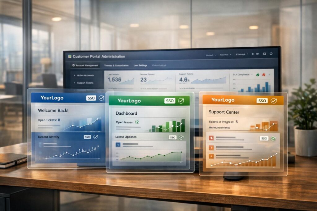
Enterprise client portals need to feel personalized. Customizing themes and layouts for each account allows businesses to align portals with their clients’ unique branding, workflows, and user preferences. This approach improves trust, simplifies navigation, and reduces support issues by creating a tailored experience.
Key takeaways:
- Custom branding (logos, colors, layouts) reassures users and builds trust.
- Functional tweaks, like localized languages and custom forms, streamline operations.
- Dynamic CSS and account-specific SSO ensure seamless integration.
- Accessibility and usability are critical to avoid user frustration.
Why Enterprise Accounts Need Per-Account Customization
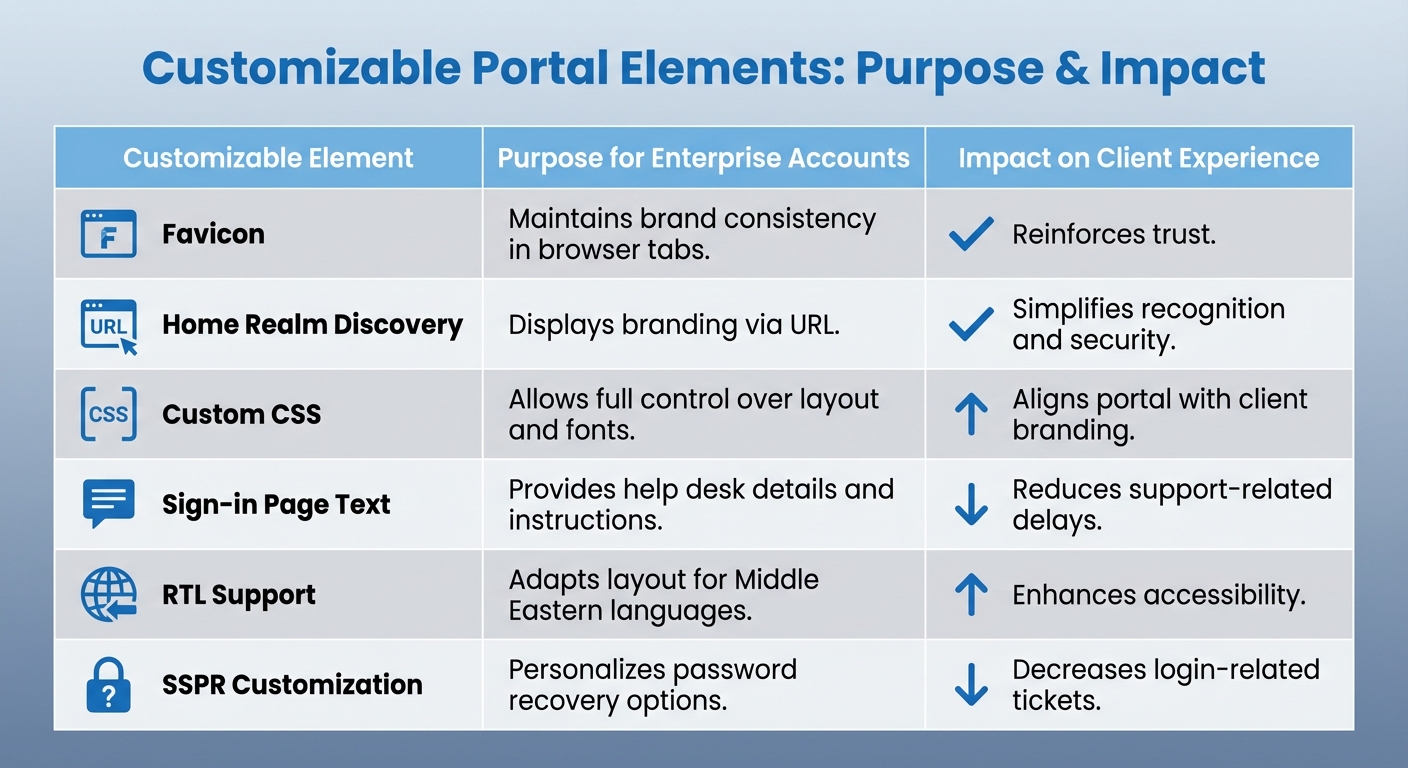
Customer Portal Customization Elements and Their Impact on Enterprise Client Experience
Enterprise clients demand more than a generic portal – they want a system that fits their internal workflows, reflects their brand identity, and streamlines operations for their teams. A cookie-cutter approach can lead to confusion, slow onboarding, and disconnect between the client and support teams. This is where per-account customization becomes essential.
Tailoring elements like branding, layouts, and navigation to meet each client’s specific needs ensures smoother operations and fosters trust at every interaction.
Improving the Client Experience
A customized portal makes navigation intuitive and onboarding hassle-free. For instance, employees from various subsidiaries within the same enterprise can log in to see branding specific to their division, eliminating any confusion caused by a generic vendor interface. This creates a premium, cohesive experience. As Luis Estéfano from ServiceNow puts it:
Service Portal is intended to give a great user experience to our employees or customers… we can align the portal with their corporative branding. In this way, the employees from different sub-companies, or the customers from different accounts could enjoy a better experience [6].
Functional customizations, like modifying ticket forms or knowledge base layouts, ensure the portal aligns with how each client’s team operates. For example, if a client doesn’t use community forums, that section can be removed from their home page. If specific data fields are needed for ticket submissions, they can be embedded directly into forms. This approach minimizes wasted time and gets users to the information they need faster [4].
For global enterprises, browser language localization is another game-changer. The portal can automatically adjust to a user’s preferred language, including right-to-left (RTL) layouts for languages like Arabic and Hebrew [2]. These features not only enhance the user experience but also improve support efficiency.
Aligning with Client Brands
Beyond functionality, aligning the portal with the client’s brand builds trust. This isn’t just about adding logos or changing colors – it’s about creating a sense of security. When users see familiar branding from the moment they log in, they feel confident they’re in the right place. Tools like Home Realm Discovery (HRD) allow for domain-specific branding (e.g., whr=contoso.com), displaying the client’s logo and colors even before they enter their email address [2].
This is particularly important in cross-tenant B2B scenarios, where users might otherwise question the legitimacy of the page. By showcasing the client’s home tenant branding – including their fonts, logos, and color schemes – you reinforce a professional and secure environment throughout the session [2].
For external-facing tenants, replacing default vendor branding with neutral or client-specific assets ensures the focus stays on the client’s identity, not the vendor’s [1]. Advanced customization options include controlling up to 15 color properties, uploading custom banners (800×400 px), and applying dynamic CSS to further personalize the experience [5][6].
Cutting Down Support Friction
Customized layouts also help reduce repetitive support requests. For example, adding custom text to the sign-in page (up to 1,024 Unicode characters) allows you to include help desk contact information, legal disclaimers, or specific instructions right in the portal [2]. This empowers users to resolve common issues without submitting a ticket.
Even small adjustments, like renaming Self-Service Password Reset (SSPR) links to "Can’t access your account?" can encourage users to resolve login issues independently, cutting down on "locked out" tickets [1].
For clients with unique internal workflows, customizing "New Ticket" and "Ticket Details" pages ensures all necessary information is captured upfront. This reduces back-and-forth communication and speeds up issue resolution [4]. When the portal mirrors the client’s existing tools and processes, their teams can focus on their work instead of struggling with unfamiliar systems. These tailored changes also integrate seamlessly with AI-driven support tools, boosting overall efficiency.
| Customizable Element | Purpose for Enterprise Accounts | Impact on Client Experience |
|---|---|---|
| Favicon | Maintains brand consistency in browser tabs | Reinforces trust |
| Home Realm Discovery | Displays branding via URL | Simplifies recognition and security |
| Custom CSS | Allows full control over layout and fonts | Aligns portal with client branding |
| Sign-in Page Text | Provides help desk details and instructions | Reduces support-related delays |
| RTL Support | Adapts layout for Middle Eastern languages | Enhances accessibility |
| SSPR Customization | Personalizes password recovery options | Decreases login-related tickets |
sbb-itb-e60d259
What You Can Customize in Portal Branding
Customer portals give you a high level of control over both the visual design and functionality, allowing the portal to feel like an organic part of a client’s ecosystem. Support teams can tweak headers, footers, and individual page layouts to create a consistent branded experience. This balance of design and functionality ensures the portal not only looks aligned with the brand but also integrates smoothly into various workflows.
Visual identity elements are the backbone of branding. You can define specific brand colors for headers, footers, tabs (including hover states), buttons (primary and secondary backgrounds), links, cards, and even input focus rings. Typography options include setting base and heading fonts, as well as defining heading colors to match corporate style guides. In fact, systems allow you to control up to 15 color properties, along with border thickness, corner styles (rounded or sharp edges), and even custom HTML or JavaScript blocks for added functionality [5][7].
Page-specific customization spans up to 17 different pages, including the portal home, ticket management forms, knowledge base, and community forums [4]. Each page layout can be adjusted by reordering elements – like placing "Summary" above "Products" – to better align with client goals and workflows [5]. Additionally, custom domain mapping lets portals use subdomains specific to each client (e.g., support.clientname.com), further reinforcing brand ownership [8]. These features help streamline navigation while maintaining a strong brand presence.
Dynamic customization goes a step further with account-specific branding through CSS. In multi-account environments, portals can load unique StyleSheets based on the logged-in user’s account number or company ID. This allows each client to see their own logos, background styles, and link colors automatically [6]. To prevent style flash during loading, you can set the default body display to "none" in the main stylesheet, then use a script to make it visible only after the correct styles have loaded [6].
For more advanced needs, support teams can incorporate custom JavaScript for tracking, configure account-specific Single Sign-On (SSO) methods (like JWT, OAuth 2.0, or OpenID Connect), and add announcement banners or footer links for legal documents such as Privacy Policies [8]. These tools work together to create a smooth, branded experience that builds trust and reduces friction at every interaction point.
Setting Up Per-Account Themes and Layouts
Gathering and Organizing Client Assets
Start by collecting essential branding assets like high-resolution logos (at least 60×60 pixels, 1:1 aspect ratio, in .svg or .png format, and under 2MB) and favicons (16×16 or 60×60 pixels, under 64KB) [8][9]. Make sure to request Hex codes for all brand colors, including those used for headers, buttons, navigation, links, hover states, and backgrounds. Additionally, obtain the exact font names for both headings and body text [7].
Compile account-specific information such as URLs for legal pages (e.g., privacy policies, terms of use, and cookie policies), logo linkback destinations, support phone numbers, and helpdesk email addresses for portal placement [8]. For advanced branding, prepare any custom CSS or JavaScript files, as well as background images for login screens [6]. To keep everything organized, label folders using the client’s Account Number or Company ID, ensuring smooth dynamic loading. Lastly, confirm that the chosen brand colors meet WCAG standards for contrast and readability to ensure accessibility [7].
Once all assets are ready and neatly organized, you can move forward with applying and testing the themes.
Applying Themes and Testing
To save time, start by cloning an existing theme that already has a proven layout [7]. If you’re working in a multi-account environment, use scripts that detect the logged-in user’s account and dynamically load the corresponding CSS stylesheet based on their Company ID [6].
Test the theme’s responsiveness across devices, including desktops, tablets, and mobile phones, to ensure a consistent user experience [5][7]. For splash screens, aim for a 3:4 ratio on desktop (portrait) and a 16:9 ratio on mobile (landscape) [5]. Use features like "Test Email" or restricted CSS application to preview changes with a small group of users before rolling them out to everyone [5].
Once you’ve verified that the theme works well across devices, you’re ready to deploy.
Deploying and Assigning Themes to Accounts
If you’re managing a smaller portfolio of clients, you can assign themes manually by selecting specific applications or accounts during the theme creation process [3]. For larger-scale operations involving hundreds or thousands of accounts, programmatic deployment through APIs is the way to go. This allows you to upload assets, update colors, and apply branding elements efficiently [1].
Incorporate dynamic scripting to automatically load account-specific styles [6]. Set up fallback mechanisms to ensure that if an account-specific theme fails to load, the system defaults to the tenant-wide branding [1][3]. You can also use query string parameters or domain variables in custom URLs to trigger account-specific branding as soon as users sign in [2]. Finally, when importing themes via .zip files, double-check that all required keys are present in the preferences file to avoid deployment issues [10].
Managing Multiple Themes at Scale
Creating Branding Guidelines
When enterprise accounts grow, having a unified branding framework becomes a necessity. For companies managing multiple accounts, standardized branding guidelines can help avoid chaos. Without clear rules, asset management can spiral out of control. As Kate Hankinson aptly put it:
In most large organizations, ‘brand management’ is code for creative chaos. Each region or department manages assets differently [12].
To maintain order, establish clear rules for asset formats, color contrast ratios, and naming conventions. For example, define acceptable aspect ratios like 3:4 for desktop splash images or 16:9 for mobile, and require metadata tags such as usage rights and expiration dates. These proactive steps can prevent headaches, such as dealing with multiple versions of the same logo – a situation that has caused compliance issues and inconsistent client experiences in the past [12].
Organizing and Automating Asset Libraries
A centralized Digital Asset Management (DAM) system can become the single source of truth for all branding assets. For instance, in March 2026, a global SaaS company launched a connected brand portal, resulting in a 50% drop in asset request emails and cutting creative approval times in half within just six months [12]. The key to this success? Metadata tagging. By tagging assets with labels like "region", "product", or "usage rights", teams could quickly locate what they needed across multiple accounts.
Automation also plays a big role here. Automating tasks like notifying teams about expiring licenses or outdated content can save time and reduce errors. Per Bendsen, CPO of Digizuite, highlighted the value of this approach:
Brand portals make it easy for distributors, partners, internal employees, etc. to find the relevant assets they need… It’s a real game-changer [11].
With a centralized system and automation in place, regular monitoring is essential to ensure everything stays consistent.
Tracking and Auditing Customizations
Regular audits are crucial for avoiding branding drift and ensuring customizations meet client expectations. Audit logs can help track who accessed or modified assets, when changes were made, and why. For example, a global B2B company that monitored its brand portal ROI saw a 40% drop in asset request emails and a 30% boost in on-brand campaign launches within just one quarter. This was achieved by using analytics to identify teams that needed additional support [12].
Quarterly reviews are another important step. Maintain version control for all custom CSS files to retire outdated materials, preserve institutional knowledge, and confirm that active themes meet WCAG accessibility standards. These practices ensure that every account’s portal remains consistent, secure, and aligned with its brand identity.
Common Mistakes in Portal Customization
Inconsistent Branding Across Accounts
For enterprise portals, mismatched colors, logos, or fonts can confuse customers and erode trust in your brand [5]. In fact, 90% of a customer’s first impression is influenced by color alone, so even minor inconsistencies can leave a lasting negative impact [14].
To maintain consistency, set portals to "Embedded in platform storefront" whenever possible. This allows the portal to automatically inherit the main site’s header, footer, and fonts, saving time and ensuring a unified look [13]. Before implementing themes on a large scale, preview custom CSS and HTML blocks using test accounts. This step helps catch and correct visual inconsistencies before customers encounter them [5][13].
Ignoring Accessibility Standards
While light brand colors might look sleek, they can make interactive elements difficult to read for visually impaired users. Paola Ramirez Gutierrez highlights this issue:
If your brand color is really light, using it for links and icons might create accessibility issues. A good alternative is to use a darker shade of your brand color instead [13].
Contrast checkers are invaluable tools for tackling this issue. Set the background to #FFFFFF and test your foreground hex code to ensure that your color combinations are accessible to all users [13]. By addressing these concerns, you can meet accessibility standards without sacrificing your brand’s visual identity.
Over-Customizing at the Expense of Usability
Flashy designs, excessive contrasts, and overly complex layouts often do more harm than good. Remember, enterprise portals thrive when users can complete tasks quickly and efficiently. Overcomplicating the interface slows users down and leads to frustration. Consider this: 70% of online businesses fail due to poor usability, and 88% of users won’t return after a single bad experience [16][17].
A better approach is progressive disclosure, which means revealing information gradually to avoid overwhelming users [15][16]. Test your interface with realistic data – like long names, large currency amounts, or empty charts – instead of placeholder text [16]. Also, keep in mind that every $1 spent on UX can yield a $100 return, but fixing UX issues after development can cost 100 times more than addressing them during the design phase [17]. Focus on the tasks that matter most to your users, such as reordering or paying invoices, and avoid overloading the portal with unnecessary features [18].
Conclusion
Per-account customization isn’t just about making things look good – it’s about improving efficiency and building stronger client relationships. When a portal reflects a client’s branding, it feels like an extension of their business, reducing barriers and creating a smoother user experience.
To make this happen, the process is straightforward: gather high-quality branding assets, apply themes through centralized dashboards, and thoroughly test before going live. You can streamline the process by cloning successful themes and dynamically loading them based on account IDs. Don’t forget to ensure your customizations meet accessibility guidelines.
Handling multiple themes at scale calls for organization and automation. Use centralized asset libraries and automated scripts to load the right theme for each account. Many modern branding tools let you manage several themes at once and adjust up to 15 different color properties, making it easier to maintain consistency across accounts [5].
Steer clear of common mistakes by keeping branding consistent across all touchpoints, ensuring accessibility with proper contrast ratios, and avoiding excessive customization that could hurt usability.
FAQs
How do I load the right theme for each enterprise account?
To ensure each enterprise account has the right theme, head to your customer portal’s branding settings to tailor its look and feel. Go to Storefront > Customer Portal > Branding tab, where you can tweak elements like colors, banners, images, and other visuals. This helps align the portal with the client’s branding, offering a consistent and personalized experience. These settings also let themes load automatically for each account.
What should we standardize to manage hundreds of branded portals?
To handle hundreds of branded portals efficiently, focus on standardizing key branding elements like colors, images, banners, and layout templates. This approach helps maintain a unified visual identity while still offering room for account-specific customization. By setting consistent parameters – such as defined color palettes and image dimensions – you can simplify portal management and ensure your brand stays cohesive across all enterprise accounts.
How can we customize branding without hurting accessibility or UX?
To create a branded experience without sacrificing accessibility or usability, it’s crucial to strike the right balance between aesthetics and functionality. Start by incorporating high-contrast colors that align with your brand identity to ensure text remains easy to read. Steer clear of clashing or overly vivid colors that could overwhelm users. Similarly, any images or banners you use should enhance the design without pulling attention away from navigation or core functionality.
Stick to accessibility guidelines by using sufficient contrast ratios, choosing fonts that are easy to read, and testing CSS customizations thoroughly. This approach ensures your portal remains functional and user-friendly while still delivering a tailored and visually appealing experience.
Related Blog Posts
- How do you set up a customer portal that supports role-based access and multiple customer teams?
- How do you design a multi-brand support setup (portals, inboxes, and reporting)?
- Customizing Portals for Strategic Accounts: Why One Size Doesn’t Fit All
- How to build a portal that supports multiple contacts per customer account