

Want leadership to trust your support dashboard? Start with clarity, accuracy, and actionable insights.
Dashboards are powerful decision-making tools, but only when leadership trusts the data. Without trust, executives rely on instincts, which can lead to costly mistakes. A well-designed dashboard connects support metrics to business goals like retention, revenue, and customer satisfaction.
Here’s the formula:
- Understand leadership’s priorities: Identify the decisions they need to make and the metrics that matter most.
- Simplify metrics: Focus on 5–8 key KPIs tied to business outcomes like NPS, customer lifetime value, and cost per ticket.
- Design for usability: Use a two-tier layout – high-level summaries for executives and detailed views for managers.
- Ensure data accuracy: Automate updates, validate sources, and include trust indicators like timestamps and sync statuses.
- Integrate into operations: Update regularly, gather feedback, and track usage to keep the dashboard relevant.
Key takeaway: A trusted dashboard isn’t just about data – it’s about driving decisions that align with business goals.
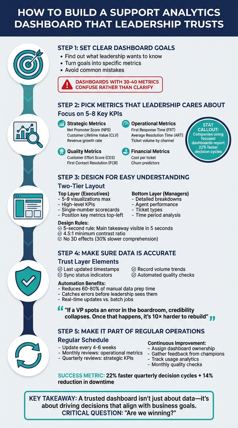
5 Steps to Build a Trusted Support Analytics Dashboard for Leadership
Step 1: Set Clear Dashboard Goals
Find Out What Leadership Wants to Know
Dashboards shouldn’t just be a collection of data; they need to answer real business questions. Start by understanding what decisions leadership needs to make, not just what data is available. Ask them: What insights would help them act faster or make better choices? For example, are they trying to gauge how support affects customer churn, pinpoint compliance risks, or align operations with strategic goals? Each of these requires a unique approach to data and presentation [3].
Leadership doesn’t want another overwhelming list of metrics – they want clarity. A Support Manager might care about operational stats like ticket backlog or average handle time. In contrast, an Executive likely needs a broader perspective, such as how support influences CSAT, CES, and NPS, customer lifetime value, or cost per ticket [4][6].
"Leadership without visibility is like steering a ship through fog. You might be moving, but you’re guessing where you’ll end up." – Siddharth, Blog Author, Agile Seekers [3]
Once leadership’s priorities are clear, you can move on to transforming those into actionable metrics.
Turn Goals into Specific Metrics
After identifying leadership’s decision-making needs, the next step is to translate those into measurable targets. For instance, if the goal is to improve customer retention, you could set objectives like reducing escalation rates by 15% in six months or increasing first-contact resolution from 68% to 80% by Q3 2026.
Break these high-level goals into manageable data points. If reducing customer churn is the focus, consider tracking metrics like resolution time, CSAT scores, and repeat contact rates – factors that directly influence retention. Pair each primary metric with a secondary “guardrail” metric to avoid unintended outcomes. For example, if you’re monitoring resolution speed, also track CSAT to ensure quality isn’t sacrificed for speed [5].
For a deeper dive, refer to the earlier case study on AI-powered dashboard implementation [3].
Avoid Common Mistakes
Dashboards that don’t address a specific business problem often end up cluttered with too many metrics – 30 to 40, in some cases – which can confuse rather than clarify [8][9].
"A dashboard that doesn’t support a specific decision or priority is just noise." – CSG Solutions [8]
Watch out for metric surrogation, where the metric itself becomes the goal. A cautionary tale is Wells Fargo’s 2016 scandal, where the focus on a “cross-selling” metric led employees to open 3.5 million unauthorized accounts. This approach ultimately harmed customer trust – the very thing the metric was supposed to strengthen [7].
Numbers are meaningless without context. For example, “100 tickets resolved” doesn’t tell leadership much unless they know if it meets, exceeds, or falls short of expectations. Always explain the “why” behind the data and what actions should follow. This builds trust and ensures dashboards support meaningful decisions [3].
sbb-itb-e60d259
Step 2: Pick Metrics That Leadership Cares About
Core Metrics for Leadership Decisions
Once your goals are clear, the next step is identifying metrics that align with what leadership values most. These metrics should directly connect to business outcomes. For instance, strategic metrics like Net Promoter Score (NPS), Customer Lifetime Value (CLV), and revenue growth rate link support performance to broader company objectives. They show whether your support team is driving customer loyalty or inadvertently increasing churn.
Operational efficiency metrics are another critical area. These include First Response Time (FRT), Average Resolution Time (ART), and ticket volume broken down by channel. These numbers reveal how well your team is handling demand and allocating resources. On the quality side, metrics like Customer Effort Score (CES) and First Contact Resolution (FCR) are essential because they’re strongly tied to long-term customer satisfaction and loyalty.
Financial metrics are especially important for leadership because they speak in terms executives understand. For example, cost per ticket helps assess whether your support system is scalable and cost-effective. When combined with churn predictors, these metrics can act as early warning signs for potential revenue loss. AI-powered dashboards have even shown the ability to flag operational risks weeks in advance, helping companies avoid major financial setbacks.
| Metric Category | Key KPI | Business Impact |
|---|---|---|
| Strategic | Net Promoter Score (NPS) | Gauges customer loyalty and overall brand health |
| Operational | First Response Time (FRT) | Improves immediate customer satisfaction |
| Quality | First Contact Resolution (FCR) | Reduces customer effort and boosts team efficiency |
| Financial | Cost per Ticket | Measures scalability and operational sustainability |
| Risk | Churn Predictors | Identifies potential revenue loss early |
Keep It Simple Without Losing Detail
Leadership and support teams need different levels of data. Executives typically want a high-level summary that answers, "Are we on track?" – think single-number scorecards for quick insights. On the other hand, your support team needs detailed breakdowns to pinpoint and resolve specific issues.
A two-tiered dashboard design works well here. Start with a top-level summary for executives, like an Average Resolution Time score, and allow managers to drill down into details by ticket type, agent, or time of day. This approach gives both groups what they need: leadership gets a fast overview, while managers access actionable insights. Companies using this method have reported 22% faster decision cycles by cutting out manual data gathering [3]. The result? Leadership sees the big picture without getting bogged down in unnecessary details.
Don’t Overwhelm Leadership with Too Much Data
Keep your dashboard focused by limiting it to 5–8 high-impact KPIs. One of the most common mistakes is tracking every available metric just because the data is there. This creates information overload and makes it harder for leadership to focus on what truly matters [3].
"If you track everything, you focus on nothing." – Torsten Walbaum, Omni Analytics [5]
Avoid vanity metrics that might look impressive but don’t drive action. For example, raw ticket volume means little unless it’s broken down by channel or urgency. Similarly, "tickets handled per agent" can be misleading if it’s not paired with quality metrics like CSAT. Always balance efficiency metrics with quality indicators. If you’re measuring resolution speed, also track customer satisfaction to ensure speed doesn’t come at the cost of quality.
Complex metrics, like LTV:CAC ratios, can also be problematic. If leadership can’t explain how a metric is calculated in a single sentence, they’re less likely to trust or use it. Stick with simple, transparent metrics that answer key business questions directly, rather than overwhelming leadership with the sheer volume of data you can collect.
Step 3: Design for Easy Understanding
Use a Two-Level Layout
A well-thought-out layout is key to making dashboards easy to understand. The most effective designs separate executive-level needs from those of support managers. Start with a summary layer at the top, featuring high-level KPIs like Average Resolution Time or CSAT, presented in single-number scorecards. Below this, add a diagnostic layer that allows managers to dive deeper into details, such as ticket types, agent performance, or specific time periods. This structure avoids clutter while giving each audience the precise insights they need. Research indicates that the human brain can only process about seven chunks of data at a time, so exceeding this limit can cause cognitive overload [12]. To keep things clear, limit the top layer to 5–9 visualizations [11].
Position your most important metrics in the top-left corner, as users naturally scan dashboards in a Z-pattern or F-pattern, starting in that area [12]. For those who need even more detail, consider adding a third, interactive layer. This layer can provide granular, transactional data without overwhelming users who only need high-level insights.
Once your layout is complete, enhance usability with interactive elements that empower users to explore the data on their terms.
Add Interactive Features
Interactive features allow users to dig into the data without overwhelming the main dashboard view. Tools like filters and tabs can create role-specific views, enabling executives to focus on strategic outcomes while support managers access operational details [1]. For instance, a filter might let a VP examine resolution times across all channels, while a team lead zooms in on an agent’s performance during peak hours.
Hover tooltips are another great addition, offering explanations for complex metrics only when needed. For example, hovering over "First Response Time" could display its definition: "The time from ticket creation to the first agent reply" [1]. Features like natural language queries take this a step further, letting users ask questions such as, "Why did CSAT drop in the Northeast region?" and receive straightforward answers supported by charts [3]. These interactive tools not only improve usability but also speed up decision-making and enhance risk management [3]. Many teams see similar results when optimizing their reporting workflows.
While interactivity is important, clear visual design remains a cornerstone of effective dashboards.
Follow Clear Visual Design Rules
A clean, well-organized design makes dashboards easier to read and builds user confidence. Apply the "5-second rule" – anyone looking at the dashboard should understand its main takeaway within five seconds [11]. Remove unnecessary elements like chart borders, gridlines, and background patterns to reduce visual noise [12]. Avoid 3D effects, as they can slow down comprehension by as much as 30% [12].
"Graphical Excellence consists of complex ideas communicated with clarity, precision, and efficiency."
- Edward Tufte, Professor of Computer Science and Statistics, Yale University [14]
Use color coding thoughtfully. Red, yellow, and green are effective for status indicators, but remember that about 8% of men experience color vision deficiency [12]. To address this, pair colors with icons or patterns for redundancy, and ensure a minimum contrast ratio of 4.5:1 for text to maintain readability [12]. Consistency in typography, color schemes, and interaction patterns across all views is also essential for reducing the learning curve [10][11].
When selecting chart types, match them to the data’s purpose. Line charts work best for showing trends over time, bar charts are ideal for comparing categories, and scorecards are perfect for highlighting key metrics at a glance [12][4]. To add context, include comparison values like targets, benchmarks, or data from previous periods. This makes the numbers more actionable and meaningful [13][4].
How To Build Executive Level Tableau Dashboards

Step 4: Make Sure Data Is Accurate
A dashboard is only as good as the trust leadership places in its data. If the numbers are off – even slightly – it can undermine confidence and derail strategic decisions. As Ali Z., CEO of aztela, puts it:
"If a VP spots an error in the boardroom, credibility collapses. Once that happens, it’s 10× harder to rebuild" [2].
Check Data Sources and Calculations
Start by ensuring your data is rock solid. Double-check that your dashboard’s outputs align with primary systems like your CRM, ticketing platform, or financial records. For instance, if your dashboard shows an "Average Resolution Time" that doesn’t match the original system, it’s a red flag that something’s gone wrong.
To keep things reliable, add a data integrity layer to your dashboard. This could include features like:
- "Last Updated" timestamps
- Trends in record volume (e.g., week-over-week ticket counts)
- Sync status indicators to flag issues like expired authentication or inactive CRM connections [1]
Additionally, tools like dbt or automated anomaly detection can help catch subtle issues – like charts that look fine but display outdated or incomplete data due to source system changes. As Sumit Gupta, Analytics Leader at Notion, warns:
"The most dangerous kind of break? One that doesn’t crash. It just stops updating" [1].
Assign ownership to each dashboard view and implement a monthly quality assurance process. This should include checking for schema changes, validating metrics, and refreshing authentication tokens [1]. Before building, gather stakeholders from Finance, Sales, and Operations to agree on a single source of truth for every KPI during a "Metrics Summit" [2].
Automate Data Collection and Updates
Manual data entry is a breeding ground for errors. Automation not only reduces mistakes but also saves time. Research shows that data preparation can take up 60–80% of analytics efforts, and nearly half of new records often contain critical errors [15].
Switch to event-driven architectures instead of relying solely on scheduled batch jobs. This ensures your dashboard updates in real time whenever key actions occur, such as a customer responding to a survey or a ticket being resolved [15]. AI tools can also process unstructured data – like customer emails or chat transcripts – which often make up the majority of enterprise data. These tools can extract sentiment, categorize issues, and flag urgent cases without human intervention.
Set up automated quality checks to catch issues like missing values, duplicates, or formatting problems. Use alerts to notify owners if something unusual occurs, such as a 90% drop in record counts week-over-week, so problems can be fixed before leadership sees the data [1]. Companies that leverage advanced real-time data analytics are far more likely to attract customers and boost profits [15]. As Benjamin Kennady, Cloud Solutions Architect at Striim, explains:
"The capability of a company to make the best decisions is partly dictated by its data pipeline. The more accurate and timely the data pipelines are set up allows an organization to more quickly and accurately make the right decisions" [15].
While automation enhances reliability, transparency about any data gaps is key to maintaining trust.
Be Honest About Data Limitations
Transparency is critical when it comes to data [2]. If there are gaps or limitations, don’t sweep them under the rug. Instead, include a "Trust Layer" on your dashboard to provide metadata like:
- Last updated timestamps
- Data refresh status
- Schema test results [1]
If a data source is experiencing issues, use clear status indicators like "✅ CRM synced" or "⚠️ API auth expired" to provide context for the numbers [1].
Be specific when labeling metrics. For example, instead of simply saying "Purchases", use a label like "Purchases (last-click attribution)" and include hover tooltips to explain how the metric is calculated. A linked or embedded Metrics Glossary can further clarify KPIs, their sources, and the logic behind them [1]. If you’re using AI-driven insights, add explainability layers to show the factors influencing predictions or recommendations so that leadership understands the reasoning behind the data [3].
Step 5: Make the Dashboard Part of Regular Operations
Creating a dashboard isn’t just about assembling data – it’s about building a tool that becomes a core part of leadership’s decision-making process. It’s not a one-and-done project but an evolving resource that adapts to changing priorities.
"The right question isn’t: ‘What can we show?’ It’s: ‘What decision will this dashboard enable?’" [2]
To keep your dashboard relevant and impactful, treat it like a product that requires regular updates, maintenance, and alignment with business goals [1].
Set a Regular Reporting Schedule
Consistency is key. Plan to update your dashboard every 4–6 weeks, aligning the updates with decision cycles such as monthly operational reviews or quarterly strategy sessions. For example, during monthly reviews, focus on operational metrics like ticket resolution times and escalation rates. For quarterly updates, shift the focus to strategic KPIs such as customer retention or cost per ticket.
A global manufacturing firm saw impressive results by integrating dashboards into their operations, cutting quarterly decision cycles by 22% and reducing production downtime by 14% through predictive alerts embedded in their dashboard views [3].
Leverage AI tools to automate updates and flag critical changes in real time. This ensures decision-makers have the most relevant data at their fingertips.
Assign ownership for each part of the dashboard. For instance, the VP of Support might oversee operational metrics, while the CFO manages cost-related views. Clear accountability ensures the dashboard remains actionable and avoids becoming an unused tool [2].
With a schedule in place, the next step is to refine the dashboard through user feedback.
Get Feedback and Make Improvements
A dashboard’s value hinges on how well it serves its users. Regularly seek input from a diverse group of stakeholders. Select "champions" from departments like Finance, Sales, and Operations to provide feedback on usability and suggest improvements [17]. These champions can also help train others on interpreting the data.
Organize periodic Metrics Summits to align on KPIs. Misaligned definitions – like differing interpretations of "Leads" between Sales and Marketing – can quickly erode trust in the dashboard.
Gather feedback from multiple angles – superiors, peers, and direct reports – to ensure you’re addressing everyone’s needs [16]. If usage drops, apply techniques like the "5 Whys" to uncover the root cause [16]. Once you identify the issue, you can adjust and improve the dashboard accordingly.
After refining the tool based on feedback, the focus should shift to monitoring its usage and driving adoption.
Track Usage and Increase Adoption
A dashboard is only effective if it’s being used. Use built-in analytics to track who’s accessing the dashboard and which sections get the most attention [1]. This data highlights what’s working and what might need improvement.
Add a visible "Trust Layer" to reassure users about data accuracy. Include details like "Last Updated" timestamps, refresh statuses (e.g., "✅ CRM synced" or "⚠️ API auth expired"), and trends in record volumes [1]. Automated alerts can notify the dashboard owner if something seems off – like a 90% drop in record counts week-over-week – so issues are resolved before they reach leadership [1].
Tailor the dashboard to meet the needs of different leaders. Executives may require high-level, strategic views focusing on metrics like revenue and retention, while department heads might need more detailed, tactical insights like pacing or A/B test results. If leaders are reverting to spreadsheets or instinct-based decisions, it’s a clear sign the dashboard isn’t hitting the mark [2].
Finally, designate a dedicated dashboard owner – someone in RevOps or Analytics – to perform monthly quality checks. This person ensures schema integrity, validates key metrics, and confirms that data authentication tokens remain active [1]. Having a clear owner helps maintain the dashboard’s reliability and relevance over time.
Conclusion
Create a dashboard that truly supports decision-making by centering it on outcomes that matter – like revenue, Customer Lifetime Value (LTV), and net margin – instead of getting sidetracked by vanity metrics. The ultimate question your dashboard should answer is, "Are we winning?" [1]
Once you’ve established clear goals, design your dashboard to serve the needs of different audiences. Executives typically need a high-level summary with top customer support KPIs, while operational managers benefit from more detailed insights, such as campaign pacing or First Response Time (FRT) [1].
Trust in your dashboard hinges on data integrity. Include clear trust indicators, such as timestamps, sync statuses, and record trends, as outlined earlier [1]. A shared glossary is also essential to avoid misunderstandings – terms like "conversion" or "lead" can cause confusion if interpreted differently by various teams [1].
Finally, always validate your data before presenting it to leadership. Spotting errors during a key meeting can severely damage your credibility [2]. To prevent this, assign a dedicated dashboard owner to conduct monthly reviews, ensuring the data remains accurate and reliable [1].
FAQs
How do I prove support impacts revenue or churn?
To show how customer support impacts revenue or churn, connect your support metrics directly to financial outcomes. Use dashboards to align key performance indicators (KPIs) like resolution time and customer satisfaction (CSAT) with revenue and churn data.
For example, demonstrate how faster resolution times or higher CSAT scores lead to happier customers. Happier customers are more likely to stick around (reducing churn) and spend more (increasing revenue). By visualizing these relationships, you can clearly illustrate how improvements in support metrics contribute to overall business success.
Creating these visual connections makes your case stronger and highlights the value of investing in quality support.
What 5–8 KPIs should I show executives?
When building a support analytics dashboard that aligns with leadership goals, consider tracking these metrics. They offer a clear picture of performance, customer satisfaction, and operational efficiency:
- Customer Satisfaction Score (CSAT): This metric measures how happy customers are with their support experiences. It’s a direct reflection of the team’s ability to meet customer expectations.
- First Response Time (FRT): Tracks how quickly support agents respond to initial inquiries. Faster response times often lead to higher customer satisfaction.
- Resolution Time (MTTR): Measures the average time it takes to resolve issues. This highlights how efficiently the team handles problems.
- Case Volume and Backlog: Provides insight into workload trends by showing the number of incoming tickets and unresolved cases. This helps in resource planning and identifying potential bottlenecks.
- Escalation Rate: Indicates the percentage of tickets that are escalated to higher-level support. A high rate might point to complex issues or areas where additional training is needed.
- Agent Utilization: Tracks productivity metrics like average handle time or the number of tickets resolved per agent. This ensures the team is working effectively without being overburdened.
- SLA Compliance: Monitors how well the team adheres to Service Level Agreements, especially regarding resolution timeframes.
- Customer Retention or NPS (Net Promoter Score): Helps gauge the long-term impact of support on customer loyalty and overall satisfaction.
By focusing on these KPIs, you can gain actionable insights into your team’s performance and the quality of the customer experience.
How do I add a “trust layer” to my dashboard?
To make your dashboard more reliable, prioritize data accuracy, proper validation, and alignment with leadership goals. Double-check metrics, keep the information straightforward, and update regularly to prevent misunderstandings or mistrust. If you’re using AI for tasks like predicting trends or spotting anomalies, be transparent about your data sources and methods. Providing clear, dependable, and actionable insights will help establish trust in your dashboard.