
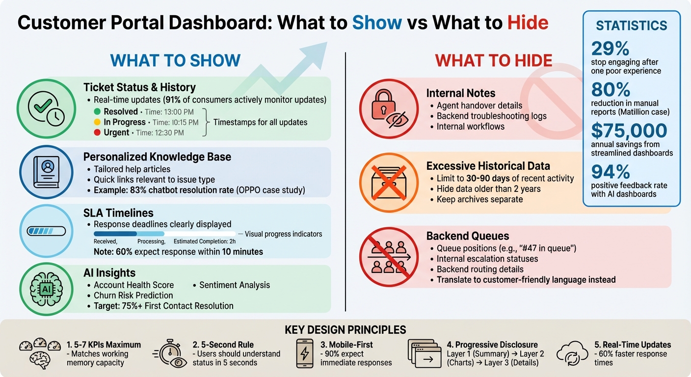
A great customer portal dashboard does two things: it helps users find answers quickly and avoids overwhelming them with unnecessary details. Here’s what to show and what to leave out:
What to Show:
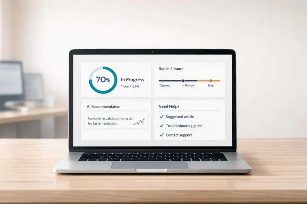
- Ticket Status and History: Use clear labels, timestamps, and color codes (e.g., green for resolved, red for urgent).
- Personalized Knowledge Base: Offer help articles or resources tailored to the user’s issue (e.g., billing guides for payment tickets).
- SLA Timelines: Display response deadlines and progress bars to set clear expectations.
- AI Insights: Include tools like sentiment analysis or account health scores to simplify complex data.
What to Hide:
- Internal Notes: Keep backend details like agent handovers or troubleshooting logs out of sight.
- Excessive Historical Data: Limit visible history to recent interactions (30–90 days).
- Backend Queues: Avoid showing internal processes like escalation or queue positions.
Key Design Tips:
- Prioritize simplicity with 5–7 key metrics per view.
- Use clear visuals and progressive layers for details.
- Ensure mobile compatibility with tappable cards and minimal scrolling.
Customer Portal Dashboard: What to Show vs Hide – Complete Guide
What to Show on Your Customer Portal Dashboard
Your dashboard should answer one key question: "What’s happening with my issue?" The goal is to provide clear, concise information that guides users without overwhelming them.
Ticket Status and History
Real-time ticket updates are a must – 91% of consumers actively monitor updates and value quick communication [2]. Your dashboard should clearly display the current status of tickets, key progress milestones, and a full history of interactions, from the initial contact to resolution. Transparency like this not only informs but also reduces unnecessary follow-up inquiries.
Pro tip: Use color-coding to make statuses easy to interpret at a glance:
- Green: Resolved
- Yellow: In Progress
- Red: Urgent
Adding timestamps (e.g., 3/15/2026, 2:30 PM) ensures users know exactly when updates occurred. This level of detail reassures customers and keeps them informed.
"A dashboard is a visual display of the most important information needed to achieve one or more objectives that has been consolidated on a single computer screen so it can be monitored at a glance." – Stephen Few [7]
To further enhance the experience, integrate personalized resources directly into the dashboard.
Personalized Knowledge Base and Quick Links
Tailor the dashboard experience by displaying help articles and quick links that align with each customer’s needs. For instance:
- If a customer has a billing-related ticket, show troubleshooting guides for payments.
- For technical issues, surface product documentation or video tutorials.
This targeted support approach not only empowers users to resolve issues themselves but also decreases overall ticket volume.
A great example of this in action is OPPO. The global smart device brand implemented AI-powered dashboards that increased their chatbot resolution rate to 83%, earned a 94% positive feedback rate, and contributed to a 57% rise in repurchase rates [2]. By offering smart content recommendations, your portal can evolve from a simple ticket tracker to a proactive support hub.
Beyond updates and resources, setting clear expectations is another way to build trust.
SLA Timelines and Response Deadlines
Transparency is key to building customer confidence. Highlight when users can expect responses and resolutions. Use visuals like progress bars to make SLA (Service Level Agreement) goals easy to understand. For example:
- If 60% of customers expect an immediate response to mean within 10 minutes [2], clearly display your response and resolution targets (e.g., 2-hour response time, 24-hour resolution time).
This approach helps set realistic expectations while reducing the need for follow-up inquiries.
AI-Generated Insights and Predictions
Modern dashboards can go beyond static updates by incorporating AI-driven insights. Use AI to surface predictive and actionable data without overwhelming users. For example, AI-generated case summaries can condense complex ticket threads into easy-to-read insights. Metrics like First Contact Resolution (FCR), targeting over 75%, can also showcase your team’s efficiency [2].
Here’s how AI-driven metrics can add value:
| AI-Driven Metric | Purpose | Impact on Decision-Making |
|---|---|---|
| Account Health Score | Measures overall relationship strength | Helps prioritize high-value or at-risk accounts |
| Churn Risk Prediction | Identifies likely cancellations | Enables proactive outreach to prevent loss |
| Sentiment Analysis | Tracks customer emotional tone | Alerts managers to escalating frustrations |
These insights simplify complex data, turning it into actionable intelligence that benefits both your team and your customers.
sbb-itb-e60d259
What to Hide: Reducing Clutter and Confusion
What you leave out of a dashboard is just as critical as what you include. Overloading a dashboard with unnecessary details can confuse users and lead to more questions than answers. The principle is straightforward: if it doesn’t help the customer solve a problem or understand their status, leave it out.
Internal Notes and Operational Metrics
One of the first things to hide is backend data that doesn’t guide customer decisions. Internal workflows, agent handover notes, or troubleshooting metrics belong in your CRM – not on a customer-facing dashboard. Showing these details only creates confusion. Make sure the metrics displayed are relevant to the customer’s needs.
"If everything is important, then nothing is." – insightsoftware [7]
A great example comes from Matillion in 2025. By shifting from cluttered, static reports to streamlined self-service dashboards, they cut manual report requests by 80% and saved more than $75,000 annually. This success came from focusing on customer-centric data and hiding unnecessary details like analytical drill-downs and raw operational metrics [5]. Experts suggest keeping dashboards focused on 5–7 key performance indicators (KPIs) to avoid overwhelming users [5].
Excessive Historical Data Archives
Another common mistake is overloading dashboards with excessive historical data. While archives can be useful, most customers are more interested in what’s happening now or in the recent past, not in every interaction from years ago. Limit dashboards to the last 30–90 days of activity, and if older data is needed, make it accessible through a separate archive.
This approach ties into the idea of the "data ink ratio", which emphasizes reducing unnecessary visual clutter. Overloaded dashboards are harder to read and process because irrelevant details get in the way [6]. For example, time-based charts should ideally display no more than 7 data points to keep them clear and actionable [3]. The goal is to ensure customers can instantly grasp their current status without sifting through irrelevant information.
Unresolved Escalations and Backend Queues
It’s also a good idea to keep internal escalation statuses, queue positions, and backend routing details out of customer view. Showing a user they’re "number 47 in the escalation queue" or that their issue is "pending internal review" only adds to their frustration.
Instead, translate these internal processes into simple, customer-friendly updates. For example, instead of "Escalated to Tier 3 Engineering", show "In Progress – Our technical team is working on your issue." This approach ensures clarity without overwhelming the customer. Automation can play a big role here, as studies suggest that 60% of all occupations could see at least one-third of their tasks automated with current technology [4]. Use that automation to simplify what customers see, not complicate it.
| Dashboard Element | Internal View (Hide from Customer) | Customer View (Show) |
|---|---|---|
| Metrics | Agent utilization, backend queue position, cost per ticket | SLA status, time to resolution, current ticket status |
| Notes | Internal troubleshooting steps, agent handovers | Public status updates, resolution summaries |
| Data Depth | Raw logs, historical archives (>2 years) | Actionable current data, recent history (last 30–90 days) |
The rule of thumb here? Customers should understand their status within 5 seconds [7]. Keep it simple, clear, and relevant.
How to Design an Effective Customer Portal Dashboard
A well-designed customer portal dashboard should deliver essential information clearly and quickly. In today’s AI-driven B2B support systems, the focus is on creating dashboards that allow users to understand their status within 5 seconds and identify the next steps effortlessly. To achieve this, prioritize clear organization, personalized features, and intuitive filtering. Building on the key data elements previously discussed, the layout should make critical information easily visible and simple to interpret.
Use Clear Visual Hierarchy and Simple Layouts
A dashboard should guide the user’s attention naturally. Since people tend to scan screens in an F- or Z-shaped pattern, place the most important details – like ticket status, SLA deadlines, and urgent alerts – in the top-left quadrant [8][2]. Secondary data, such as historical trends, can be placed further down.
To avoid overwhelming users, employ progressive disclosure. Start with high-level summary cards displaying key metrics like ticket status and unresolved issues (Layer 1). For users needing more context, provide interactive charts and filters (Layer 2). Finally, reserve detailed tables and logs for deeper exploration via click-throughs (Layer 3) [8]. This layered approach ensures that users get the insights they need without unnecessary clutter.
"A dashboard that shows everything tells you nothing. The best dashboards are ruthlessly focused on the decisions their users need to make."
– Boundev Team [8]
Consistency is key. Use the same colors, chart styles, and interaction patterns throughout the dashboard. For instance, if red signals an "SLA breach", avoid using it for other purposes. Enhance accessibility by pairing color-coded statuses with icons or text labels, as around 8% of men have color vision deficiencies [8]. Stick to one typeface and limit font weights to two, while using whitespace effectively to separate data clusters rather than overcrowding the layout [8][1].
Enable Personalization and Mobile Access
Dashboards should adapt to the user’s role. A support manager might need team-wide metrics like CSAT, CES, and NPS metrics and ticket backlogs, while an individual customer will focus on their open cases and estimated response times. Role-specific customization ensures users see only the information relevant to them [1].
Mobile compatibility is essential – 90% of customers expect immediate responses, and 60% define "immediate" as within 10 minutes [2]. Your dashboard should function seamlessly on smartphones and tablets. For mobile layouts, prioritize the top 3–4 KPIs as large, tappable cards. Use vertical scrolling for grids and replace full charts with sparkline visualizations. The idea is to display critical information on a single screen, minimizing the need for excessive navigation gestures [8].
Add Interactive Filters and Limit KPIs
Interactive filters allow users to explore specific details without cluttering the main view. For instance, include options to filter by ticket status (open, pending, resolved), date ranges (last 7 days, last 30 days), or product categories. This keeps the default view clean while empowering users to dive deeper into the data [9].
Keep the number of KPIs manageable – 5 to 7 metrics at most. This aligns with the human brain’s working memory capacity, helping users process and retain the information presented [8]. Place the most critical numbers as scorecards at the top (e.g., "2 Open Tickets" or "Next Response Due: 3/23/2026, 2:15 PM"), and use charts below for trend analysis and comparisons.
"By only providing 7 major KPIs you can be assured that your dashboard users will understand and retain the information being presented. Do not overwhelm the customer-facing dashboard’s users with a page full of numbers."
– Agathe Huez, Head of Brand & Communication, Toucan Toco [9]
A great example of this approach is OPPO, which implemented a unified dashboard in August 2025. By focusing on actionable metrics and personalized views, they boosted their chatbot resolution rate to 83%, achieved a 94% positive feedback rate, and saw a 57% increase in customer repurchase rates [2]. These results highlight how effective design can directly improve customer service outcomes and drive better engagement.
| Dashboard Element | Design Principle | Why It Matters |
|---|---|---|
| Top-Left Position | Place critical KPIs (e.g., ticket status, SLA timelines) in the top-left quadrant | Users scan in an F-pattern; the eye naturally lands here first [8] |
| Progressive Layers | Summary cards → charts → detailed tables | Prevents information overload [8] |
| Mobile KPIs | Limit to 3–4 large, tappable cards | Ensures usability on small screens [8] |
| Color + Icons | Pair status colors with text/icons | Supports accessibility for approximately 8% of men [8] |
| KPI Limit | Maximum 5–7 metrics per view | Matches the average working memory capacity [8] |
Using AI to Improve Dashboard Content
AI is changing the way customer portal dashboards function, turning them into smarter, more responsive tools. Instead of just displaying static information, these dashboards now anticipate user needs, prioritize data, and simplify complex case histories. This shift aligns with the broader trend of making data more accessible and actionable. The growing demand for these capabilities is evident in the global sentiment analytics market, which hit $5.71 billion in 2025 and is expected to soar to $19.01 billion by 2035. Below, we’ll dive into how AI enhances dashboards through sentiment analysis, real-time summaries, and intelligent recommendations.
Sentiment Analysis and Ticket Prioritization
AI-driven sentiment analysis goes beyond simple keyword detection to evaluate tone and context in customer communications. It can recognize subtle cues, like sarcasm or frustration, to classify tickets based on emotional urgency. For instance, a comment like "Great, another delayed shipment" is flagged as negative, ensuring it gets immediate attention.
This system scores and categorizes tickets, making it easier for agents to focus on high-priority issues rather than processing tickets in chronological order. AI determines priority by analyzing several factors, including sentiment scores, urgency indicators (e.g., "system down"), customer tier (like VIP status), and interaction patterns. Businesses using this approach have seen impressive results, such as a 27% boost in CSAT scores for eCommerce companies [10]. Overall, companies integrating AI into customer service report improvements of 20% to 32% in key metrics like customer satisfaction and employee productivity [10].
"CX leaders rank AI-inferred sentiment of customer interactions as the single biggest driver of CSAT improvements, ahead of agentics and AI-powered content creation." – Zoom, citing Metrigy 2025 [10]
To make the most of this technology, ensure your sentiment analysis tool processes messages in real time to avoid delays. Automate actions based on sentiment scores, such as adjusting SLA deadlines or escalating critical issues to senior agents. Opt for tools powered by advanced NLP models to handle nuanced complaints effectively. Combine sentiment data with CRM insights to prioritize tickets that involve high-value customers or strict SLA commitments.
Real-Time Case Activity Summaries
AI-generated summaries streamline case management by condensing long interaction histories into concise updates. These summaries highlight unresolved issues, the most recent actions, and the next steps, saving agents from having to sift through extensive records.
The benefits are clear. Monday.com, for example, integrated AI summarization with Mosaic AI, cutting average handle times by 13.5% [13]. Similarly, Own Company used AI for tasks like ticket translation and JIRA escalations, enabling agents to manage 130% more tickets per month and reducing handle times by 15% [13].
"AI Case Summarization… can automatically read and distill lengthy interactions and case histories into concise, meaningful summaries, providing instant context and dramatically reducing the time needed to understand the situation." – Eric Klimuk, Founder and CTO, Supportbench [12]
For dashboards, consider adding a "Current Status" summary visible to customers, so they’re always aware of what’s happening without needing to ask. Pair this with sentiment-based prioritization to ensure urgent issues are flagged for immediate action. Make sure your summarization tool can pull data from external sources like Confluence or Google Docs to provide a complete view of the situation. Gartner predicts that AI could cut agent labor costs by $80 billion by 2026, with partial automation reducing interaction times by up to 33% [14].
AI-Powered Knowledge Base Recommendations
AI can classify incoming queries into categories like billing, technical issues, or feature requests, instantly suggesting the most relevant knowledge base articles. This ensures customers get tailored solutions instead of generic search results. By integrating with support platforms, the AI also uses sentiment analysis to prioritize solutions for frustrated users, helping de-escalate tense situations [11].
The goal here is to lower the Customer Effort Score (CES) by offering accurate answers with minimal back-and-forth. For example, Yotpo, an eCommerce marketing platform, reduced internal support tickets by 20% by embedding an AI-powered knowledge base into Slack. This allowed employees to find answers themselves without pulling support agents away from their tasks [13].
"Instead of agents debating whether something is a bug or a feature request, AI applies consistent logic every time." – Duy Vu, Internal Tool Designer, Retoolers [11]
To implement this effectively, use a "draft first" approach where AI suggests responses or articles for human review before they’re sent to customers. Track help center performance metrics like article views and feedback to refine content based on what works. AI can also monitor sentiment spikes to identify emerging issues, allowing you to update knowledge base content proactively before complaints pile up.
Common Dashboard Design Mistakes to Avoid
Even a well-meaning dashboard can alienate users if it falls into common design traps. These missteps don’t just irritate customers – they can push them away entirely. Consider this: 29% of consumers stop engaging with a brand after a single poor customer service experience [16], and 75% of users admit they judge a platform’s credibility based on its visual design rather than its content or accuracy [17]. The upside? Most of these mistakes can be avoided with a few targeted adjustments. Let’s explore the pitfalls that can derail your dashboard and how to steer clear of them.
Overloading the Dashboard with Data
Too much information on a dashboard overwhelms users. Research shows that working memory can typically handle only 7 (±2) items [8]. When dashboards display more than nine metrics, users struggle to process the information, often abandoning the platform altogether. If basic details like ticket status aren’t easy to locate, customers may either leave in frustration or inundate your support team with questions.
"Your dashboard isn’t a data dump. It’s a control panel. And if users feel like they need a manual to operate it, they’ll quietly churn." – Shift by Design [15]
One company reduced their dashboard visuals from 24 to just 6, organizing them with a clear hierarchy. This simple change boosted user adoption from 11% to 74% in just three weeks [17]. To ensure clarity, apply the five-second test: can users identify key insights within five seconds? Focus on the 1–3 actions that account for 80% of customer interactions, and place advanced tools under an "Advanced" tab using progressive disclosure [15]. Swap out technical terms like "KPI Delta %" for straightforward language such as "Response Time" or "Days Until Resolution" [15][17].
Neglecting Real-Time Updates
Outdated data is a quick way to lose customer trust. Dashboards relying on manual data exports often display stale or inaccurate information [1]. Customers expect quick updates: 90% want immediate visibility, and 60% define "immediate" as within 10 minutes [2]. If your dashboard shows a ticket as "pending" when it’s already resolved, you’ve just created unnecessary confusion.
To avoid this, connect your dashboard to real-time data sources like CRMs or help desk platforms using APIs. This ensures automatic updates [1][19]. For time-sensitive commitments like SLAs, incorporate live countdown timers to highlight the time left until a breach [20]. Also, configure urgent tickets to appear at the top of the dashboard for easy prioritization [20]. Companies using real-time dashboards respond to customers up to 60% faster and see up to five times more engagement [2].
Ignoring Customer Feedback
A dashboard is never "done" – it needs ongoing feedback to stay effective. Without input from users, you’re essentially guessing what works and what doesn’t. Customers are more than willing to share their thoughts if you make it easy for them. Add features like a "Was this helpful?" prompt, a feedback button, or periodic surveys directly in the portal. Automated feedback collection can also help drive continuous improvements.
Analyze whether the actions customers take through the dashboard are actually improving their experience [18]. Are they finding answers faster? Are repeat tickets decreasing? Use this data to fine-tune the KPIs you display and how they’re presented. Establish a closed-loop feedback system, where customer input is reviewed monthly and used to make iterative updates. This prevents the "action gap", where users identify a problem but don’t know how to address it [17][18].
Conclusion
The true strength of a dashboard lies in how clearly it communicates. Striking the right balance between simplicity and transparency ensures that customers can find answers without frustration. Focus on displaying what matters most – like ticket status, SLA timelines, personalized knowledge base links, and AI-powered insights – while keeping unnecessary details, such as backend queues or operational notes, out of sight. The goal is to cut through the clutter and deliver a dashboard that feels intuitive.
AI takes this clarity to the next level, turning your dashboard into a proactive support tool. Features like automated triage, sentiment analysis, and response drafting significantly reduce manual tasks while speeding up response times. As Duy Vu, Internal Tool Designer at Retoolers, explains:
"Instead of spending five minutes drafting a reply, they spend thirty seconds reviewing a draft and clicking send. Across hundreds of tickets, productivity soars" [11].
Real-time sentiment tracking also shifts the focus from reacting to problems to preventing them altogether. It helps flag frustrated customers early, giving your team a chance to address issues before they escalate.
When you combine a streamlined design with AI-driven insights, the result is a dashboard that delivers real customer benefits. For example, in March 2026, GeoVerra reported a 25% boost in productivity after implementing automated workflows and skill-based ticket routing. This approach ensured agents handled issues suited to their expertise rather than addressing tickets on a first-come, first-served basis [21]. Considering that 70% of consumers switch brands after two negative experiences [21], a well-designed, AI-powered dashboard does more than improve efficiency – it becomes an essential element of a modern, cost-effective support strategy.
FAQs
How do I pick the 5–7 KPIs to show?
To select 5–7 KPIs for your customer support dashboard, start by aligning these metrics with your business goals and the specific objectives of your support team. Look for metrics that are both actionable and measurable, focusing on outcomes that matter most – like lowering costs, improving efficiency, or boosting customer satisfaction.
Some commonly used KPIs include:
- Ticket Volume: Tracks the number of support requests to gauge workload.
- Resolution Time: Measures how quickly issues are resolved, reflecting efficiency.
- CSAT (Customer Satisfaction Score): Indicates how happy customers are with the support they receive.
Keep your dashboard focused by limiting the number of KPIs to avoid overwhelming your team. Also, make it a habit to review and update these metrics regularly to ensure they align with changing priorities and strategies.
How can I be transparent without exposing internal details?
To maintain transparency, focus on showing high-level, role-specific metrics alongside visual indicators that provide meaningful insights. Keep sensitive operational data off the dashboard to avoid unnecessary exposure. Prioritize clear, actionable information that aligns with smart dashboard design principles, ensuring it addresses user needs effectively without revealing internal specifics.
Which AI features will reduce ticket volume fastest?
Some of the most effective tools for cutting down ticket volume include AI-powered triage, automatic response drafting, and sentiment analysis.
- AI-powered triage: This feature categorizes and prioritizes incoming tickets, eliminating the need for manual sorting and speeding up the process.
- Automatic response drafting: By handling repetitive tasks like drafting replies, this tool saves agents significant time and effort.
- Sentiment analysis: This technology identifies unhappy customers early, allowing your team to step in with proactive support.
When combined, these AI tools streamline workflows, improve resolution times, and can deflect up to 29% of cases. This efficiency translates into cost savings of about 24%, making them a game-changer for support teams.
Related Blog Posts
- How do you handle support for multiple subsidiaries/locations under one customer?
- How do you create a support analytics dashboard leaders actually use (and what to track)?
- Slack vs. The Customer Portal: Why Enterprise Clients Demand a Proper Dashboard
- Why Customer Success Needs Visibility into Support Tickets